"Your brand is what people say about you when you're not in the room. Your visual identity is what they picture when they say it."
Jeff Bezos (adapted)
Two SaaS startups launch the same week, targeting the same market. Both have solid products. Both run paid ads. The first company's social feed looks like three different agencies touched it: a bold sans-serif post one day, a soft pastel the next, a cluttered infographic after that. Their website uses different typography to their pitch deck. Their LinkedIn banner looks nothing like their homepage.
The second company has a clear visual identity. Every post feels like it came from the same mind. The same colour palette. The same photographic style. The same typographic rhythm. When someone lands on their Webflow site from an Instagram ad, they don't have to re-orient it's unmistakably the same brand.
Six months in, the second company has twice the follower engagement, a higher demo-to-close rate, and a waitlist. The first company is still debating their brand colours. The difference is visual consistency, the most underrated growth lever in branding. This guide is the definitive breakdown of why it works, what it takes, and how to build a consistent visual identity that becomes a strategic asset.
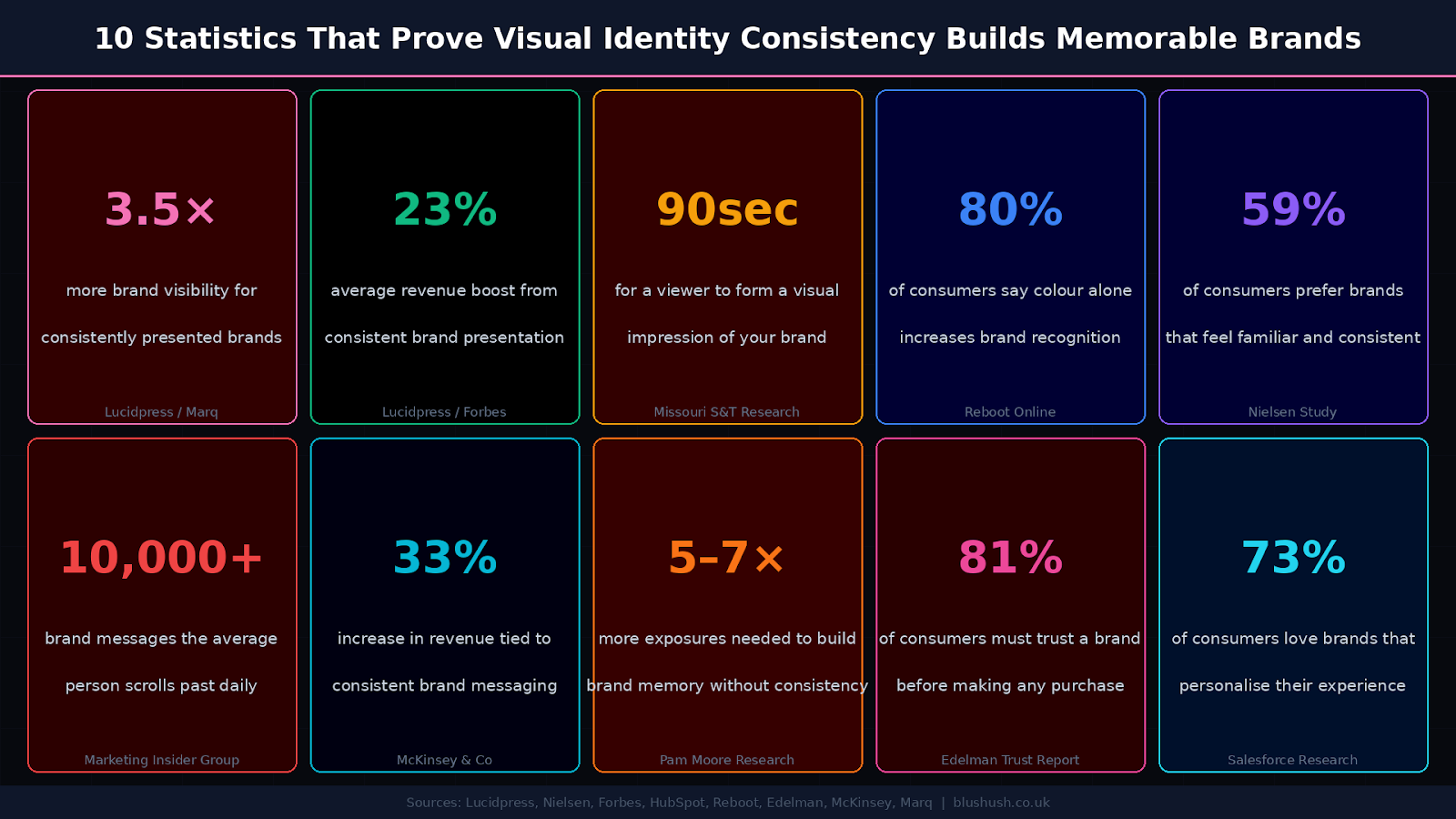
Before we go deeper, here's the data that separates the brands that compound from the brands that fade:

Branding is more than what you say. It's how you show up visually repeatedly, and without hesitation. Scroll through your favourite brands and you'll see something deeper than nice fonts and palettes. You'll see consistency. A rhythm. A pattern you trust.
Now look at the brands struggling to get traction. In nine out of ten cases, their visuals are scattered. One post looks one way; the next looks like another designer touched it. Their feed lacks fluency. Their website feels like a different company from their pitch deck. Consistency is not a design luxury. It's a trust accelerator.
A consistently presented brand is 3.5× more likely to enjoy excellent brand visibility than an inconsistent one (Lucidpress / Marq). The mechanism is straightforward: the brain seeks patterns. When visuals follow a pattern, the brain spends less effort processing them. This makes your brand easier to notice, remember, and recall later.
Most startups fumble here because they treat visual identity as decoration instead of direction. You can't mislead your audience about who you are and if your visuals are sending mixed signals, that's exactly what's happening. Every design shift without intent weakens your authority. A customer might discover your brand through a slick ad, but that trust breaks instantly if your website feels clunky or off-brand.
Visual identity is more than your logo. It's the entire visual language your brand speaks. And like any good language, it needs grammar, tone, and rules. Think of it as the body language of your brand before a word is read or heard, your design speaks. It sets the tone. It signals professionalism. It either invites people in or pushes them away.
A complete visual identity system includes:
• Colour palette your brand's emotional fingerprint
• Typography the fonts that carry your personality across every surface
• Logo usage clear rules for every variant, size, and context
• Imagery and illustration styles the photographic and artistic language of the brand
• Iconography the visual shorthand that reinforces your world
• Layout and spacing systems the structural grammar that makes everything feel intentional
• Motion graphics and transitions how your brand moves on screen
• And most importantly: how all of these are used together, over time.
It's not just about looking good. It's about looking recognisable. Everywhere. Every time. The best brands don't just design, they design intentionally and repeatedly. That intention is what forms trust, familiarity, and brand memory in the minds of your audience.
Visual identity also acts as a strategic filter. It teaches you to say no to anything that doesn't match the energy of your brand: a new campaign, a social post, a partnership. A clear visual identity gives you clarity and boundaries. And when it's right, your brand becomes recognisable even without the logo. 80% of consumers say colour alone increases brand recognition (Reboot Online). Your palette is memory architecture.
Why does consistency matter so deeply? Because the human brain is wired to trust what feels familiar.
• Recognition leads to trust. The more often we see a consistent look, the more legitimate a brand feels. We subconsciously associate visual familiarity with stability, reliability, and professionalism.
• Trust reduces friction. In a world flooded with options, a consistent presence cuts through the noise. Audiences don't have to relearn anything they engage and grasp it faster.
• Familiarity shortens decision cycles. Whether it's hiring you, buying from you, or following you, people choose what feels safe. Consistency is the shortest path to feeling safe.
Researchers at Missouri S&T found that it takes just 90 seconds for a viewer to form an initial visual impression of a brand and up to 90% of that impression is based on colour alone. In a world where the average person scrolls past 10,000+ brand messages daily, you have a fraction of a second to be recognised. That's not enough time to read copy. Your visual identity has to do the job before a word is processed.
Visual consistency sends a clear signal: "We know who we are, and we show up with intention." That clarity builds credibility not over weeks, but over every touchpoint. It compounds. And the opposite inconsistency creates confusion. One day your visuals are minimalist, the next they're loud and playful. That uncertainty makes audiences hesitate to trust or engage.
Most founders know consistency is important. But still, their visual identity is scattered. Here's why:
Most brands build assets but never document them. Designers work in silos. There's no central brand guide or shared reference point. Everyone creates based on personal style or past versions. This results in different fonts, shifted colours, and misused logos and over time, it erodes the brand recognition you've been slowly building. This is precisely the problem that a strong branding service solves: creating a documented system that anyone who touches the brand can follow.
Startups move quickly. New hires, external vendors, and growing teams mean more hands on the brand. Without clear guardrails, interpretations start to vary. A designer in week one will create something very different from a designer in week twelve. The drift doesn't happen overnight but it shows up across your website, decks, social content, and ads. Eventually, the brand starts to feel inconsistent even to people who've been following you.
LinkedIn feels "professional," so the tone shifts. Instagram feels "aesthetic," so designs shift again. Pitch decks try to be sharp. Emails go a different route. In trying to adapt everywhere, the brand starts looking like a different company in every context. Adaptation is important but without visual alignment, it comes at the cost of brand equity. The answer is a visual system that flexes within defined boundaries.
Founders and marketing teams often get bored with their branding before their audience even notices it. They start "spicing things up" with new fonts, styles, or colours not because it's needed strategically, but because it feels fresh to them. The problem: audiences don't crave change. They crave familiarity. Constant visual shifts signal instability. The brand strategy should be the governor on creative impulses if the strategy hasn't changed, the identity shouldn't change either.
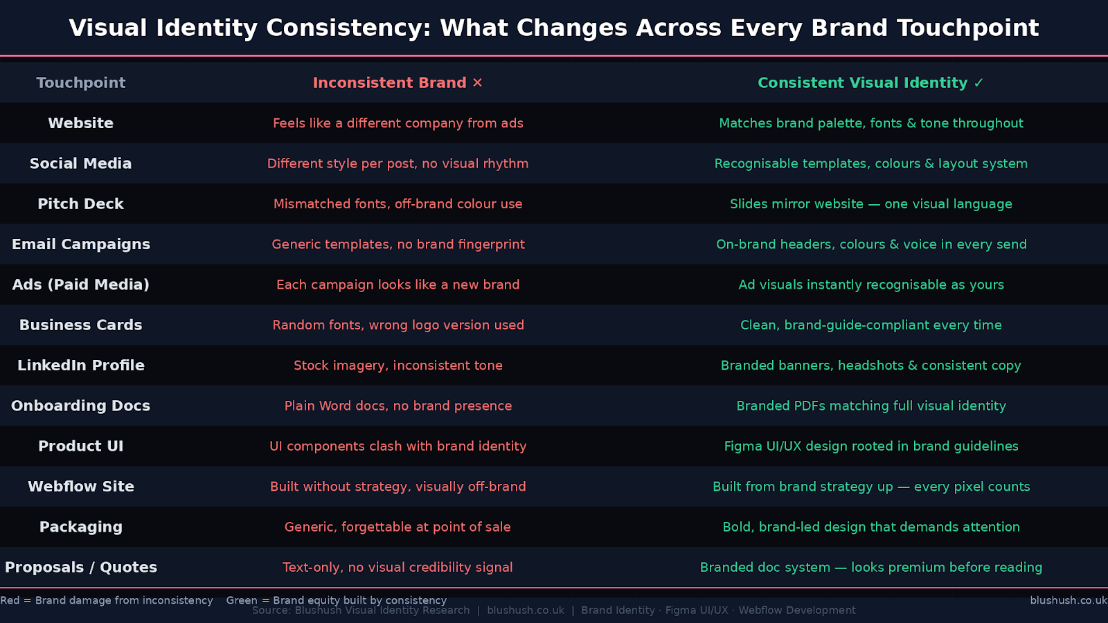
Consistency is about every surface your brand occupies. Here's how inconsistency damages and consistency builds brand equity across the touchpoints that matter most:

Visual: Brand Touchpoint Audit Inconsistent vs Consistent Visual Identity | Blushush Visual Identity Research | blushush.co.uk
Not everything that drives growth shows up in your analytics dashboard. Visual consistency works before any of that in the space between awareness and action. It sets the tone, builds trust, and reduces friction. Quietly but effectively.
The average user scrolls past 10,000+ brand messages daily. If your design is not distinct and repeated, you're easy to forget. Consistency creates memory hooks for a colour scheme, font, or layout that your audience recognises before they consciously register it. 5–7× more brand exposures are needed to build memory without visual consistency (Pam Moore Research). Consistency reduces that number dramatically.
When a brand looks inconsistent, it creates doubt. It feels unstructured, less credible. But when every touchpoint is aligned from your Webflow development build to your LinkedIn posts to your pitch deck it signals clarity and competence. People trust what looks polished, even if you're still growing. The perception of professionalism often precedes the reality of it.
81% of consumers say they must trust a brand before making a purchase (Edelman Trust Report). Consistency speeds up trust and trust speeds up decisions. When your messaging and design speak in unison, your audience doesn't need to second-guess. Whether it's buying, subscribing, or reaching out, they act with more confidence. This is especially critical for webflow agency for startups builds, where a first-time visitor often makes a trust decision in under 10 seconds.
Internally, consistency saves significant time. When design rules are defined and documented, teams don't start from scratch for every post or campaign. Marketers, designers, and sales reps all work faster when they're not guessing. This reduces back-and-forth and improves execution across the board. A well-documented brand strategy and visual identity system is one of the highest-ROI operational investments a growing company can make.
Start by looking honestly at your current state. Review your website, social media, decks, and ads. Ask: do they look like they belong to the same company? Note inconsistencies fonts, colour, layout, and logo use. Most brands are shocked by what an audit reveals. This is the baseline you're working from.
Finalise your core visual elements: colours, fonts, and image styles. Create a visual hierarchy of how elements relate across different asset types. Think in systems, not just styles. A Figma UI/UX design component library is the backbone of a scalable brand system. Every button, card, heading, and icon should derive from the same system rather than being designed fresh each time. For digital brands, this system feeds directly into your Webflow development build ensuring the site expresses the brand, not just approximately resembles it.
Create a brand guide that's short, visual, and clear. This is a practical reference that anyone who touches your brand can use in five minutes. Logo usage rules, colour codes with hex values, approved fonts with sizing guidance, photography style references, tone of voice examples. Make it accessible. If it lives in a locked Notion page that only the design lead can access, it's not serving its purpose. This is the foundation of a proper branding service not just designing the system, but documenting it so it scales.
One off-brand Instagram post can confuse your entire audience. Make sure your team internal or outsourced knows the system, why it exists, and how to apply it. Brand training doesn't need to be a course. It can be a 30-minute onboarding session, a shared Figma file, and a Loom walkthrough. The investment is minimal. The cost of not doing it is compounding brand dilution.
Evolve with intention, not with restlessness. Don't redesign because you're tired of your brand. Redesign when your audience is tired or when your brand strategy has meaningfully changed. The best brands refresh incrementally: a refined colour palette, a updated typeface, a modernised logo all while maintaining the core visual language that their audience already recognises. If your strategy hasn't changed, your visual identity shouldn't either. Consistency compounds.
Your Webflow site is often the single most important expression of your visual identity. It's where the brand strategy, the Figma UI/UX design system, the CMS management service architecture, and the visual language all converge into one experience. For most prospects, it's the first deep encounter with your brand and it needs to be unmistakably, consistently you.
A conversion‑focused Webflow agency doesn't just build a site that looks good. It builds a site that is a direct visual extension of the brand strategy where every section, colour, component, and piece of copy derives from the same system. The result is a site that feels coherent rather than assembled; confident rather than chaotic.
This is why at Blushush a Top Branding Agency and Webflow development specialist our process always begins with brand before build. We use Figma UI/UX design to establish the visual system first, then translate it into a high-performance Webflow sites build that expresses the brand at every pixel. The CMS management service is built to support consistent visual output at scale so that every new blog post, case study, or landing page feels like it came from the same brand, not a different designer.
SEO performance optimization also benefits from visual consistency: a coherent brand that creates strong user signals, low bounce rates, high dwell time, return visits sends positive signals to search engines. Brand consistency and technical SEO are not separate disciplines; they compound each other.
Consistency done right is invisible. It doesn't scream. It doesn't beg for attention. It simply works over time, across touchpoints, in the minds of your audience.
You'll notice small signs first: people tagging you with your brand colours. Clients describing you visually "That clean, minimalist one with the coral palette." Better performance from campaigns that visually align with your brand identity. Sales calls where someone says, "I've been following you for a while it just feels legit." These aren't random compliments. They're signals of trust, recognition, and brand memory all built silently through visual consistency.
You'll also notice stronger internal alignment. Designers won't second-guess layouts. Marketers will know the tone. Content creators will stay on-brand. Everyone moves faster because the visual identity is clear. 33% increase in revenue is associated with consistent brand messaging (McKinsey & Co) but the internal efficiency gains compound that further. Teams spend less time debating, less time reworking, and more time executing.
Over time, your brand starts to feel bigger than it is not because of scale, but because of coherence. That's the compounding power of a consistent visual identity. Every post, ad, or interaction reinforces what came before. Nothing feels out of place. The brand becomes familiar, and familiarity builds preference.
And here's the key insight: the more consistent you are, the less effort it takes to be recognised. People see one frame and they know it's you. That's branding without needing to say your name. Quiet, constant, effective. That's the subtle power.
Without visual consistency, research suggests 5–7 exposures are needed to build lasting brand memory (Pam Moore Research). With a strong, consistent visual identity, that number drops significantly because the brain stores and retrieves visual patterns more efficiently. Consistency is the most direct shortcut to brand recognition.
A complete visual identity system includes: colour palette, typography, logo and its usage rules, imagery style, iconography, layout and spacing systems, and motion/animation guidelines. The most important element, however, is how they're used together over time. A system that looks good in isolation but is applied inconsistently provides less brand equity than a simpler system applied with absolute discipline.
Significantly. When a visitor arrives on your Webflow development site from an ad, email, or social post and the visual language is immediately familiar matching the ad they came from trust is instantly transferred rather than having to be rebuilt from zero. This reduces bounce rates, increases dwell time, and improves conversion. A High-Converting Webflow Website is almost always one that is visually consistent with every upstream brand touchpoint, not just internally well-designed.
When the brand strategy has meaningfully changed new market, new audience, repositioning, or a fundamental shift in company direction. Not because the design team is bored, and not because a competitor has rebranded. The visual identity is a long-term investment in recognition. The cost of an unnecessary rebrand is the brand equity you've been quietly accumulating through consistent exposure.
At Blushush, our approach to Webflow agency for startups and enterprise builds is always strategy-first. We establish the visual identity system in Figma UI/UX design before a single Webflow component is built. The design system colours, typography, component library, spacing rules becomes the source of truth for the entire build. This ensures the finished site is not just well-designed but deeply on-brand, with every element traceable back to the brand strategy. Our Blushush project portfolio demonstrates this across SaaS, e-commerce, and enterprise clients.
Your brand doesn't need louder design. It needs smarter, more strategic consistency. The brands that win don't just show up, they show up looking like themselves every time. And when you do that well enough, long enough, people stop scrolling. They stop comparing. They start recognising you.
Not because you screamed the loudest. Because you whispered the same thing, beautifully, for months.
That's visual identity. That's brand memory. That's the subtle power of Brand storytelling expressed not in words, but in pixels, colours, and space.
The compounding returns of consistency are real: 3.5× brand visibility, 23% revenue uplift, faster trust, stronger teams, higher conversions. None of it requires a bigger budget. It requires discipline, a documented system, and the restraint to stay consistent when the creative impulse says otherwise.
Ready to build a visual identity that scales with you, speaks for you, and sells for you without saying a word? Start your brand transformation at Blushush →


.avif)

