Building a website that converts visitors into leads or customers is both an art and a science. It's not enough for a site to look good, it must also drive action. In this ultimate guide, we will explore how to craft a high-converting website using Webflow, covering strategies, tips, and examples to boost your conversion rates. We will also answer common questions (People Also Ask) and share insights from our experience as a Webflow design and development agency to lend credibility and practical perspective. Let's dive in!

Introduction: Why Conversions Matter

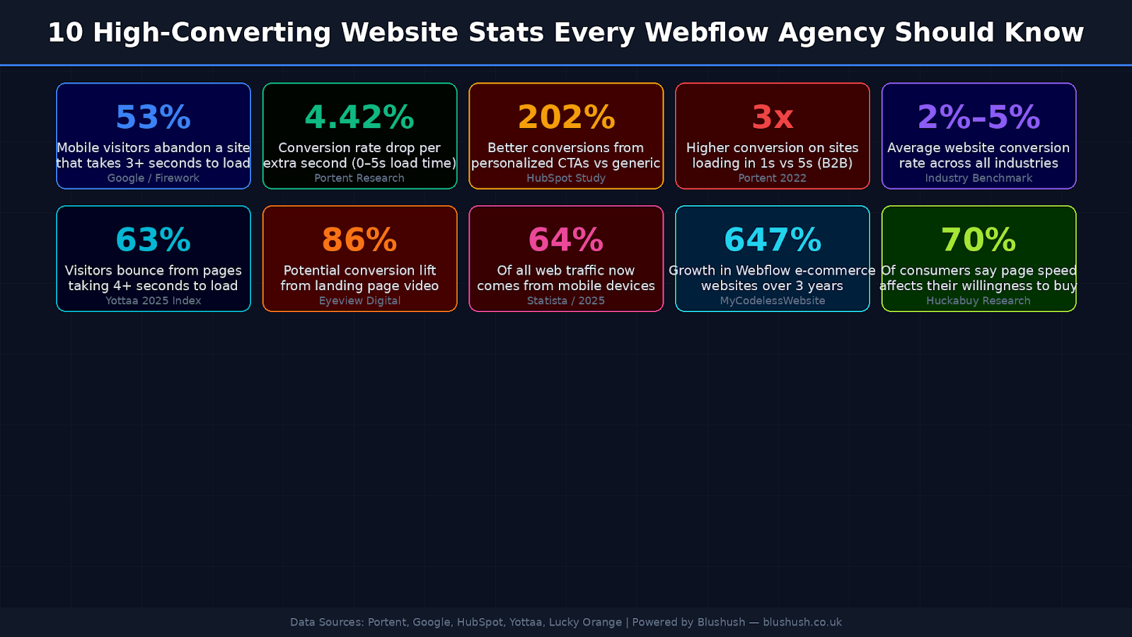
Every visitor to your website is a potential lead or sale. A "high-converting" website is one that moves a significant percentage of those visitors to take a desired action, whether that's signing up for a newsletter, making a purchase, booking a demo, or any other goal. Even a small uptick in conversion rate can have a big impact on your business's bottom line. For context, average website conversion rates across industries typically range from about 2% to 5%, so if you are hitting above 10% you are doing exceptionally well. That means most sites have vast room for improvement.

High-converting websites do not happen by accident. They are the result of intentional design choices, compelling copy, and continuous optimization. As Neil Patel notes, the highest converting websites tend to have clear unique value propositions, strong CTAs, short forms, great UX on all devices, and fast load times. The good news is that with modern tools like Webflow, you have everything you need to implement these best practices, often without writing a single line of code.

At our Webflow design and development agency, we have seen firsthand how applying conversion-centric strategies can dramatically improve results for clients. We will be sharing those strategies in this guide so you can apply them to your own site.

Before we delve into the how, let's clarify what a high-converting website really means and why Webflow is an ideal platform to build one.

What Is a High-Converting Website? (And What’s a “Good” Conversion Rate?)

A high-converting website is one designed to systematically turn a large portion of its visitors into takers of a desired action. That action could be making a purchase, submitting a contact form, signing up for a trial, whatever your primary goal is. The site guides users through important information and toward a clear call-to-action (CTA) without losing them along the way. In essence, it does not just attract visitors; it converts them into customers or leads.

But what qualifies as “high-converting”? As mentioned, typical website conversion rates are often in the single digits. Across most industries, 2%–5% is considered an average conversion rate. That means out of 100 visitors, maybe 2–5 will take the desired action. A site performing above 5% is doing better than many, and above 10% is excellent. Of course, what’s “good” can vary by industry and the complexity of the action, a free newsletter signup will convert higher than a big-ticket product purchase.

People Also Ask: Is 100% conversion rate possible?

In reality, a 100% conversion rate is extremely unlikely. Almost 96% of visitors arrive on a site not ready to buy immediately. There will always be people who are uninterested, are not ready, or are just Browse. So do not chase perfection, instead, focus on removing friction and persuading the right visitors. Even small improvements (say from 3% to 4% conversion) can mean a substantial increase in revenue or leads.

The key takeaway: a high-converting website is one that significantly outperforms the average by engaging visitors and compelling them to act. Now, let’s look at why Webflow is such a powerful platform for building this kind of conversion-focused site.

Why Choose Webflow for a Conversion-Focused Website?

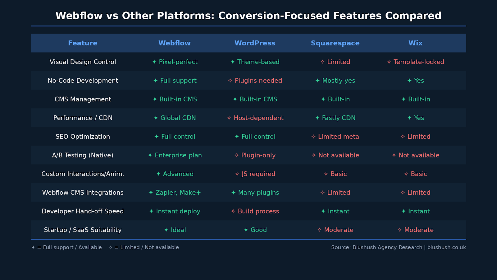
Webflow is a modern website design platform that combines a visual drag-and-drop editor with the power of HTML/CSS and JavaScript under the hood. It has exploded in popularity among designers, marketers, and businesses, and with good reason. When it comes to building high-converting websites, Webflow offers several clear advantages:

Visual Design with Code-Level Control: Webflow gives you pixel-perfect control over your site’s design and layout without requiring you to hand-code everything. This means you can implement conversion best practices (like strategic CTAs, forms, or interactive elements) exactly as you envision. You are not boxed into templates or limited by a theme’s constraints. As one expert puts it, Webflow “gives you the flexibility of code, but in a visual interface,” letting designers build high-converting layouts directly on the canvas. No lengthy developer hand offs required, design changes can happen rapidly, which is critical for testing and optimizing conversions.

  • Faster Iteration = More Optimization: High-converting sites are rarely perfect on first launch, they are improved over time through testing and tweaks. Webflow shines here by enabling rapid iteration. Marketing teams can edit pages, swap out headlines or images, and publish updates in minutes, without waiting on a developer. Need to A/B test a new headline or try a different hero image? With Webflow, you can implement it immediately. This speed and agility mean you can respond to data and continually refine your site for better results. In fact, many startups choose Webflow because they “need speed without sacrificing quality” and want control to iterate without developer bottlenecks.
  • Built-In Performance Optimizations: A slow site can kill conversions, so performance is non-negotiable (more on that later). Webflow has performance baked in, sites are hosted on fast Content Delivery Networks (CDNs) and the platform automatically handles optimizations like minifying code and responsive image generation. As a result, Webflow sites tend to load quickly out-of-the-box. You still need to follow best practices (compress images, limit third-party scripts, etc.), but Webflow provides a strong foundation for a fast, smooth user experience. And remember, a faster site means higher conversion potential, as we will discuss.
  • Responsive Design Made Easy: By 2025, being mobile-friendly is absolutely essential, more than 80% of people browse on mobile devices. Webflow makes responsive design straightforward by allowing you to design for various breakpoints (desktop, tablet, mobile) visually. You can ensure your site looks and works great on every screen size, which is crucial since a site that converts well on desktop must do the same on mobile (otherwise you are “bleeding traffic” on mobile). With Webflow, you can tweak layouts for smaller screens, ensure buttons and forms are thumb-friendly, and maintain a consistent experience across devices with minimal effort.
  • Powerful CMS and Reusability: High-converting websites often have multiple pages, landing pages, product pages, blog posts, etc., each tailored to persuade the visitor. Webflow’s built-in CMS (Content Management System) lets you create collections (for blog posts, case studies, products, etc.) and design templates for them, which you can reuse to spin up new pages quickly. For example, you can design a persuasive case study page once and then publish dozens of case studies with that same optimized layout. This consistency saves time and ensures every page follows best practices. Webflow also supports reusable components (Symbols) for elements like CTAs or forms, so you can update a CTA site-wide in one edit. The result: you can scale a conversion-optimized design across your whole site efficiently.
  • SEO and Analytics Friendly: Getting traffic is the first step to conversions, and Webflow does not hinder your SEO efforts. You have fine-grained control over SEO settings like meta titles, descriptions, URL slugs, alt text, and canonical tags without needing plugins. Plus, Webflow cleanly codes your design, which helps with technical SEO. You can easily integrate analytics tools like Google Analytics 4 or others by adding tracking IDs or custom code. Webflow even has a native integration for Google Analytics and other marketing tools, making it simple to track your conversion goals. In short, Webflow helps you attract the right traffic and measure what those visitors do.
  • New Optimization Features: Webflow has been introducing features geared toward conversion optimization. For instance, Webflow’s Analyze and Optimize tools (for customers on certain plans) allow you to gather insights and run A/B tests or personalize content for different audiences. This means you might even need third-party A/B testing tools for simpler experiments, you can do it right within Webflow. Even if you are not on an enterprise plan, Webflow sites can easily integrate with external A/B testing and personalization tools. The bottom line: Webflow is evolving into a full-fledged conversion optimization platform, which is great news for marketers.

It is clear that Webflow’s flexibility and feature set align perfectly with the needs of CRO (Conversion Rate Optimization). One Webflow case study highlighted a customer who boosted conversions by more than 25% after moving to Webflow, thanks to the agility and performance gains. While tools alone can not guarantee success, using Webflow gives you a strong advantage in creating a site that both looks amazing and converts highly.

Now, let's get into the specific elements and strategies that make a website convert, and how to implement them effectively on a Webflow site.

Key Elements of a High-Converting Webflow Website

High-converting websites tend to have several essential elements in common. We will break down each of these key components and show how you can apply them. Think of these as the building blocks for your Webflow site’s success:

1. Clear Value Proposition & Messaging

When a new visitor lands on your site, you have only a few seconds to convince them to stay. That’s why your value proposition, essentially, what you offer and why it’s useful, must be immediately clear. Clarity is king for conversions. In practice, this means your homepage or landing page should have a headline and supporting text that instantly communicate what you do, who it’s for, and why it matters.

●     Craft a compelling headline: The headline is often the first (and sometimes only) text visitors read. It should be straight to the point and jargon-free. For example, instead of a vague tagline, use a headline that addresses a specific problem or desire of your target audience. One company improved conversions by 30% simply by taking a more personal and benefit-driven approach in their headline copy. Likewise, another saw better results when changing a generic headline (“Online advertising that works!”) to a clear, descriptive one (“Create a webpage for your business”), the winning headline told users exactly what they would get.

●    State your unique value: What makes your product or service different? Why should the visitor care? These points should be highlighted prominently. A common mistake is focusing on features (the what) rather than benefits or outcomes (the why). Remember, users care about solving their problems and improving their lives, not the technical details. Address their pain points early and often. For instance, instead of “Our app uses AI-driven algorithms,” say “Our app saves you 5 hours a week by automating your busywork.” That kind of messaging is more likely to resonate and convert.

In Webflow, you have full control to design your hero section (the top part of your page) for maximum clarity. Use a large, legible font for the headline and ensure there’s enough contrast with the background so it’s easily readable. Keep supporting text concise and scannable, break up long text into bullet points or short paragraphs so that even scanners (which is most people) can grasp your value quickly. Above-the-fold content (what’s visible without scrolling) is crucial; it should contain your main value prop and a CTA. According to Webflow’s own experts, the above-the-fold section can make or break engagement, so make it count.

Tip: It can help to ask yourself, “If I had 10 seconds to explain my business to a new potential customer, what would I say?” Use that answer as inspiration for your headline and tagline.

People Also Ask: What is a unique value proposition, and why is it important?

A unique value proposition (UVP) is a clear statement that describes the benefit of your product/service, how you solve customers’ needs, and what differentiates you from the competition. It’s important because it’s essentially the core message that will persuade visitors to stay and explore. High-converting sites make their UVP obvious. For example, Instacart’s homepage immediately answers a key customer question (“When can I get groceries delivered?”) by showing an estimated delivery time, helping drive an estimated 70% conversion rate for certain users. The lesson: address your user’s main question or pain point right away, that’s a strong UVP in action.

2. Prominent and Persuasive Calls-to-Action (CTAs)

A call-to-action is typically a button or link that tells the user what to do next, “Sign Up Now”, “Get Started Free”, “Request a Quote”, etc. CTAs are literally the conversion points on your site, so optimizing them is crucial. A high-converting website usually has CTAs that are clear, attention-grabbing, and well-placed.

Here’s how to craft CTAs that get clicks:

  • Use Action-Oriented Text: The wording on your CTA should be specific and action-oriented. Avoid generic labels like “Submit” or “Learn More.” Instead, tell the user exactly what will happen or what they will get. For example, “Download My Free Guide” or “Start Your Free Trial” sets expectations and appeals to their interest. Clarity beats cleverness here. A famous example: Mozilla increased downloads of Firefox by changing a CTA from “Try Firefox 3” to “Download Now Free”, making it crystal clear that the product was free and the action was a direct download. The result was a significant uplift in conversions.
  • Make CTAs Stand Out: Design your CTA buttons so they visually stand out on the page. Use a contrasting color that is not heavily used elsewhere in your design, so the button draws the eye. In Webflow, you can easily style buttons with bright background colors, bold text, and a bit of padding to make them larger. Also consider adding subtle hover effects (Webflow Interactions make this easy), for instance, a slight color change or shadow on hover can provide tactile feedback and entice clicks.
  • Place CTAs Strategically: Location matters. Ideally, a primary CTA should appear prominently near the top of your page (often in that hero section) and again at logical points as the user scrolls. It’s common practice to include a CTA near the bottom of a long page as well, catching visitors who read to the end. However, be careful not to clutter the page with too many different CTAs which can confuse users. Focus on one primary action you want them to take per page. If you have secondary actions (like “Learn More” vs “Get a Quote”), design the page to emphasize the primary one more. On landing pages especially, it’s often best to have one single CTA goal to avoid distractions.
  • Provide Context: A CTA is more effective when the user knows exactly what will happen next. If your button says “Book a Demo”, make sure the surrounding text or heading makes it clear that clicking will schedule a product demonstration (e.g., “Schedule a 15-minute demo with our team”). Flowout, a Webflow agency, points out that a random “Buy Now!” button without context can come off as shady. So set expectations, if it’s a form, say “Get Started – No Credit Card Required” or if it’s a call booking, “Book a Free Call.” This builds trust that the user won’t be ambushed by something unexpected.
  • Consider Personalization: If you can, tailor CTAs to different audiences. HubSpot found that personalized CTAs converted 202% better than default ones. In practice, this could mean showing different CTA text or offers based on whether someone is a new visitor vs. returning, or which page they came from. With Webflow’s CMS and logic, you can swap out content based on certain criteria, or use scripts to personalize. Even something simple like “Welcome back! Continue your trial” as a returning user’s CTA can boost conversion probability.

On our own projects, we often A/B test CTA variations, different text, colors, or placements, to see what resonates best. Webflow makes it easy to implement these tests (via custom code, an A/B testing integration, or Webflow’s Optimize feature on Enterprise plans). Remember, CTAs are high-impact elements; small tweaks here can yield big gains in conversion rate.

3. Simplified Navigation & User Journey

A high-converting website guides visitors smoothly to the information they need and the actions you want them to take. If users get lost in a confusing menu or can not find the page they’re looking for, they will drop off before converting. Simplifying your site’s navigation and structure is therefore an important but sometimes overlooked, aspect of CRO.

  • Keep the navigation menu concise: As a rule of thumb, your main menu (the top navigation) should contain only your most important pages. Too many links can overwhelm users with choices (analysis paralysis is real!). Many successful sites limit their primary nav to 3-5 items. For example, a B2B site might just have “Product,” “Pricing,” “About,” and “Contact.” If you have multiple product offerings or sections, use drop-down menus or mega-menus sparingly and organize links under clear categories. The key is to make people not think too hard about where to go, it should be obvious. In fact, one Webflow agency notes that page structure should be similar across the site and important info should be no more than 1-2 clicks away. Consistency helps users learn the navigation quickly.
  • Guide users with logical page hierarchy: Consider the path you want a visitor to follow. Often, a common journey might be: Landing on homepage -> Check out a features or services page -> Read a case study or about page for trust -> Go to pricing -> Click sign up. Design your site architecture to facilitate that flow. Internal linking is part of this, for instance, within a blog post that gets traffic, include a CTA or link guiding the reader to a relevant landing page or signup page. Each page should have a purpose and ideally a next step for the user. Do not leave them at a dead end.
  • Use clear labels and format: In navigation labels and page headings, clarity beats cleverness (notice a theme?). Use standard terms that people expect. For example, label the contact page “Contact” or “Contact Us” (not “Let’s Chat” which could be misinterpreted as a live chat). If you have an FAQ or Help Center, call it that, rather than something branded like “Guru Guides” which may confuse. This is especially important on e-commerce or SaaS sites, users scan for words like “Pricing,” “Features,” “Blog,” etc. Make it easy for them.
  • Minimize distractions on critical pages: For landing pages focused on conversion (like a dedicated campaign landing page), you might even remove the main navigation entirely or significantly slim it down. Landing pages often work best with a very singular focus, less places to click away means more focus on the CTA. Webflow allows you to create pages without your global nav if needed (you can un symbol the nav on a particular page and delete extraneous links). For example, a webinar sign-up page might have just a logo and a “Home” link, but nothing else to lead the user astray from signing up.
  • Ensure easy access to contact info: If your conversion goal involves the user contacting you (common for service businesses), make that frictionless. For instance, a “Contact Us” or “Get a Quote” button should be in the top nav or even as a persistent element. Some sites put a phone number in the header for quick access. Also, consider a sticky header that follows the user as they scroll, so the nav (with your CTA button) is always one click away. Webflow makes it easy to implement a sticky nav if needed with a bit of CSS positioning.

A well-structured site that anticipates the user’s needs will keep them engaged. As an example, one agency blog noted that placing “Contact” or “Book Now” buttons in prominent positions (like top-right of the nav or as a floating element) can guide users toward conversion points more effectively. It’s not just about aesthetics, it’s about creating an intuitive journey that naturally leads to your conversion goals. And if you are ever unsure about your navigation, tools like heatmaps or session recordings (easily added to Webflow) can show you where users are clicking or getting stuck, so you can adjust accordingly.

4. Trust Signals & Social Proof

Visitors are naturally cautious, before they take an action (especially one like making a purchase or filling a form), they want to feel they can trust your site and your business. High-converting websites recognize this and prominently feature trust signals and social proof to reassure users. In fact, building trust can significantly improve conversions by reducing the perceived risk of taking the next step.

Here are some effective ways to build trust on your Webflow site:

  • Testimonials and Reviews: Showcase quotes from happy customers or clients. A brief testimonial, especially if paired with the person’s name, photo, and company, goes a long way toward validating your offering. Reading about someone else’s positive experience can push a visitor closer to converting. Try to place a compelling testimonial near your CTA sections. For example, right below a signup form, you might have a quote like “This tool saved us 10+ hours a week and doubled our leads, Best decision ever!” Jane D., Marketing Director. Social proof like that can counter a user’s hesitation at the moment of decision. Our agency often integrates reviews from platforms like Clutch or Trustpilot directly into Webflow sites; in fact, one CRO tip is that even a single strong review can meaningfully boost conversions.
  • Client Logos or Numbers: If your business has notable clients or has reached impressive milestones, highlight them. Seeing logos of well-known companies you have worked with signals to visitors that others have trusted you (and they should too). Webflow’s own homepage famously shows logos of companies like Dell, Zendesk, etc., which immediately boosts credibility. Even if your clients are not household names, a grid of company logos or a tagline like “Trusted by over 5,000 customers worldwide” can build confidence. Just ensure you have permission to use client logos and stick to a modest size/color so it looks professional.
  • Case Studies or Success Stories: For more complex offerings, consider having case study pages that tell the story of how you helped a customer achieve results. Then, on conversion pages, you can link to or preview those case studies (e.g., “See how we helped X Company increase sales 150%”). Storytelling can be powerful in convincing prospects. A short version of this is an “outcome stat” highlight. For example, if you have data, “Over 1 million users served” or “Avg. client conversion rate up 35% after 3 months with our solution” can pique interest. Just make sure any stats are truthful (no fake data!) and ideally cite a source or be ready to back it up if asked.
  • Trust Badges and Guarantees: Depending on your industry, certain badges can reassure visitors. Common ones include security badges (for checkout pages, showing SSL secure, etc.), money-back guarantee seals, or certifications (like “Certified Webflow Expert” or any industry accreditation). For e-commerce, things like payment provider logos (Visa, Mastercard, PayPal) near the cart indicate a sense of security. If you have a generous return policy or guarantee, state it clearly: e.g., “30-Day Money Back Guarantee – No questions asked” near the CTA for a free trial or purchase can reduce purchase anxiety.
  • Transparent Contact and Support Options: Trust is also built by showing that there are real people behind the site. Provide a clear way to get in touch, whether it’s a contact form, email, phone, or live chat. Many high-converting sites have a chat widget or at least a clearly accessible help center. When people know they can reach you if needed, they feel safer doing business with you. In Webflow, embedding a live chat tool (like Intercom, Drift, etc.) is typically just a copy paste of a script into the site’s custom code section, easy win for user assurance.
  • Social Proof in CTAs: Another clever use of social proof is within or near CTAs. For example, a button might say “Join 5,000+ marketers – Start Your Free Account” which subtly indicates lots of people have signed up. Or an email signup might note “(50,000 subscribers and counting!)”. This leverages the bandwagon effect, if thousands of others found it worthwhile, new visitors are more inclined to try it too.

Remember, trust signals should be genuine. Never fabricate testimonials or slap a fake badge. Users are quite savvy and can smell inauthenticity, which will hurt conversions more than help. Instead, focus on highlighting real positive indicators about your business. In our experience, adding a dedicated “Testimonials” section on a homepage or landing page is one of the quickest ways to uplift conversion rates for a new site. As Webflow’s blog succinctly puts it, social proof “builds trust and validates your offer” by helping visitors visualize themselves benefiting from your product/service.

One more note: trust-building is especially important if you are relatively unknown or selling something that requires a lot of commitment. The lesser known your brand is to a visitor, the more you need to earn their trust through these signals.

5. Page Speed and Performance Optimization

No matter how great your content and design are, if your website is slow, you will lose a chunk of users before they even see it. In an age of short attention spans, page load speed is directly tied to conversion rate. In fact, studies show about 40% of people will abandon a site that takes more than 3 seconds to load. Additionally, Google uses site speed as a ranking factor, which means a slow site could also get less traffic to begin with.

High-converting websites prioritize performance. Here’s how you can ensure your Webflow site is lightning-fast:

  • Optimize and Compress Images: Large image files are often the #1 culprit for slow pages. In Webflow, when you upload images, the system creates responsive variants, which helps, but you should still upload reasonably sized images. Use tools like TinyPNG or Squoosh to compress images without visible quality loss. For example, that 4MB hero background image can probably be compressed to 500KB or less as a JPG or WebP. Also, use the appropriate format (photographs as JPEG/WebP, graphics as PNG/SVG). This can drastically cut load times.
  • Minify and Combine Code: The good news, Webflow automatically minifies your HTML, CSS, and JavaScript on publish, removing unnecessary characters and spaces. It also hosts your CSS/JS externally and caches them. If you add custom code or third-party libraries, be mindful of their size and try to only include what you need. For advanced users, if you have a lot of custom scripts, you could manually minify them or use Webpack, but for most, Webflow handles minification.
  • Limit Third-Party Scripts: Marketing and analytics tools are great, but each one often adds a JavaScript file that can slow down loading. Be judicious, if you have multiple chat widgets, analytics trackers, A/B testers, etc., each adds weight. Try to consolidate or remove ones that are not providing value. Webflow’s Integrations section in Project Settings lets you add these scripts; review this periodically and remove old ones. Also, load scripts in the footer when possible so they do not block the initial render. (Webflow’s custom code in Footer is a good spot for things that are not needed immediately.)
  • Enable Browser Caching and CDN: Webflow sites are automatically served via a CDN, which means content is delivered from servers closest to the visitor (faster). Browser caching is also mostly handled by Webflow for static assets. If you are self-hosting outside Webflow, you would ensure caching headers are set, but on Webflow’s hosting this is taken care of. Essentially, Webflow’s infrastructure is built for speed and redundancy, which is a big advantage over many DIY hosting setups.
  • Optimize Webflow Animations: Webflow allows cool interactions and animations. But be mindful, heavy use of animations or using large Lottie files can impact performance. Use animations sparingly and test on mobile devices. Sometimes, complex interactions can cause jank or slow down older devices. Webflow’s Designer has an Audit panel (under “Publish” menu > “Audit” before publishing) that flags issues like oversized images or too many fonts. Use that! And consider disabling certain animations on mobile if they are not crucial, to lighten the load.
  • Monitor and Test Speed: After building your site, use tools like Google PageSpeed Insights or GTmetrix to see how it performs. These will give specific suggestions (e.g., “eliminate render blocking resources” or “defer offscreen images”). Many of those suggestions will already be handled by Webflow, but you might catch something like an uncompressed image or an inefficient script. Webflow’s built-in Analyze dashboard (if available on your plan) can also give performance stats. Keep an eye on real-world data too, if you have Google Analytics, check the Site Speed reports or use Chrome User Experience Report data.

Optimizing for speed might sound technical, but Webflow does a lot of heavy lifting. The main things for you are optimizing media and being mindful of additions. The effort is worth it: a faster site directly correlates with better user experience and higher conversions. Amazon famously calculated that every 100ms of added load time cost them 1% in sales, while you may not be Amazon, the principle holds. As one Webflow agency cheekily put it, “nobody likes slow sites”, and slow speed is one of the biggest reasons for high bounce rates. So squashing those load times is a must for your conversion strategy.

6. Mobile-Friendly, Responsive Design

With the majority of web traffic now on mobile, a high-converting site must deliver a great experience on smartphones and tablets. If your site works beautifully on desktop but falls apart on mobile (tiny text, buttons off-screen, slow to load, etc.), you will lose a huge number of potential conversions. In fact, Google has shifted to mobile-first indexing, meaning the mobile version of your site is considered the primary one. So mobile UX is not optional; it’s foundational.

How to ensure your Webflow site is mobile-optimized for conversions:

  • Adopt a Mobile-First Mindset: While designing in Webflow’s desktop view is common, periodically switch to the mobile preview (Webflow’s design panel lets you preview at tablet, landscape phone, and portrait phone sizes). Make design decisions starting from how it will appear on a small screen. This often means using simpler layouts. For example, multi-column layouts might stack on mobile. Ensure that content and CTAs are not buried way down on mobile, users should not have to scroll endlessly to find the main action.
  • Readable Text and Big Tap Targets: On a phone, text should be large enough to read without pinching to zoom (Webflow’s default typography will scale down on mobile, but double-check if you used any custom fixed font sizes). Aim for at least 16px font on mobile for body text. Buttons and links need to be large enough for a thumb tap. Apple’s guideline is at least 44px tall buttons, not a bad rule. Also, leave enough spacing between tappable elements so users do not accidentally hit the wrong link.
  • Mobile Navigation: A common approach is to use a hamburger menu on mobile that expands to show nav links. Webflow provides a built-in mobile menu for the default navbar component, which you can customize. Keep the mobile menu simple and make sure it’s easy to open/close. Another tip: implement a sticky bottom bar on mobile with a CTA if appropriate. For instance, some sites have a fixed “Call Now” or “Get Quote” bar on the bottom of the phone screen, this can significantly increase mobile conversion by keeping the action in view. Just be sure it’s not too intrusive.
  • Optimize Media for Mobile: Mobile networks can be slower, so performance is extra critical on phones. Use Webflow’s responsive images feature to your advantage, it automatically serves smaller images on smaller devices. Also, avoid autoplay background videos or heavy animations on mobile. You can use Webflow’s interaction triggers to turn off certain animations on mobile breakpoints (or just hide an element on mobile if it’s too much). Our rule: if an embellishment is not adding significant value on a small screen, consider removing it for mobile users to streamline things.
  • Test on Real Devices: Webflow’s preview is great, but nothing beats testing on an actual phone or two. Check your site on iPhone and Android, different browsers if possible. Sometimes little quirks pop up (like an element that looked fine in preview is overflowing on an actual device). Ensure forms are usable via touch (e.g., can you easily select dropdowns, checkboxes are large enough, etc.). If your site uses interactions that involve hover effects, remember there’s no hover on touch devices, be sure nothing critical is only visible on hover (if so, adapt it for tap or show it by default on mobile).

Mobile conversion can even be higher than desktop if done right, because mobile users might be more on-the-go and action-oriented (e.g., searching for a solution urgently). But it can also be lower if the experience is bad. One blog noted that by 2025, being mobile-first is no longer optional, and if your CTA is “perfect on desktop but invisible on mobile, you are bleeding traffic”. We have found that to be true. Sometimes simply fixing a mobile layout issue or making a mobile CTA more prominent caused immediate bumps in our clients’ conversion metrics.

In short: treat mobile as equal to desktop in design priority (if not higher). Webflow gives you the tools to make a responsive site without separate mobile URLs or anything, use that power thoroughly.

7. Consistent Branding and Visual Hierarchy

Conversion is not only about mechanics and numbers, it’s also about the feeling a user gets from your site. A polished, consistent design establishes credibility subconsciously, whereas a disjointed or sloppy design can sow doubt. That’s why maintaining a strong visual hierarchy and consistent branding throughout your Webflow site contributes to conversion success.

Visual hierarchy refers to arranging and styling elements so that the most important content stands out. People scan web pages in an F- or Z-pattern; they do not read every word. Use this to your advantage by making key info (headings, value propositions, CTAs) larger or more prominent, and secondary info smaller or subdued. For example, your page title might be a 48px bold font, section headings 30px, body text 16-18px. Use color and weight to draw attention: maybe your brand color highlights links and buttons, whereas neutral colors are for generic text. A well-defined hierarchy ensures that if a user only glances around, they still grasp the main points.

In Webflow, define your heading styles (H1, H2, H3…) and paragraph styles consistently site-wide. Do not have 10 different font styles on different pages, pick a set and stick to it. Consistency here makes your site feel professional and trustworthy. As the Webflow blog notes, consistent use of logos, colors, and fonts helps users recognize your brand quickly and builds trust faster than even copywriting can.

Brand consistency means your site’s tone and look align with your overall brand identity. That includes logo usage, brand colors, typography, imagery style, and even the tone of voice in copy. If your homepage is playful and colorful but your landing page is suddenly stark and formal, it can jar users. Ensure your Webflow style guide is in place: use the same color swatches for buttons, the same logo variant (do not randomly change the logo color or spacing), and maintain a coherent voice in writing. This consistency matters because it reassures visitors that they are still interacting with the same company and that you are professional. Our brains pick up on subtle cues; if one page looks wildly different, users may think they have navigated to a different site or that the site might not be secure.

One subtle trust factor is design quality. You do not need award-winning art, but things should be neat and aligned. Use adequate whitespace; do not cram things together. A clean, modern design often yields better conversions because it’s easier on the eyes and appears credible. Think of the difference: would you more likely trust a cluttered, ad-ridden page, or a sleek site from a known brand? Always aim for the latter vibe, even if you are a small business, Webflow’s design flexibility allows even small teams to create enterprise-quality designs that punch above their weight.

Here are a few practical tips for visual design that boosts conversions:

●   Use color wisely: Leverage one or two accent colors (often your brand colors) for conversion critical elements like CTAs or important info. Use more neutral or muted colors for backgrounds and secondary content. High contrast between CTA buttons and the background is proven to improve visibility and click rates.

●    Imagery and visuals: Images can either enhance a message or distract. Use images that support your content, for instance, product images, pictures of people using your service, or simple illustrations that highlight a point. Avoid irrelevant stock photos that do not add meaning; users will ignore them, or worse, they could diminish trust if overly cheesy. Authenticity is better; custom illustrations or real photos of your team or clients often work well. Also, images can guide the eye. An image of a person looking or pointing toward your CTA can subtly direct users to that area. It’s an old conversion trick: people naturally follow the gaze of people in photos. So if you have a hero image with a person, have them facing toward your headline or form if possible.

●   Don't overdo design flourishes: It might be tempting to use lots of fancy fonts or rainbow colors to grab attention, but restraint is usually better. Stick to 1-2 fonts (one for headings, one for body text, for example). Too many colors or fonts looks amateurish and hurts credibility. As one conversion consultant quipped: if your UI looks like it’s “stitched together from templates” with inconsistent styles, users notice and trust drops. So aim for a cohesive look.

In summary, a professional, consistent design is not just about looking pretty, it directly influences a user’s trust and willingness to convert. When design and messaging work together harmoniously, your site’s persuasiveness multiplies.

8. Use of Engaging Visuals (Images & Video)

While strong copy is essential for conveying your message, visual content plays a huge role in holding attention and improving conversion. Engaging images, graphics, and videos can make your page more appealing and can also communicate complex ideas faster than text. The key is to use visuals strategically, they should reinforce your message and not just serve as decoration.

●    Images: Incorporate high-quality images that showcase your product, service, or the outcome your customer can achieve. For example, if you sell a physical product, include crisp photos of the product in use. If you offer a service, consider images of your team (to humanize your brand) or graphical representations of results (charts, before-after, etc.). Avoid generic stock photos (like the smiling call center lady or two businessmen shaking hands), those tend to be ignored and can even trigger skepticism. Authenticity is better; custom illustrations or real photos of your team or clients often work well.

●     Video: An explainer video or demo video can significantly boost conversion on landing pages. Videos combine audio and visual to deliver a lot of info in a short time and can increase user understanding of your offering. There’s a stat that adding an explainer video on a landing page can increase conversion by up to 86%. We have seen videos work wonders especially for SaaS products or any offering that might need a bit of explanation or is easier to show than tell. If you use video, keep it concise, ideally 2 minutes or less for an intro/explainer. Place it prominently (above or near the fold). Make sure it’s obvious what the video is about (use a clear thumbnail or text overlay like “Watch: How Our Service Works (90 seconds)”). In Webflow, embedding videos (e.g., via YouTube, Vimeo, or a direct file) is straightforward. Just watch the file sizes, using a YouTube embed offloads the loading until clicked, which is good. Avoid auto-play with sound, which can annoy users; if you auto-play a video background, keep it muted and short.

●   Infographics or Icons: Sometimes a quick icon can illustrate a point and break up text. Webflow’s CMS and rich text make it easy to insert icons or mini-graphics in line with text. For example, if listing features, a small icon next to each feature can draw attention and aid memory (a shield icon for “Secure”, a lightning bolt for “Fast”, etc.). Just ensure any icons match your style (you can use Webflow’s inline SVG or upload images).

●    Visual hierarchy in content: Use imagery to segment sections. A common pattern is alternating text and image sections as you scroll down a homepage, this keeps the page visually interesting and prevents it from becoming a wall of text. Each section’s image should relate to that section’s content. For instance, a section about analytics features might show a screenshot of a dashboard. A section about customer support might show a happy customer or support agent.

Finally, always include alt text for images, not just for accessibility (important on its own) but also because if an image fails to load, the user still gets context. Plus, alt text can help your SEO slightly.

To illustrate the impact: imagine a landing page with only text versus one with a few relevant images and a short video of the product in action. The latter is far more engaging. Users spend more time on it, absorb more information, and feel more connected. That time and engagement can translate to higher conversions, as the content has held their interest and addressed their questions or objections in multiple formats.

In summary, use visuals to complement your copy. They should add value (explain or persuade) and not just be filler. When done right, visuals can significantly improve how effective and user-friendly your site is, leading to better conversion outcomes.

9. Streamlined Forms and Lead Capture

Often, the final step of a conversion is a form, whether it’s a checkout form, a signup form, or a contact form. Forms are where a casual visitor becomes a lead or customer by giving you their information. It’s also a point where many drop off if the form is too long or complicated. So optimizing your forms is critical for a high-converting website.

  • Keep forms as short as possible: Every extra field in a form is an extra hurdle for the user. Ask yourself what information do you truly need at this stage. For example, if it’s a newsletter signup, do you need more than an email? Likely not. If it’s a free trial signup, maybe just name and email (and password if no social login). Long forms can feel daunting, one expert noted that forms should stick to only essentials, as overly long forms will cause users to give up. A classic case is Dropbox: their signup is just name, email, and password, nothing more. They do not even ask for username or confirm password to minimize friction. Similarly, e-commerce sites often allow guest checkout with minimal info, because forcing account creation can deter purchases. If you have a longer form (say for a quote request), consider whether you can break it into steps. Multi-step forms sometimes convert better than a single massive form because users commit progressively. Webflow’s form capabilities can be extended with a bit of custom code or using page load logic to simulate multi-step flows (or simply link to Typeform/others for complex flows). But often, simply trimming fields is the easiest win.
  • Clearly label and structure forms: Use clear labels or placeholder text so users know what to input. For accessibility, place labels outside the fields (or use the placeholder attribute wisely). If certain fields are required, mark them clearly. Additionally, provide help text or examples for anything not obvious (e.g., format for a phone number). A well-designed form gives confidence, if people are not sure what to do, they will bail.
  • Reduce perceived effort: You can sometimes increase conversion by making forms feel easier. For instance, if it’s a signup, allow social logins (Google/Facebook sign-in) to skip filling fields. If it’s a checkout, show a progress bar if multi-step (“Step 2 of 3”) so they know it’s not endless. Also, timing matters: you might not want to show a pop-up form 1 second after someone lands, that’s too aggressive. But an exit-intent pop-up or a form after they have scrolled a bit can capture those who are interested. Webflow allows embedding custom pop-up scripts or using interactions to show hidden divs as pop-ups.
  • Provide a fallback or alternative: Not everyone is ready to fill a form. If your primary CTA is a form (like “Book a call” which then presents a form), consider offering an alternate conversion for those not ready. For example, Flowout (the agency) realized some visitors were not ready to book a call, so they added an option to “watch a demo” video by just entering name and email. This lower commitment action still captures a lead (email) and nurtures them. So you might have a secondary CTA like “Download a free guide” or “Watch webinar” for users who are not ready for the full deal. Make sure these offers still move them along the funnel.
  • Trust and reassurance around forms: People are protective of their info. Adding a short privacy note like “We won’t spam you, unsubscribe anytime” below a newsletter field can alleviate concern. If you are asking for a phone number, maybe mention “We will only call if absolutely necessary, no sales spam.” And always ensure your site is secure (SSL) so that the browser shows the little lock icon, users are trained to look for that especially when providing personal data. All Webflow sites on the Webflow domain or with SSL enabled custom domains will show secure by default.
  • Test your forms: Frequently, forms can break or fail to submit due to technical issues (maybe an integration API changed, etc.). A broken form is zero conversions! Always test after making changes, and use Webflow’s form notification or integration features to ensure you receive the data. If you integrate with something like MailChimp or Zapier, double-check that pipeline. Also, consider setting up conversion tracking (like a Google Analytics event or Pixel event on form submission) to measure form conversion rates.

One more consideration, email capture vs immediate conversion. If your business is not an instant sale model, capturing an email (or other contact) might be the main conversion. Even for e-com, getting them on an email list has value if they did not purchase now. So having a well-placed newsletter or offer signup (with that short form) can be a secondary conversion on pages. Just do not overdo it with pop-ups and banners everywhere, as those can annoy and hurt conversion of the primary goal.

In summary, make forms easy, fast, and reassuring. This way, when a user is convinced to convert, nothing in the form design will hold them back from completing the action.

10. Ongoing Testing and Analytics-Driven Improvements

After implementing all the above, the work is not done. One hallmark of truly high-converting websites is that they are continually tested and optimized over time. Conversion rate optimization (CRO) is an ongoing process of hypothesis, test, and iterate. This is where you leverage analytics and user feedback to find what works best.

  • Track key metrics: At a minimum, ensure you have Google Analytics (or a similar analytics platform) set up on your Webflow site. Identify the key actions that define conversion for you, these could be purchases, form submissions, button clicks, etc. In GA4, you can mark these as conversion events. For a content site, it might even be something like time on site or pages per session. Regularly review these metrics. For example, see the bounce rate on your landing pages, the drop-off points in a funnel (like how many go from product page to cart to checkout), and the overall conversion rate. As the saying goes, “if you can measure it, you can improve it.”
  • Use heatmaps and session recordings: Sometimes raw numbers do not tell the whole story. Heatmap tools like Hotjar or Microsoft Clarity (which is free) can be easily added to Webflow (just paste their script) and will show you where people click, scroll, or get stuck. A heatmap might reveal that users often click an element that is not actually a link, indicating perhaps they think it’s something it’s not. Or you might see most people never scroll past a certain point on a page, suggesting that content lower down is not being seen (maybe move important stuff higher). User session recordings let you replay individual visits to watch how a user navigates, very insightful for spotting UX issues. As one guide put it, heatmaps highlight the “hotspots” of attention, and recordings can uncover friction in the journey. These qualitative insights complement your quantitative analytics.
  • A/B testing: Do not rely on assumptions, test them. With A/B testing, you create two (or more) versions of a page or element and split traffic between them to see which performs better. For example, test two different headlines, or two different CTA colors, or a long page vs. short page. On Webflow, there are a few ways to do this. If you are on Webflow Enterprise, the Optimize feature (formerly Intellimize) can run tests natively. If not, you can use external tools: Google Optimize was one popular free tool (it sunset in 2023, but you might use its successor or alternatives like Optimizely, VWO, etc.). Alternatively, you can do simpler manual tests, like run version A for a week, then version B for a week, and compare conversion metrics (not as rigorous, but easier for a small scale). The goal is to validate changes with data. HubSpot’s study on CTAs we mentioned is a great example, they tested personalized vs generic CTAs and found a 202% difference, something you would only know by testing. When running A/B tests, change one major element at a time and give it sufficient sample size to be confident in results.
  • Learn from user feedback: Sometimes just talking to users or gathering feedback can highlight issues. Add a simple feedback form or use a tool like Qualaroo for on-site surveys. Ask questions like “What almost stopped you from signing up today?” or “What information were you unable to find?” The responses can be gold, maybe people are not clear on pricing, so they do not convert, indicating you should clarify that on the page. Websites like Neil Patel’s emphasize asking customers questions to understand pain points and confusions, which then inform site design improvements.
  • Iterate and refine: When data shows something is not optimal, be willing to tweak your Webflow design. The beauty of Webflow is you can adjust content and design quickly without a full redesign. Maybe analytics show very few people go from your homepage to your pricing page, perhaps the pricing link is not prominent, or your homepage does not make it compelling to click. You could try adding a section on homepage that highlights pricing benefits with a CTA, for example. Then see if that page’s visits and conversions improve. Continuous improvement is the mindset, even if your site is doing well, there are usually gains to be had. It’s no coincidence that the best conversion-focused companies run experiments relentlessly. As Neil Patel succinctly put it: Test, test, test, across high-converting websites he studied, constant testing and pivoting was a common thread.
  • Conversion audits: Every so often, do a systematic review of your site with fresh eyes (or have someone else do it). Look for outdated content, unclear messaging, or new assumptions you might have missed. See if all your forms and buttons still work. Technology or user expectations change over time, and a periodic audit ensures you catch issues that might be silently hurting conversions.

Finally, keep in mind that CRO is an iterative journey, not a one-time project. Celebrate the wins, like a 5% bump here, 10% bump there, as they can add up significantly. And when something does not work (e.g., a test variation that underperforms), it’s not a failure, it’s a learning. You now know more about your users. Maintaining this data-driven, curious approach is what will ultimately maximize your site’s conversion potential over the long term.

At our Webflow agency, we treat websites as living projects. Post-launch, we closely watch how the site performs, using many of the tools mentioned. We often conduct A/B tests on headlines or layouts and are sometimes surprised by what works best, which is why testing beats guessing! By being proactive and iterative, we ensure our clients’ Webflow sites keep improving their conversion rates month after month.

People Also Ask: Frequently Asked Questions

To wrap up, let’s address some common questions related to building high-converting websites and using Webflow:

Q1: What is a good conversion rate for a website?

A: Conversion rates vary by industry and the action desired, but generally a 2%–5% conversion rate is considered average for websites. That means out of 100 visitors, 2-5 convert (buy, sign up, etc.). Anything above 5% is doing well, and hitting 10%+ puts you in excellent territory. Keep in mind the type of conversion matters: a free signup will naturally convert higher than a high-dollar purchase. The key is to benchmark your current rate and aim to continuously improve it. Even a small increase can be significant, for example, going from 3% to 4% is a 33% increase in conversions!

Q2: How do I track conversions on my Webflow site?

A: Webflow provides the tools to track conversions through integration with analytics platforms. The most common approach is to use Google Analytics 4 (GA4), you can add your GA tracking ID in Webflow’s settings so it loads on every page. In GA4, define conversion events (like a form submission thank-you page view, or a button click) to measure your conversion rate. Alternatively, you can use Webflow’s built-in Analyze panel or third-party tools like Amplitude or Mixpanel for deeper funnel analysis. 

For form submissions, Webflow captures those in the Forms section (and can email you), but to count them as “conversions” you would typically redirect to a thank-you page after form submit and count page views of that, or use an HTML embed to fire a tracking script on submit. If you are on Webflow Enterprise, you can leverage the Optimize features which tie into testing and results as well. In short, integrate an analytics tool and set up goals/events, from there you will get data on how your Webflow site is converting.

Q3: Is Webflow good for SEO and organic traffic?

A: Yes, Webflow is quite SEO-friendly. You have full control over on-page SEO elements (titles, meta descriptions, headings, alt text). Webflow automatically produces clean, semantic code which search engines appreciate, and it offers fast load times via CDN which indirectly helps SEO. Many Webflow sites rank very well in Google. That said, SEO also depends on your content quality and external factors (backlinks, etc.), rather than the platform. 

But using Webflow will not hold you back, in fact, it can help by eliminating the need for plugins (which can sometimes slow down WordPress, for example). We have also found Webflow’s integration with tools like Google Search Console and automatic sitemap generation to be convenient. So, if part of “high-converting” for you means getting more (quality) traffic in the door, Webflow is a solid foundation, allowing you to implement SEO best practices and drive organic visitors who are likely to convert.

Q4: When should I consider hiring a Webflow design & development agency to help?

A: If you are not achieving the conversion results you want, or if designing and optimizing a website feels overwhelming, working with a specialized Webflow agency can be extremely helpful. An experienced agency (like ours) has worked on many Webflow projects and knows the CRO best practices by heart, from design principles to advanced A/B testing. They can audit your current site, identify conversion blockers, and redesign or tweak elements to improve performance. 

Agencies also bring development expertise for custom features (like complex integrations or animations) that can enhance UX beyond what the visual builder alone offers. In short, if you are serious about creating a high-converting site but lack the time or in-house skills to execute all these strategies (design, copywriting, analytics, testing, etc.), it’s worth getting professionals involved. They can likely accelerate your results and bring an outside perspective influenced by data and experience. Many agencies offer conversion optimization as a service, not just building the site and walking away, but ongoing improvements. So, consider an agency if you want to ensure your Webflow site is hitting its conversion potential and you value having experts guide the process.

Q5: How long does it take to see conversion improvements after making changes?

A: It can vary. Some changes have an immediate impact, for example, fixing a broken form or making a CTA button more prominent can boost conversions literally overnight. Other adjustments might be more subtle and need time (and enough traffic) to measure. Generally, after implementing a significant change or running an A/B test, you would want to gather a few weeks’ worth of data to account for daily fluctuations. 

If you have high traffic, you might see patterns emerge in days. With lower traffic, give it a bit more time or rely on directional feedback like user comments. That said, a continuous improvement mindset means you should be making iterative changes regularly, so conversion rate is something you monitor ongoing. Often, you will see a series of small gains that, over months, add up to a big improvement. Patience is key, as long as the trend is upward and you are learning from each change, you are on the right track.

Conclusion: Turning Visitors into Customers with Webflow

Building a high-converting website is a journey, not a one-time task. It involves understanding your audience, applying best practices in design and content, and continually refining your approach. With Webflow as your platform, you have a powerful ally in this journey, a tool that empowers you to implement changes quickly, experiment freely, and create a polished user experience without technical roadblocks.

Let’s recap the core strategies we covered for a conversion-optimized site:

  • Clear messaging that immediately tells visitors the value you offer and speaks to their needs.
  • Strong, visible CTAs with compelling copy, guiding users toward the action you want them to take.
  • User-friendly navigation and structure, so people find what they need in as few clicks as possible, following a logical path to conversion.
  • Trust elements like testimonials, reviews, and guarantees that reduce anxiety and build credibility at crucial moments.
  • Fast loading pages and mobile-responsive design, ensuring no one bounces because your site is slow or unusable on their device.
  • Consistent, professional design that establishes brand trust and uses visual hierarchy to emphasize key points.
  • Engaging visuals and media to capture attention and explain concepts, making your content more digestible (and memorable).
  • Optimized forms that make converting as easy as possible, only asking for what’s necessary and minimizing friction.
  • Data-driven optimization, using analytics, heatmaps, and A/B tests to keep improving your site’s performance over time.

Each of these pieces, when executed well, can give a noticeable lift to your conversion rates. Together, they create synergy, a fast, clear, trustworthy site can feel effortless for users to engage with, and that’s when you will see conversion numbers really climb.

At the end of the day, remember that your website is there to serve your visitors. When you make the experience great for them, they will reward you by taking action. Always be asking: Is this helpful to my user? Is there any hesitation or confusion I can eliminate? If you maintain that user-centric mindset, you will naturally drive more conversions.

Finally, do not be afraid to ask for help or bring in experts (we subtly mentioned how our agency approaches this!). High conversion rates often come from a combination of great marketing insight, UX design, and technical know-how. Webflow simplifies the technical side, letting you and/or your team focus on understanding users and crafting the right experience for them.

Use this guide as a reference, but also as a starting point. The “ultimate” high-converting website for your business will be one that’s tailored to your audience and offering. Use the tips and strategies here, test things out, and build your own ultimate Webflow website that not only wows visitors with design but also reliably turns them into customers. Ready to build a website that doesn't just look good but also drives results? Create your high-converting Webflow website today and start turning visitors into customers.

Suggested articles

See all
Rescue Your Businesses
Look at these cool guys once again! If you want to work with them and get unforgettable website - hit the button and get on the quick call!
Let's book a call