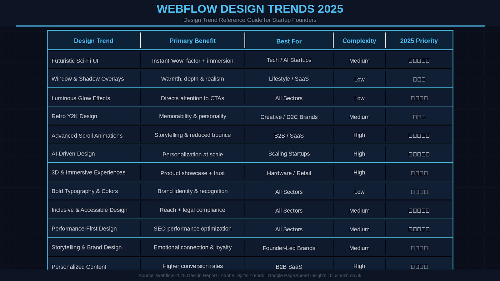
One of the most striking trends in Webflow design is the rise of futuristic, sci-fi inspired user interfaces. Websites are beginning to look like something out of a high-tech video game or a science fiction movie. This style is characterized by bold neon colors, glowing holographic elements, layered tech-inspired graphics, and 3D-like depth that give an illusion of peering into a futuristic device. Think of interfaces with translucent panels, neon grids, and cinematic micro-interactions that respond as you navigate the site almost feels like an immersive digital world.
Such sci-fi gaming aesthetics create an immediate “wow” factor. For example, a blockchain or AI startup’s homepage might feature glowing circuit patterns and animated holograms around the content, instantly signaling a cutting-edge vibe. These design touches are for eye-candy; they provide interactive feedback (e.g. panels lighting up on hover) and guide users through a high-tech narrative. The appeal is especially strong for tech startups or any brand wanting to appear innovative and future-forward. Visitors are drawn in by the sense of exploration and modernity, encouraging them to engage more deeply with the content.
Webflow makes it easier than ever to achieve these effects without coding. Use Webflow’s Interactions and 3D transform features to create animated, layered elements. Leverage neon color palettes (electric blues, purples, greens) against dark backgrounds for contrast. Subtle particle effects or animated SVGs can simulate stars, grids, or other sci-fi motifs. Balance creativity with usability ensure text is still readable and navigation intuitive even amid the futuristic visuals. When done right, a futuristic UI can make your site feel like a journey into tomorrow while still being user-friendly. As Webflow continues to expand its interactions capabilities, expect even more designers to adopt these sci-fi vibes for a memorable, high-impact web experience.
Some trends add real-world warmth to digital design. Window and shadow overlays are an emerging Webflow design technique that brings subtle realism into interfaces. Essentially, designers overlay soft shadows or light patterns on sections of a webpage to mimic how sunlight might fall through a window onto a wall. The effect is like a faint shadow of window blinds or leaves cast over the background, adding depth and a tactile feel.
This trend started in product mockups (to make screenshots feel more real) but has now made its way into live websites. For instance, a hero section might have a pale background with the soft shadow of tree leaves, as if the laptop on the page were photographed near a sunny window. These organic shadow patterns give a nod to physical reality and make the digital interface feel more inviting and “alive.” A real-world example is the product page for Daylight (a tech startup’s site), which uses a subtle blinds-shadow overlay behind a device image to create a cozy, spatial context.
Strategically, window & shadow overlays bridge the gap between flat digital design and the physical world. By blending modern flat design with a hint of skeuomorphism (mimicking real textures or light), you can make users feel more comfortable on your site. As Webflow’s Staff Designer Corey Moen notes, this is like “skeuomorphism resurfacing in new ways across the bleeding edge of web design.” In practice, these overlays help guide the eye (light and shadow can direct focus) and break up sections without harsh lines. The result is a look that’s contemporary yet warm and human.
In Webflow, you can achieve this by adding an image or CSS layer with a transparent PNG of a shadow pattern on top of your design. There are resources for free window shadow overlay images, or you can create one in Photoshop. Apply a subtle opacity and blur so it’s overpowering. Use it behind important content blocks or hero images to add depth. Keep it subtle the goal is an imperceptible realism.
When done well, users might consciously notice the shadow, but they’ll feel that the page has a bit more soul. It’s an easy way to make a template-based site feel custom. Combine this with gentle scroll animations (as we’ll discuss later) to enhance the sense of layers and space. Overall, window & shadow overlays exemplify how 2025’s design trends mix digital and physical sensibilities, making websites feel more relatable and “alive.”
Another eye-catching visual trend sweeping Webflow designs is the use of luminous glow effects for emphasis. Designers are figuratively “turning on the lights” in their interfaces using neon glows, soft halos, and blurred blooms of color to make elements stand out. For example, a call-to-action button might emit a gentle blue or green glow on hover, or a card component might have a subtle colored shadow that gives it an inner glow. These touches bring an almost ethereal, high-tech vibe to an otherwise flat design.
Glows serve both an aesthetic and functional purpose. Visually, they tap into modern device screens’ ability to display vibrant light and color, almost creating a tron-like ambience. Functionally, they guide user attention. A button with a soft glow around it immediately draws the eye, signalling “this is important click here!” Unlike the old-school tactic of making things blink (which can be annoying), a tasteful glow is a modern way to highlight calls-to-action or interactive elements. As one Webflow designer explained, “Glows can enhance and feature different aspects of design compositions and illustrate a sense of power” in the interface. In essence, the use of light conveys energy and focus.
Another benefit is in providing feedback to user interactions. For instance, when a user clicks a button and it emits a quick glow pulse, it confirms the action was registered. A navigation menu item that lights up as you hover gives a satisfying cue that it’s interactive. These little micro-interactions, achieved through glows, make the site feel more responsive and alive.
Webflow’s design panel allows adding CSS drop shadows or box shadows with blur and color, which is perfect for glow effects. To create a glow, choose a colored shadow that extends outward (increase blur and spread) on elements like buttons, icons, or even sections. Use bright colors that complement your design palette (e.g., teal glow on a dark navy card).
You can also use SVG filters or PNG overlays for more complex glow shapes. Make sure to test on high-definition screens where these glows really pop. And importantly, use restraint focus glows on key elements (buttons, feature images) so that the effect feels special and directed. If everything glows, nothing stands out. When used strategically, luminous glows add a futuristic flair and guide users through your content in a delightful way.
What’s old is new again. A fun trend in 2025 is a return to early-2000s web aesthetics essentially, nostalgia for the Flash era and Y2K design. If you remember the days of crazy cursor effects, animated page transitions, funky fonts, and “Under Construction” GIFs, those vibes are making a comeback (albeit with a modern twist). Startups are tapping into this nostalgia to give their sites a personality that sets them apart from the polished-but-sometimes-generic modern web.
In the late 90s and early 2000s, building a website with Adobe Flash meant you could do wild, creative things: splashy intro screens, music playing, cursor trails, bouncing animations, the web was a playground. Today, designers are invoking that playful spirit again, using Webflow’s interactions and modern web tech (like CSS3 and JS libraries) to create moments of whimsy on sites. We’re seeing vibrant animations, pixel art graphics, retro typography (like pixelated or Comic Sans-style fonts), and even Easter eggs like secret Konami code interactions or fun 404 pages. It’s about making a site look exactly like 2001, but about channeling the experimental, subversive energy of that era in a polished way.
For example, some modern sites might include a little animated mascot that pops up and dances, or a background that looks like a vintage video game scene. We’re also seeing the reappearance of things once considered cheesy but now charming like glittery cursor trails or neon dividers. Cassie Evans of GSAP (an animation library) noted that the early web felt “human and subversive, full of internet art and sparkly cursors,” and now that creative freedom is swinging back into play. In an age where many sites follow safe templates, a dose of nostalgia can make a brand feel more personable, creative, and bold. It especially delights users who remember the old days (Millennials who grew up with GeoCities or MySpace) and introduces younger users to something fresh and fun.
Adding retro touches in Webflow can be straightforward. Use custom fonts that mimic 8-bit or 90s styles for headings. Integrate a Lottie animation or GIF of an old-school graphic (like a pixelated character or a loading spinner that says “Dialing up…”). You can even embed small JavaScript libraries for effects like falling confetti or interactive cursors. Consider using bright, clashing colors or gradients reminiscent of the 90s. The key is to balance nostalgia with usability: ensure any crazy animations confuse navigation.
One or two nostalgic elements per page can be enough to give the flavor. For inspiration, check out sites like Retronova (a fashion project) which blends terminal-style text and neon grids with futuristic themes. The lesson here is websites have to be overly serious, a touch of retro weirdness can create joy and memorability. remember to test for performance (those old Flash sites were notorious for slow loads you want to repeat that part of history!). With Webflow’s modern interactions, you can capture the “just for fun” spirit of early web design while still keeping things smooth and accessible.
Websites used to be static pages that you scroll top to bottom, scrolling itself has become an interactive journey. A major trend for startups is using advanced scroll-triggered animations and other micro-interactions to turn Browse into an engaging story (often called scrollytelling). Instead of the user passively scrolling through content, the site responds to their scroll by revealing content in clever ways: elements fade in, slide up, or even move at different speeds (parallax effect) to create depth. It transforms a simple page into a narrative experience where the user “unlocks” the story as they scroll.
For example, imagine a startup’s landing page where as you scroll, illustrations animate to explain features step by step, or statistics count up once they enter the viewport. Perhaps the background changes color or graphics morph to match the story being told. Some sites might even tie scroll position to 3D animations e.g., a 3D model rotates or zooms in sync with your scrolling. All of this keeps users intrigued and encourages them to keep going rather than bounce. It’s about flashy effects; it’s about conveying information in a more interactive and memorable way. Users are more likely to remember content they experienced rather than read.
Webflow is a perfect tool for this trend, as it allows creators to build complex interactions without coding. No wonder Webflow’s interactions panel has become a go-to for creating scroll-centric designs without writing code. By tying animations to scroll progress, designers ensure that users get the right info at the right time (since something happens only when it scrolls into view). It also caters to user expectations at this point many users expect some element of movement when they scroll, as it has become more common. When implemented smoothly, these scroll animations can reduce bounce rates and increase time-on-site by actively captivating the user’s attention.
Beyond scrolling, micro-interactions (small animated responses to user actions, like a heart icon that bursts when liked, or a hover effect on a card) are also key to modern interactivity. These add polish and make the interface feel responsive to each tap or hover. For instance, a startup’s signup form might have fields that gently glow or shake if there’s an error, giving immediate visual feedback.
How to implement:
In Webflow, you can use the Interactions (IX2) feature to animate elements on scroll into view, on hover, on click, etc. Start with a simple scroll reveal: select an element and set it to fade/ slide in when it enters the viewport. Then explore more advanced timelines (e.g., as section 2 scrolls into view, simultaneously animate text and images in sequence). Use parallax by having an image move slightly slower than the scroll for a subtle depth effect. For micro-interactions, add hover animations to buttons (like grow on hover) or loading animations to buttons on form submit. Be mindful of performance too many animations can chug on older devices. Webflow’s interactions are optimized, but always test on mobile.
Also, ensure that if animations fail or a user has reduced-motion preferences, the content still is accessible (Webflow provides some fallbacks, but keep critical info visible even without animations). Done right, advanced animations and interactive scrolling will make your startup’s site feel like a dynamic app rather than a static page, signaling that your brand is modern and tech savvy. And if some of these effects are tricky, consider consulting or hiring a Webflow expert, our Webflow agency team has extensive experience using these techniques to craft engaging, conversion-driving sites for startups (we’ve seen how much of a difference it can make!).
Artificial Intelligence is a futuristic concept in web design, it’s here, and it’s changing how websites are created and experienced. There are two sides to this AI-driven design trend. First is the use of AI-generated visuals and content on websites. Second is the integration of AI-powered features into the website, like chatbots or personalized recommendations. Both are becoming increasingly popular and accessible thanks to Webflow and third-party tools.
On the visual side, AI tools like Midjourney, DALL·E, and Stable Diffusion have matured significantly. Designers (and even non-designers) can now generate high-quality custom images, illustrations, or textures in minutes using simple prompts. This means a startup can get unique graphics without hiring a whole art department though using AI art ethically (and refining it with a designer’s touch) is advisable. We’re seeing websites use AI-generated illustrations and backgrounds to create styles that stand out.
For example, a Webflow agency might quickly produce dozens of concept images with an AI tool and then pick or polish the best for a client. This rapid iteration was unheard of a few years ago. AI can also create product mockups, icons, or even assist with generating written content for a site (though human editing remains important to maintain brand voice and accuracy).
Beyond content creation, AI is enhancing user experience via features like chatbots and smart personalization (more on personalization as a separate trend later). Many startups now embed AI chat assistants on their Webflow sites to handle common customer queries or provide recommendations, effectively giving users a conversational UI. These AI assistants can make a website feel more interactive and helpful, operating 24/7 to engage visitors. Additionally, AI can be used to analyze user behavior on your site and adjust content on the fly (for example, highlighting different home page content to a user based on what they viewed last time, this crosses into personalization territory).
From a design workflow perspective, AI can even assist in generating layout ideas or writing code for custom features, which speeds up development. In short, AI is permeating web design from creation to user experience. In fact, some design leaders embrace it; notably, Pentagram’s Paula Scher defended her agency’s use of Midjourney to generate imagery for a project, underscoring that AI can be a legitimate part of the creative toolkit.
If you’re a startup founder, you need to be an AI expert to leverage these trends. For visuals, experiment with tools like Midjourney (via Discord) or DALL·E 3 to create an illustration or background pattern that fits your brand. Webflow makes it easy to then integrate that imagery into your site. For instance, you could generate a series of abstract shapes to use in your hero section instead of a stock photo, giving a unique flair. When using AI art, be mindful of consistency and quality often it’s worth having a designer refine the outputs or use them as a starting point.
For AI features like chatbots, there are plug-and-play solutions that integrate with Webflow. Services like ChatGPT API or platforms like Dialogflow can be connected to a Webflow site through custom code embeds. There are also no-code chatbot widgets which you can add. Ensure any AI chatbot is well trained on your FAQs and has some fallback to a human if possible (nothing frustrates a user more than a bot that can’t actually help). Another tip: use Webflow’s CMS and maybe some custom JavaScript to implement simple AI personalization, like showing different content based on user location or behavior (for example, highlight different case studies depending on the industry the visitor might be in, this can be inferred from IP or self-selection).
AI-driven design is still in early adoption, so embracing it now can set your startup apart as innovative. remember that AI is a tool, a replacement for human insight. The best results come when you use AI to augment your creativity and strategic thinking. And as always, test the impact ensure that an AI addition actually improves user experience and doesn’t confuse or alienate visitors. Used thoughtfully, AI can add a “smart” factor to your Webflow site that wows users and streamlines your content creation process.
Web design is literally breaking out of the flat plane. Thanks to improved web technologies and Webflow’s robust interactions, 3D elements and immersive visuals are increasingly common on modern sites. For startups aiming to appear cutting-edge, incorporating 3D graphics or even augmented reality previews can provide a memorable interactive experience that sets you apart from competitors with static websites.
This trend can take many forms. On the simpler end, you might have a 3D icon or illustration that rotates when you scroll past it, adding a sense of depth. On the more dramatic end, some sites feature full interactive 3D scenes right in the browser. For example, a product-centric startup might allow visitors to spin and examine a 3D model of their product in 360° on the site. There are also creative portfolio websites that let you navigate a small 3D world or game-like environment to discover content. We’re even seeing early uses of WebAR (web-based augmented reality), where a user on mobile can, say, place a 3D model of a piece of furniture into their real living room via their camera all through the website.
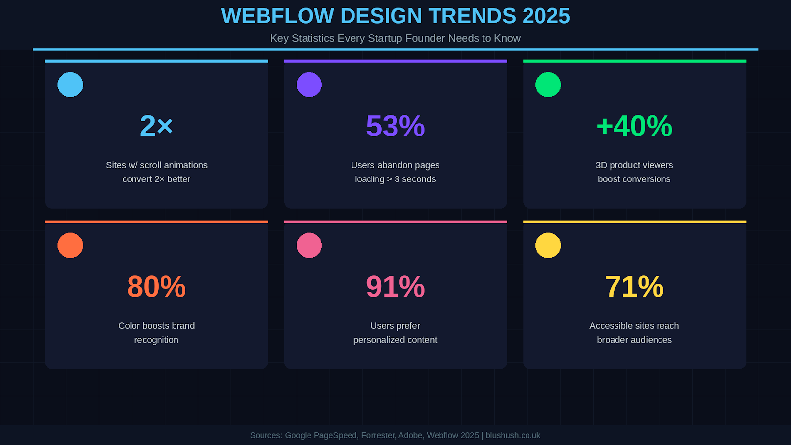
Why go 3D? Firstly, it has a huge “wow” factor. Humans are very visual and we’re drawn to things that have depth and interactivity. A well-placed 3D element can boost the time users spend on your page as they play with it, and it conveys a high level of sophistication. It signals that your startup is leveraging the latest tech. Secondly, 3D can improve how information is conveyed. If you’re a hardware startup, showing a 3D model that users can rotate will help them understand the product better than a flat photo from one angle. In fact, one study found that interactive 3D product models can increase conversion rates, as users feel they better understand what they’re buying and gain confidence. In education or storytelling, 3D can turn an explanation into an exploration (imagine a science site where you scroll and fly through a 3D solar system model).
Integrating 3D in Webflow is increasingly feasible thanks to tools and Webflow features. For simple things, Webflow’s built-in support for Lottie animations (which can include 3D-like animations exported from Adobe After Effects or Rive) is fantastic. You can get or create a Lottie of a 3D object spinning or an illustrated scene with depth, and drop it into Webflow easily. For true 3D models, you might use an embed of a WebGL scene or utilize libraries like Three.js. There are also some code platforms (e.g., Spline) that let you design 3D and embed it in Webflow. Start small: maybe add a 3D spinning logo or a hovering 3D shape in your hero section. Ensure you optimize the assets (compress textures, simplify models) because large 3D files can slow down the site and no one will wait for a 50MB model to load. Always provide an alternative for those on older devices or slow connections (like a static image version of the model).
Webflow’s community has many cloneable projects that demonstrate cool 3D integrations leverage those. Also remember accessibility: everyone can or wants to interact with a 3D element, so make sure the core info is accessible through text or images as well. When used judiciously, 3D elements can significantly boost engagement. As hardware and browsers improve, what was once niche (like WebVR and AR) is becoming more mainstream. We expect 3D design to move from a novelty to a standard component of modern websites, and Webflow designers (possibly with a little help from 3D artists) are at the forefront of this shift. If your startup has a story or product that could benefit from visualization, now’s the time to consider adding that extra dimension.
After many years of safe, minimalist design dominated by neutral colors and sans-serif fonts, 2025 is seeing an explosion of expressive typography and bold color schemes. Startups are realizing that one of the easiest ways to stand out and convey brand personality is through the fonts and colors they choose. As a result, we’re seeing a broad range of typographic styles (from elegant serifs to quirky display fonts) and more adventurous color palettes on Webflow sites.
On the typography front, there’s a notable comeback of serif fonts and unique typefaces. Many modern brands, even in tech, are moving away from the same-old Helvetica or geometric sans-serif and bringing in fonts with more character. For instance, a fintech startup might use a sharp, modern serif font in its logo or headings to convey trust and sophistication, whereas a creative agency might use a funky, retro font to show their edgy style. Some sites are even mixing multiple fonts, something traditionally avoided to give a dynamic, designed feel. Oversized text, unconventional placement (like rotated text or overlapping text elements), and artistic typography layouts are being used to make pages feel more like magazine spreads than generic websites. The bottom line: text isn’t for reading, it’s now a graphic element as well. This helps reinforce brand identity (e.g., if your startup is playful vs. serious, the type choice can instantly signal that).
As for colors, the trend is towards richer and more intentional color palettes. We’ve moved past the extremes of the past (either ultra-minimal black/white or ultra-neon brights). A lot of startups are choosing palettes that are vibrant but cohesive and reflective of their brand values. For example, many wellness or environmentally-focused startups use earthy tones (soft greens, warm terracottas, creams) to convey nature and calm. Tech and sports startups, on the other hand, might use high-contrast pairings like electric purple and sunny yellow, or classic combos like navy and neon green, to give energy and punch. Gradients are also still popular multi-tone gradients (such as a sunset orange to pink) add depth and a modern feel, often paired with semi-transparent “glassmorphic” overlays for a futuristic effect.
One interesting note: external trendsetters like Pantone have an influence. Pantone’s Color of the Year, for instance, might show up in many designs (2025’s pick was a cozy cocoa brown, signaling a desire for comfort). But ultimately, the best color choices come from what resonates with your brand and audience. A carefully chosen color scheme can boost brand recognition by up to 80%, think how we instantly identify Coke’s red or IKEA’s blue/yellow. Startups are taking this to heart, ensuring their site’s colors make a memorable statement.
Webflow gives you full control over typography and colors with ease. To ride this trend, consider updating your font stack: explore Google Fonts or Adobe Fonts for a typeface that captures your brand’s personality. Be afraid to use a display font for headings that’s a bit unconventional (make sure it’s still readable!). For body text, ensure it’s legible modern serifs can work for longer text, but always test readability on various screen sizes. Use Webflow’s responsive settings to adjust font sizes per device, especially if you’re doing very large or creative text layouts on desktop.
For colors, define a color palette (Webflow’s Style Guide or global swatches are helpful here). Typically 2-3 primary colors and a few neutrals is a good start. Use color intentionally: for example, one accent color for call-to-action buttons and highlights, another for backgrounds or header sections, etc. If you go vibrant, balance it with whitespace (negative space) so it’s overwhelming. Also, always check color contrast bold colors should still meet accessibility standards for text contrast (a bright yellow text on white might be unreadable; pair bright colors with dark opposites for text). Dark mode is also part of this trend: consider offering a dark theme toggle, especially if your audience likely browses at night. Many users appreciate a site that’s easy on the eyes in low light. With Webflow, you’d implement dark mode by creating an alternate color scheme and using some custom code or Webflow logic to switch classes, it’s a bit advanced, but doable, or you can simply design a naturally darker palette from the get-go.
By making typography bolder and colors more vibrant, your startup’s website can feel fresh and full of life. ensure that these choices still align with the message you want to send. A law tech startup might want neon pink comic fonts, whereas a new social app targeting Gen Z might! When in doubt, simplicity with one twist (one unique font or one standout color) can be enough to elevate your design. The era of playing it safe with bland designs is over 2025 is about brands having a distinctive voice and visual identity, and typography and color are your best tools for that.
In 2025, designing websites that everyone can use is a nice-to-have, it’s an absolute must. Accessibility and inclusivity have become top-of-mind in web design, and startup founders need to pay attention to this trend both for ethical reasons and business benefits. An accessible website means people with disabilities (visual, auditory, motor, cognitive impairments, etc.) can navigate and understand your content. Inclusive design goes further to consider varying devices, internet speeds, and cultural contexts so that all users have a good experience.
Why is this so important now? For one, many countries (including the US, UK, EU, and others) are enforcing stricter regulations that websites must meet certain accessibility standards (like WCAG Web Content Accessibility Guidelines). But beyond legalities, you’re potentially alienating a significant portion of your audience if your site isn’t accessible. As many as 71% of users with disabilities will leave a site that’s accessible that’s a huge chunk of potential customers to lose. Additionally, more than half of global web traffic is on mobile (around 61% as of recent data), so if your site isn’t mobile friendly (a component of inclusive design), you’re also in trouble.
Key aspects of this trend include: ensuring proper text alternatives for images (so screen readers can describe images to blind users), keyboard navigability (some people can’t use a mouse, so your site should be usable with Tab/Enter keys), sufficient color contrast for text (so those with low vision or color blindness can read it), and avoiding designs that might trigger vestibular disorders (like excessive motion always offer a way to disable animations for those who get motion sickness from parallax, for example). Also, providing options like dark mode can be seen as an inclusive move, since some users have light sensitivity and prefer a dark interface. Inclusive design also means thinking globally: e.g., does your site work for someone on a slow connection (have you optimized images, is it still functional without heavy scripts)? Does it consider language (maybe your startup should offer easy translation or at least avoid idioms that don’t translate)? These considerations are part of a broader movement to make the web open and welcoming to all.
On today’s web, speed is king. matter how beautiful your site is or how trendy the design, if it loads slowly, users will abandon it. “Performance-first design” is a trend and mindset that puts site speed and responsiveness at the forefront of the design process, rather than as an afterthought. For startups, this is vital: a slow site can mean lost customers and a poor impression of your brand. Conversely, a snappy, fast-loading site builds credibility and keeps visitors around. Google’s algorithm also favors fast sites (Core Web Vitals, which measure loading speed, interactivity, and visual stability, are important for SEO rankings).
What does performance-first entail? It means optimizing everything, from images to code, to ensure your pages load within a blink. In 2025, users expect sites to load in under 2 seconds, ideally under 1.5 seconds on mobile. Achieving this might involve technical strategies like using lightweight frameworks or static site generation, but with Webflow, a lot is already handled by their CDN and infrastructure. Still, as a designer or founder, you have control over many factors: the size of images/ videos you upload, how many scripts or embeds you add, etc. The trend in modern web development is also towards shipping less JavaScript (because heavy scripts can slow down browsers), and using techniques like lazy loading (loading images or sections only when they come into view) so that initial load is fast.
We also see increased use of edge caching and CDNs which Webflow does out of the box, caching your site on servers around the world for faster delivery. Tools and frameworks outside Webflow, like Astro or Qwik (rising popular frameworks), explicitly focus on performance by default. But even without knowing those, you can be performance-conscious in Webflow by following best practices: e.g., if you have a background video, compress it and consider using a lightweight MP4 instead of an animated GIF (which is usually larger). If you have Lottie animations, ensure they’re optimized. Use WebP or AVIF image formats for better compression (Webflow supports uploading those). Unused interactions or bloated font files? Clean them up.
Another aspect is visual stability: ensure your page does “jump around” while loading due to images or ads resizing (that’s the CLS Cumulative Layout Shift in Core Web Vitals). You can set fixed dimensions for images or use Webflow’s responsive images feature to avoid that. Also, consider using skeleton loaders or progress indicators if some content (like a large 3D embed) must load, so users are staring at nothing.
Why so much fuss about performance? Because it directly ties to business outcomes. Users are impatient studies have shown even a 1-second delay in load time can hurt conversion rates significantly. Conversely, improving page speed can dramatically boost conversion rates (in some cases, even double or triple them). Faster sites also rank better on search engines, bringing more traffic. And there’s a cascading effect: a fast site encourages users to browse more pages (since each click is painless), which can lead to more sign-ups or sales. It also reflects on your brand, a quick, responsive site implies a modern, efficient company, whereas a laggy site may subconsciously make users think the company itself is sluggish or outdated.
In practical terms, here’s a quick performance checklist for your Webflow site:
One more angle to performance is sustainable web design. A lightweight, fast site is good for users, it’s better for the environment. Less data transfer means less energy used. There’s a growing awareness of the web’s carbon footprint. Brands are even touting their “green web” efforts (some run their sites through Website Carbon Calculator to get a carbon score). So by slimming down your site, you only save your users time but also do a tiny good for the planet. It’s a virtuous cycle: fast = happy users = better conversions + eco-friendly.
In summary, as a startup you should adopt a performance-first mindset. Prioritize what content is truly important and make sure it loads quickly. It might mean making tough calls like compressing that beautiful background video or foregoing a fancy script, but the payoff in user experience is worth it. As Core Mountain Media puts it, speed and responsiveness are longer bonus features, they’re core requirements. The good news is, with Webflow’s infrastructure and a bit of mindful optimization, hitting those performance goals is very achievable for startups.
In a crowded digital world, facts and features alone won’t win hearts. The best startup websites in 2025 are those that tell a compelling story and exude a strong brand personality. This trend is about weaving your brand’s narrative, values, and voice directly into the design of the website. Rather than a generic site that could belong to any company, a brand-driven site instantly conveys “this is us.” Webflow’s flexibility enables startups to break out of cookie-cutter templates and infuse storytelling elements throughout their site.
What does storytelling design look like? It often means dedicating space on your site to talk about the “why” behind your product, just the “what.” For example, including an “Our Story” or a robust About section that might feature a timeline of your startup’s journey, profiles of the founders with personal quotes, or the mission and vision statements displayed prominently. It means using imagery and copy that reflect your brand’s character. Is your brand playful and irreverent? Your site might have witty micro-copy (little jokes in tooltips or 404 pages) and bold, in-your-face visuals. Is your brand all about trust and dependability? Your site might use a more refined design, with testimonials, and a thoughtful tone.
Agencies at the forefront of Webflow design have noted that they are evolving into brand builders. That is, the website is seen as a holistic brand experience. Every element from the color scheme (tying back to your brand palette), to the typography (your brand fonts), to the content itself is consistent with the story you want to tell about your company. A great example is how some Webflow agencies combine frameworks like StoryBrand (which is all about clarifying your brand story) with Webflow development to ensure every page of the site communicates the brand’s message effectively. They might incorporate the founder’s voice, use custom illustrations that represent the brand’s style, and craft case studies as engaging stories of how they solved client problems.
From a practical standpoint, a story-driven website often includes rich content like videos, blogs or insights from the team, interactive timelines or infographics, and lots of authentic imagery (e.g., photos of the team, behind-the-scenes looks). It avoids generic stock photos and generic phrases. Instead, it might have a section with a note from the CEO, or a bold statement of purpose as the hero headline. The design is tailor-made: you won’t mistake Blushush’s website for any other agency’s, for example their site says “Forget Boring” and every pixel, from the energetic colors to the rebellious copy, reinforces their unique vibe.
Why is this important for startups? Because people connect with stories and personalities, just products. Especially if you’re a new entrant, your story (why you exist, what problem drives you, who the people are behind the scenes) can be a differentiator that builds an emotional connection with users or investors. Consumers, particularly younger ones, are known to favor brands whose values they align with. If your website can convey authenticity and purpose, you’re more likely to convert a casual visitor into a loyal follower or customer. Moreover, from a content strategy perspective, having a strong brand narrative can improve SEO. People might search for your founders or your thought leadership content, and if your site hosts that, you gain organic traffic. For instance, many startups ensure their blog showcases their expertise and values, which only tells their story but also ranks for relevant keywords.
Start by defining your brand’s voice and key messages. Work with your team to gather the human stories why was the company founded? What obstacles have you overcome? How do customers use your product in real life? These can become testimonials or case studies on the site. In Webflow, you might create a dedicated “About Us” page that’s a block of text, but maybe an interactive timeline (e.g., using tabs or slider to show 2019 company founded in a garage; 2020 hit 100 customers, etc.), or a section with founder photos and fun facts on hover. Use the CMS for dynamic content like a blog or team member profiles, which lets you easily update and expand the storytelling content.
Design-wise, ensure your visual design aligns with the story. If your brand is minimalist and calm, reflect that in clean layouts and soothing colors. If it’s bold and disruptive, use asymmetric layouts, bold fonts, maybe unexpected visuals. Custom illustrations or icons can go a long way consider hiring a designer or using a service to create a set of illustrations unique to your brand (there are also many illustration libraries you can adapt). These visuals should metaphorically resonate with your message. For example, if you emphasize “growth”, maybe leaf or tree motifs subtly appear in the design.
Also incorporate social proof in a storytelling way: instead of just logos of clients, maybe quote a brief success story of how a client benefited from your solution. And when you talk about your product features, frame them in terms of user stories (“Meet Jane. Jane had problem X. Then she tried our product and achieved Y…”). This engages readers much more than a bullet list of features.
Finally, tie it all together with a consistent tone. If your website copy is conversational and friendly on one page, do switch to formal corporate-speak on another. It should feel like one coherent narrative from page to page. Webflow’s style symbols and templates can help maintain consistency in headers, footers, and section designs so that the experience feels unified.
remember, your website is often the first meeting between your brand and your audience. As the saying goes, “people do remember what you said, they remember how you made them feel.” A story driven, brand-focused website makes people feel something about your startup hopefully inspired, assured, or excited. That emotional resonance can set you apart in a sea of startups. It’s well worth the effort to infuse your Webflow site with the unique spirit of your company. In fact, our own agency approach with startup clients is to spend time uncovering their story and then let that guide the design. It results in sites that only present information but also build a relationship with the visitor.
(Need inspiration? Check out some award-winning Webflow sites on the Webflow Showcase that emphasize storytelling, you’ll notice they often have those memorable personal touches. And do hesitate to reach out to professionals if needed; a Webflow design expert can help translate your brand story into a compelling web experience.)
Last but certainly least, a huge trend in web design (and digital strategy in general) is personalization crafting a website experience that adapts to the user’s preferences or behavior. People have grown used to services like Netflix or Amazon that tailor content just for them, and they increasingly appreciate when even a startup’s website feels relevant to their needs. With Webflow and various integrations, even smaller companies can implement elements of personalization to boost engagement and conversions.
Personalization can manifest in simple ways: for instance, showing different homepage messaging depending on where the visitor came from or what they’ve clicked before. Websites can dynamically adapt content, imagery, or even calls-to-action based on visitor data like location, industry, or past behavior. Imagine you run a B2B SaaS startup and serve multiple industries if a visitor selects “Healthcare” on a form or if their IP indicates they’re in a hospital, your site could highlight the healthcare use-case of your product more prominently for that user. Or an e-commerce site could feature items the user browsed previously, or related to ones in their cart.
A common example we all know: Netflix’s homepage shows personalized show recommendations and even customizes the thumbnails of shows based on your viewing history. Of course, a startup site likely is as complex as Netflix, but the principle can be applied in smaller doses. Perhaps you have a resources section, you could recommend blog posts or guides related to what a visitor read last time. Or simply greet a returning user with “Welcome back!” and show content for logged-in users (if you have login/membership features via Webflow Memberships or similar).
Why do this? Because personalization tends to make users feel seen and valued, rather than giving everyone a one-size-fits-all brochure. It can significantly boost conversion rates—when users see content that matches their interests, they’re more likely to stay and take action. It also can simplify their journey (fewer clicks to find what they likely want). For startups, this could mean the difference between a visitor bouncing versus signing up for a trial.
Implementing personalization in Webflow can be done via a few methods. Out of the box, Webflow itself is mostly static once published (built-in per-user personalization beyond Memberships). But you can integrate third-party tools or scripts. One code tool is Segment or Optimizely, which can do personalization by swapping content if certain conditions are met (though these might be pricey). Another approach is using URL parameters or cookies. For instance, if you run an ad campaign targeting UK founders vs. US founders, the ad’s URL could have ?region=UK and your Webflow site could have custom code to read that and swap out a headline to “Helping UK Startups…” vs “Helping US Startups…”. Similarly, if a user fills out a quiz or form, you can save their answer in a cookie and then show relevant content on other pages using some simple JavaScript. Webflow’s CMS could also store different content versions that your script chooses from.
For a simpler start, you might implement geo-personalization: detect the user’s location (there are APIs for this or simpler, Cloudflare and some services can inject a country code). Then you could, say, show a different case study: “See how a London-based startup achieved X with our tool” for UK visitors, versus a New York one for US visitors making the content feel locally relevant.
If technical implementation is too much, another “manual” personalization is segmenting users upfront. For example, on your homepage have buttons: “I am a Founder” vs “I am an Investor” vs “I am a Developer” (whoever your audiences are). If the user clicks one, take them to a tailored landing page for that segment. That’s exactly behind-the-scenes personalization, but it achieves a personalized path by letting the user self-select.
Webflow’s upcoming Logic feature might also enable some personalization flows natively (e.g., form submissions triggering certain content), so keep an eye on that. And of course, if your site has member login (Webflow Memberships or a third-party), once logged in you can show user-specific content like their name, their usage stats, etc., which is highly personalized.
A word of caution: ensure that personalization efforts do cross into creepiness. Only use data that users have willingly given or that is generic enough (like location to city level) to feel invasive. Always maintain privacy standards and be transparent if you’re tailoring content (e.g., “Recommended for you” label is fine).
In conclusion on personalization even implementing a few simple elements can greatly enrich a user’s experience. It shows that your startup understands different user needs and is just herding everyone through the same funnel. According to the trend, people will come to expect some level of this custom treatment. The technology and tools available mean even lean teams can do it. And if in doubt, you can start small: perhaps personalize just the hero section text based on a couple of broad personas. Measure the impact (do those users convert or engage more?). You can always expand later. Personalized content experiences, when done right, make your website feel less like a static brochure and more like a helpful concierge, guiding each visitor to what they need.
As we’ve seen, 2025’s top Webflow design trends range from visual styles (futuristic UIs, glows, retro nostalgia) to technical and strategic approaches (performance optimization, accessibility, personalization). It’s an exciting time to be building a startup website because there are so many innovative tools and techniques available to make your site truly stand out. However, it’s necessary nor wise to adopt every single trend blindly. The key is to choose the trends that align with your brand and audience, and implement them in a balanced, user-centric way. For instance, a fintech startup might lean heavily into futuristic data visuals and scroll-triggered infographics, whereas a sustainability-focused startup might prioritize earthy design with accessibility and performance to align with their values.
remember that trends come and go, but usability and clarity remain paramount. All the animations and AI in the world wo help if your core message is lost or your site is confusing to navigate. Each trend should be in service of better communication and engagement with your users. It’s often a good idea to test changes (A/B testing different design approaches) to see what actually resonates with your visitors, some of the best improvements come from combining creative ideas with real user feedback.
Finally, do be afraid to seek expertise. Webflow is a powerful platform that lets you do a lot on your own, but if you find some of these implementations tricky (whether it’s a complex animation sequence, integrating an AI chatbot, or ensuring top-notch accessibility), consider partnering with a Webflow developer or agency. As a Webflow agency ourselves, we’ve helped many startups implement these trends effectively without breaking the bank. Sometimes a few hours of consulting can save days of trial and error and result in a far more polished outcome.
Staying updated with design trends is part of being a forward-thinking founder, and by reading this, you’re already on the right track. Apply these insights thoughtfully, keep your users’ experience as the North Star, and you’ll be well on your way to a startup website that only looks cutting-edge but performs and converts like a dream. Happy designing, and here’s to your startup’s success in the web world of 2025 and beyond!
Frequently Asked Questions (FAQs)
Q1: Is Webflow a good choice for startup websites?
A: Yes, Webflow is an excellent choice for startups due to its code flexibility and speed. It allows you to design custom, high-performing sites without needing a full engineering team, which is ideal for lean startups. Webflow combines the design freedom of a manual coded site with the ease of a builder, so you can iterate quickly and launch faster than traditional development. The platform also includes hosting, security, and a CMS, meaning fewer plugins or add-ons are needed (unlike, say, WordPress).
Many startups appreciate that Webflow’s visual editor empowers their marketing or design team to make site updates on the fly, without always involving developers. In short, Webflow lets startups create professional, scalable websites while saving time and resources, a perfect balance of creativity and practicality for growing businesses. (Bonus: Webflow even offers startup discounts and has a community of experts/agencies if you need advanced help.)
Q2: What web design trends will dominate 2025?
A: The year 2025 is seeing a blend of futuristic tech-driven trends and user-centric design principles. Some of the dominant web design trends include: immersive visuals (like 3D graphics and animated scroll interactions) that make web pages engaging experiences rather than static scrolls; AI integration for content generation and personalized user interactions; retro and nostalgic design elements (reviving Y2K and early-web aesthetics in a modern way) for uniqueness; and an emphasis on performance, accessibility, and inclusivity, ensuring sites are fast-loading and usable for all audiences. On the style side, expect to see more glowing neon effects, dark mode themes, expressive typography, and vibrant color schemes as brands seek to stand out visually. At the same time, minimalism is dead—it’s evolving. Many designs balance bold elements with clean layouts and plenty of white space to avoid overwhelming users. In summary, 2025’s top trends marry cutting-edge visuals (3D, animation, AI) with a deep respect for user experience fundamentals (speed, clarity, accessibility). Startups would do well to adopt the trends that highlight their innovation while still providing a slick and user-friendly experience.
Q3: How can I implement these design trends on a startup budget?
A: Implementing modern design trends does always require a big budget with smart approaches, even a lean startup can do it. First, prioritize the trends that align most with your business goals. For example, if you have a visually complex product, maybe focus on 3D demos or interactive illustrations; if your value prop is your brand story, invest time in storytelling sections and custom graphics.
Many tools and resources are available for free or low cost Webflow itself covers a lot of ground (animations, CMS, responsive design) without extra plugins. For visuals, consider using no-cost resources, there are libraries of free Lottie animations, open-source icon sets, and even AI tools with free tiers to generate images. Templates can be a cost-effective starting point: you might purchase a Webflow template that has some of the fancy interactions or layouts you like, then customize it (this can be cheaper than building from scratch).
Q4: Should I hire a Webflow agency or designer, or can I do this myself?
A: This depends on your team’s skills, time, and the complexity of what you want to achieve. Many startups successfully build and manage their Webflow sites in-house thanks to Webflow’s user-friendly interface. If you or someone on your team has an eye for design and is willing to learn, you can absolutely start with Webflow’s rich collection of tutorials (Webflow University is a fantastic free resource) and templates to get a great site up and running. Webflow’s code nature means you have to be a developer, a bit of patience and creativity can go a long way.
However, if implementing some of the advanced trends (like complex animations, custom code for personalization, or ensuring top-tier SEO and accessibility) feels overwhelming or is taking too much time away from running your business, hiring a Webflow expert can be a smart investment. A professional Webflow designer or agency will bring expertise and efficiency what might take you weeks to figure out, they could do in days or hours. They can also add creative insights and polish that elevate your site from good to amazing. Hiring does not have to mean a huge agency contract; there are freelancers and small agencies that work with startups and offer project-based packages or even hourly help. For example, you might hire a designer to create the initial design system and key pages in Webflow, and then you handle ongoing content updates. Or you could engage an agency to do a one-time revamp, implementing the latest trends and optimizing performance, and then train you to maintain it.
Our advice is to evaluate the opportunity cost. If you have the bandwidth and interest to DIY, Webflow empowers you to do so, and it can be quite fun. If your team is swamped or lacking design/ development experience, getting help ensures your website (often your startup’s most important marketing tool) doesn't fall short. One compromise approach some startups take is a hybrid: build a basic version yourself to save cost, then have a professional audit or refine it. For instance, you make the content and basic layout, then a Webflow pro comes in to clean up styles, add interactions, and ensure everything is pixel-perfect and fast.
In short, you can do a lot on your own with Webflow. But if your site is crucial to your business (which it usually is) and you want to incorporate multiple advanced trends quickly, working with experienced Webflow designers such as a specialized Webflow agency with startup expertise can be worthwhile. They’ll know the best practices and can also ensure your site is scalable for future changes. It’s all about what will get you the quality web presence you need within your time and budget constraints. Many founders start on their own and bring in help as they grow or as the design needs become more sophisticated.
Web design trends evolve every year, and it’s wise to periodically refresh your site so it does start to feel dated. Here are some tips to stay current:
By building your site on Webflow, you’ve already got an advantage in staying agile. Unlike hard-coded sites, where a redesign is a big project, Webflow’s visual nature lets you experiment and change things relatively quickly. Embrace that! Involve your design or marketing team in brainstorming creative updates. And when a new trend arises, you do have to adopt it blindly consider if it truly adds value to your site’s purpose. Trends should be evaluated through the lens of your users and brand. If the answer is yes (it will improve UX, modernize appearance, or communicate better), then plan to incorporate it in a measured way.
Lastly, consider a periodic review with a professional. Some startups have an annual or biannual site audit with a freelance designer, a fresh pair of eyes can suggest contemporary improvements you might miss. Whether in-house or with external help, treat your website as a living product that grows with your company. This way, it will never fall behind and will continue to impress users as design standards evolve year after year.
By staying proactive and user-focused, your startup’s website can ride the wave of design innovation rather than catching up to it. Good luck, and enjoy the creative process of keeping your web presence on the cutting edge! Ready to create a cutting-edge website for your startup? Explore the possibilities with blushush today!