Brands spend countless hours investing in how their website looks, but often forget that the core idea is to deliver results. You're keeping the user confused; they barely get any hint, won't click on anything, and have no clarity on what action to take.
At Blushush, we believe good design isn’t just aesthetic, it’s functional. That’s why our website developers approach every project like a conversion funnel, because if your site isn’t guiding visitors toward action, it’s not doing its job.
This blog breaks down what funnel-based design really means, why it works, and how we build it into every website project from SaaS to service-based businesses.
A marketing funnel is a framework that maps how potential customers move from awareness to decision. And when applied to website design? It turns static pages into intentional pathways that guide users toward conversion.
Here’s how the funnel typically looks:
This is your homepage or blog where people land when they’re still figuring things out. The goal here isn’t hard-selling. It’s to educate, intrigue, and encourage further exploration.
Examples:
Now they know you. They’re considering you. This is where your services, case studies, and brand storytelling come in.
Examples:
Time to convert. This is where users are warmed up and ready to take action.
Examples:
Your website should guide users in a step-by-step manner.
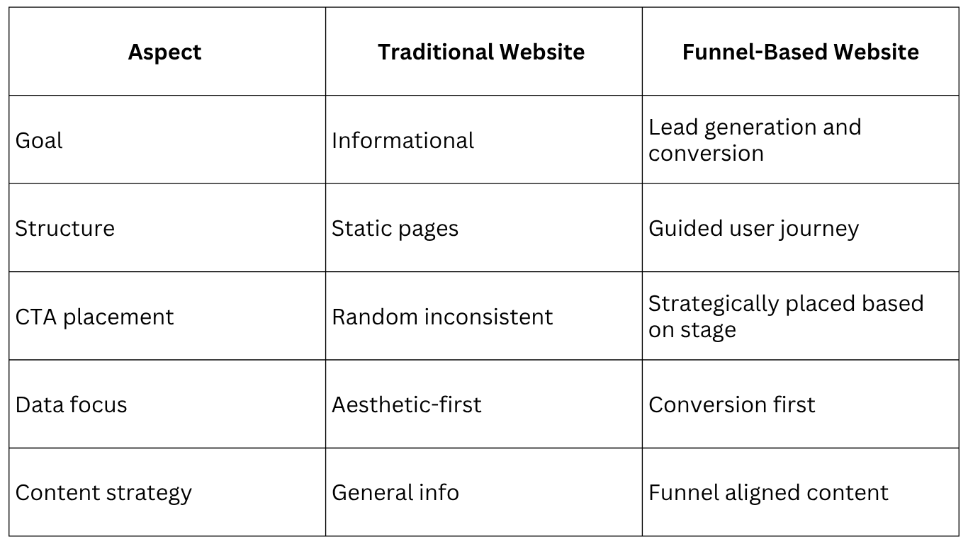
Let’s compare. Here’s what most sites look like versus what we build at Blushush.

We’re not just website developers, we’re conversion strategists. Every button, block, and scroll is placed with purpose.
Great UX isn’t about flashy animations. It’s about frictionless decisions.
Here’s how smart funnel-based design solves common website flaws:
When users know where to go next, they go. If your site feels like a maze, they’ll drop off. Funnels prevent this by creating a smooth, intuitive flow.
People want less cognitive load. A funnel-based design acts like a GPS: showing them what’s next, without overwhelming.
You can’t improve what you don’t measure. A conversion funnel lets us track which parts of the site are performing and where users are dropping off.
This is key. Your website isn't a standalone piece; it's your hardest-working marketing tool. Design should support your branding strategy, SEO performance optimization and lead generation efforts.
How Blushush Designs Funnel-Based Websites
Let’s walk you through our process.
We’re not just a website development company; we’re growth partners. And here’s how we do it:
Before pixels, we plan. We sit down with you to understand your audience, their intent, and how they make decisions. That insight shapes your funnel.
Because if your funnel doesn’t work on mobile, it’s not working.
“Our goal is not just to make you look good, it’s to make your visitors take action.”
Funnel-first websites aren't built by accident. They're intentional, every block, every button, every scroll. At Blushush, our website developers don’t just build what looks good. We bake conversion psychology right into the foundation.
Here’s what we always include (and why it works):
A call-to-action should never make the user search for it. Whether it's “Book a strategy consultation” or “Download the guide,” we make sure your CTAs are visible throughout the user journey, rather than buried at the bottom of the page.
Think of it this way: users won’t click if they’re never nudged. Sticky CTAs work because they gently remind without being pushy. It’s smart, not spammy.
Nobody likes a pop-up that jumps at you the second you land. But done right, they can be a quiet “wait, before you go ” that actually adds value.
We use exit-intent tech to trigger popups only when the user’s about to leave. That means:
When paired with clear copy and minimal design, exit popups become a final CTA, well-positioned to add value.
Attention spans are short. But curiosity is long if you guide it.
Our builds use intentional content hierarchy to serve both types of visitors:
This is more than just about pretty formatting. It’s about helping users move smoothly from top-of-funnel exploration to bottom-of-funnel action. A solid conversion funnel doesn’t just rely on CTAs; it uses layout to build momentum.
You can say you’re great all day. But if someone else says it? That’s proof.
We include:
Strategic placement matters too. We don’t dump them all in one block. Instead, we weave trust signals into decision points, especially near forms and CTAs.
Because trust is rarely built in one section, it builds gradually, across the entire funnel.
People won't always convert on day one. That’s why every site we build includes lead capture points that feel optional.
Whether it’s:
We design these touchpoints to feel like gifts. That way, even if someone’s not ready to buy today, they stay in your orbit and with integrations into your CRM or email marketing tools, those leads aren’t wasted; they’re nurtured.
A funnel is only as good as what you learn from it. That’s why our website development company's approach includes:
Post-launch insights tell you where users get stuck, what’s working, and where to double down. It’s not “set and forget”, it’s “launch, learn, optimize.”
Alongside the must-haves, our Blushush builds often include:
We don’t just build websites. We build conversion systems. Everything supports the user's decision-making process. These aren’t “extras.” They’re essentials for any website trying to move users through a conversion funnel.
Want to see how this works in real life? Check out our Blushush projects where we built high-performing sites using these exact elements.
Real talk? Funnel-based design works.
Even when data isn’t public, the client feedback is consistent: “We’re finally seeing our website do what it’s supposed to do.”
Who Should Use Funnel-Based Website Design?
Short answer? Almost everyone.
But let’s unpack that a little.
Here’s the thing: websites used to be digital brochures. Pretty placeholders. You would launch one, maybe refresh it every few years, and hope people clicked around. But things have changed. Attention spans are shorter. Competition’s louder. And your audience doesn’t have time to figure out what you do or why it matters. That’s where funnel-based web design comes in. It's not just about looking good. It's about moving people from curious to confident. From landing on your site to signing up, booking, buying, or reaching out. Seamlessly.
So who actually needs this approach?
If you’re early-stage, you don’t have the luxury of brand recognition. You need to be crystal clear, instantly. A funnel-focused site helps you answer three unspoken questions your visitor always has:
Get those right, and you build trust fast, even if you’re new.
Adding a new offering? That’s exciting, but it can easily create confusion. Funnel-based design ensures you guide different audiences to different outcomes, without muddying the message.
Whether you're targeting solopreneurs for one service and enterprises for another, your site needs to segment, qualify, and convert all without overwhelming anyone.
Let’s be real: if your business runs on discovery calls, demos, or client applications, your website is your top salesperson. And like any good sales funnel, it should warm up cold leads, answer objections, and create just enough urgency to prompt action.
Most sites don’t do this. They talk about themselves instead of talking to the visitor.
Funnel-based design flips that. Every section has a purpose. Every page is part of a larger story. And the whole thing is built to guide, more than to showcase.
If you’re scaling, your brand presence needs to scale too. At some point, that website your cousin’s friend built won’t cut it anymore. You don’t just need a site that looks better; you need a strategy partner, one who understands how design, content, UX, and conversion psychology all work together. A funnel-based approach brings structure to the chaos. It connects the dots between your brand, your goals, and your audience’s journey.
Look, if you’re building a website just to check the box to have something up, then yeah, a funnel might feel like overkill. But if you're playing the long game, if you want your website to bring in leads while you sleep, if you're ready to use design and messaging as growth levers. This is the move.
We build every site at Blushush like it’s a high-performing funnel, not just pretty but powerful. Because that’s what your brand deserves.
Want a site that works this hard? Let’s talk
You can have the sleekest homepage in your industry… and still miss the mark. At Blushush, we’re not here to win design awards. We’re here to build websites that convert, educate, and grow your business. That’s why we design every project like a marketing funnel, because form should always follow function. If you're ready to build with purpose. Book a free strategy consultation and let's turn your website into your best sales asset.


.avif)

