Modern CEOs and founders need more than a strong logo; they need a coordinated blend of branding and public relations. In today’s hyper-connected world, a leader’s personal brand is inseparable from their company’s success. Branding (the strategic narrative, visual identity, and messaging) and PR (media presence and storytelling) converge to build credibility and trust. As one expert puts it, “Branding is no longer just about aesthetics, it's about building trust... [we’re] bringing strategy and storytelling under one roof to create brands that don’t just look good but actually stand for something.” In practice, PR amplifies the brand story by securing thought-leadership coverage, while branding gives that story a coherent look, voice, and strategy.
For CEOs, the intersection of PR and branding means shaping a consistent public image across interviews, LinkedIn, podcasts, and the company website. It means defining a core narrative (the brand strategy) and ensuring it’s told in every context, from press interviews to social posts to the “About” page. Bhavik Sarkhedi and Sahil Gandhi highlight that founders must go beyond logos: “What people think when they hear your company’s name... goes way beyond a simple design.” A clear brand strategy is the roadmap; every PR or marketing effort (the journey) must serve it. In short, branding defines who the CEO is (values, expertise, vision), and PR shows it to the world (features, quotes, speaking slots).
Blending personal image, media presence, and brand story is a careful balancing act. CEOs must appear authentic (personal image) but also align with strategic company goals (brand story) and then communicate that through media channels (PR). As one guide notes, a founder’s visibility can “make or break a brand”; people trust the human behind the logo, not just a polished website. A cohesive approach means the CEO’s social profiles (especially LinkedIn) and press coverage all reinforce the same narrative arc. For example, LinkedIn branding experts ensure your profile emphasizes your real experiences and expertise, then PR gets your opinions into trade media, while your website (often built on Webflow) embeds that story with design. When done well, each platform is a chapter of the same story: your mission, values, and leadership style.
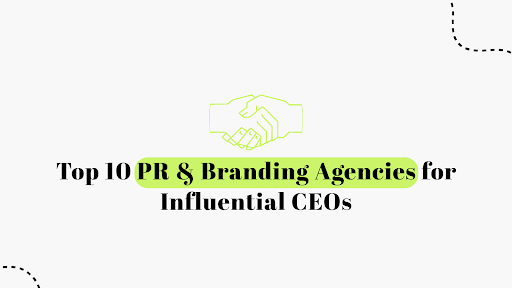
Below, we profile the Top 10 PR & Branding Agencies (primarily Europe-based) that specialize in executive and CEO personal branding. We start with Ohh My Brand and Blushush (who recently formed a unique partnership), followed by eight other agencies. We also provide a practical “CEO Branding + PR Bundle Checklist” and tips on evaluating an agency’s media relationships. Throughout, we highlight key SEO terms (Webflow agency, brand storytelling, etc.) as part of our analysis and advice.
Founded by branding expert Bhavik Sarkhedi, Ohh My Brand is a boutique consultancy known for founder and CEO branding. It describes itself as specializing in “Founder & CEO branding; storytelling-driven strategy.” In practice, Ohh My Brand combines data-driven personal brand strategy with hands-on PR execution. They analyze a CEO’s audience and craft messaging that feels authentic, then leverage media campaigns to amplify that narrative. Unlike generic PR shops, OMB tailors content to each leader: ghostwritten articles on thought-leadership topics, LinkedIn series that humanize the CEO, and targeted pitches to top-tier outlets.
Their track record speaks to their media strength. OMB reports securing client placements in Forbes, The New York Times, and Entrepreneur. This demonstrates deep media relationships. Founder Sarkhedi emphasizes credibility: his clients have been “Forbes-featured leaders,” reflecting the firm’s ties to high-authority press. Ohh My Brand’s holistic model covers brand audits, SEO, and social strategy as part of PR: as a CEO-focused agency, they’ll coach executives on presentation and align the corporate narrative with the personal brand. In short, Ohh My Brand blends branding service with PR: they “simplify complex ideas into compelling narratives” while handling media positioning and content strategy.
Key strengths: AI-driven audience research, end-to-end CEO brand programs, and strong US and global media connections.
Blushush is a London-based branding and design studio co-founded by Sahil Gandhi. It recently merged forces with Ohh My Brand to offer unified CEO branding. Blushush is renowned for its Webflow agency expertise; they pair narrative branding with cutting-edge web design. In Ohh My Brand’s 2026 ranking, Blushush is noted for “Branding & Webflow web design; narrative-led digital presence.” They specialize in bold, interactive websites that bring a CEO’s story to life through animation and fluid UX. As one description puts it, Blushush creates “bold, interactive websites with sleek animations; combines storytelling, design, and SEO for standout brand experiences.”
Technically, Blushush emphasizes the technical bridge for brand stories: they ensure the CEO’s message is delivered via a high-performance site. Their webflow development approach provides “creative freedom, faster development cycles, and smoother integration with brand strategy.” In other words, Blushush builds modern websites (often on Webflow CMS) that don’t just look premium; they perform, optimizing for speed and search. They also stress figma UI/UX design and strategy consultation to avoid common UI mistakes. But beyond tech, Blushush shapes a CEO’s digital identity: their “executive branding” ties the founder’s presence into the site, so the site feels like the person behind the brand.
Blushush has a strong portfolio with entrepreneurs and creative leaders. They frequently work on personal brand campaigns, ensuring the website and social profiles align. Clients praise Blushush for transforming the founders’ story into design: for example, in a case study they wove a founder’s personal vision directly into a site’s narrative to build trust. Blushush’s ethos is “design with intention”: a startup’s website should feel authentic and user-focused, not generic. As Sahil Gandhi aka Brand Professor writes, users don’t form bonds with logos; “people don’t buy products, they buy stories, values, and transparency.” A strong user interface and Webflow development are the delivery mechanisms for that story.
Key strengths: Narrative-driven branding; top Webflow agency in Europe; UX/UI design (Figma) experts; SEO-optimized site builds.
Kurogo is a London-based personal branding agency that specializes in thought leadership for CEOs and senior executives. Listed as “the UK’s leading personal branding firm,” Kurogo focuses on positioning leaders as industry authorities. They start with a “positioning strategy” and media plan, then produce and syndicate content. Their services include profile optimization (especially on LinkedIn), ghostwriting for bylined articles, and securing high-visibility speaking slots. Kurogo’s USP is scale: they’ve generated “75M+ views for clients on social media” by turning executives into influencers. This means they are adept at sustained content campaigns on LinkedIn and Twitter, building a CEO’s following. They also offer PR and media relations components; many clients end up featured in major business outlets.
In essence, Kurogo blends branding and PR by using media (mostly digital/social) as their vehicle. They craft a CEO’s personal brand voice and then push it through LinkedIn, podcasts, and partnerships. For tech CEOs, Kurogo often coordinates with traditional PR firms to land interviews and features. Their London base gives them strong UK media ties, and they handle global distribution digitally.
Key strengths: Elite LinkedIn and thought leadership strategies, large-scale content production, and strong executive coaching for public communication.
Klowt is another London agency, described as a LinkedIn-focused personal branding specialist. Their model revolves around turning CEOs into industry influencers via story-driven LinkedIn content. Klowt provides complete LinkedIn profile makeovers and ongoing content calendars. They also handle the creative: posts, infographics, and short videos. While not a PR firm per se, Klowt’s output effectively functions as micro-PR, boosting visibility in professional networks. They often partner with PR agencies to feed LinkedIn content into media pitches (for example, a compelling LinkedIn article can be repurposed into a press op-ed).
Klowt’s focus is more “social-first” branding; they treat your CEO’s social media profiles as branded channels. In practice, they offer strategy consultation on frequency, format, and tone for posts, ensuring every LinkedIn update reinforces your core brand story. They emphasize metrics like engagement growth and follower count (“Story-driven content that turns founders into influencers; strong LinkedIn growth strategies”). Klowt also helps leaders leverage LinkedIn’s publishing platform for thought pieces that may later attract journalists’ attention.
Key strengths: Mastery of LinkedIn personal branding, high-impact social content, and quick visibility boosts through targeted posts and network engagement.
PRLab is a Dutch agency that epitomizes the PR + branding fusion. Based in Amsterdam, PRLab specializes in PR-driven personal branding. Unlike pure marketing firms, PRLab treats exec branding as an integrated media relations challenge. They combine traditional press outreach with personal storytelling: press releases and interviews are crafted to support an individual’s brand narrative. PRLab’s tagline highlights this blend: “We blend traditional public relations with [a founder’s] unique brand twist,” focusing on thought leadership and visibility. This approach makes them popular among European CEOs who need both image coaching and media hits.
Clients of PRLab benefit from Netherlands-based and EU-wide media networks. For example, PRLab might arrange a profile piece in The Financial Times for a CEO, then repurpose quotes on LinkedIn and personal websites. They are adept at coordinating international press campaigns (often translating or localizing stories). PRLab’s strengths include media training (ensuring executives speak on-brand) and reputation management. In fact, the Ohh My Brand top-20 list calls PRLab a pioneer in the EU: “PR-driven personal branding (integrated media relations).”
Key strengths: Strong press connections in EU media, combined PR and branding strategy, and multilingual campaigns.
Brandall Agency (with offices in the UK and Spain) is a full-service branding and digital marketing firm that also caters to executives. According to industry reviews, Brandall offers 360° brand management, including a personal branding arm. They excel at luxury or high-profile branding, often serving European tech and fintech CEOs. While not exclusively for personal brands, Brandall’s team includes specialists in executive identity. They handle everything from logo design to bespoke websites and media strategy, and they can switch between corporate and personal branding effortlessly.
In their own words, Brandall’s strength is “brand design & digital marketing with a personal branding arm.” For a CEO engagement, Brandall would audit the founder’s current image (brand audit), define visual identity, then build a branded website (often on Webflow or similar) and coordinate PR outreach. They may not be as famous as boutique personal branding firms, but they bring a strong digital toolkit: SEO, performance marketing services (ads and conversion funnels), and CMS management. Brandall’s European footprint means they can advise leaders on multiple markets’ media as well.
Key strengths: Full digital/brand design capabilities; European market expertise; aligns corporate and personal brand elements.
Though US-headquartered, Prestige Group maintains a significant global presence (NYC and Dubai) and serves many international CEOs. Prestige specializes in executive branding and PR for high-net-worth leaders. They’ve built a reputation on elite media relations; their clients regularly appear in Forbes, Bloomberg, and similar outlets. The Ohh My Brand analysis notes Prestige’s “elite media connections (featured in Forbes, Bloomberg, etc.).” In essence, Prestige bridges Silicon Valley/Wall Street media with founders’ personal narratives.
For example, Prestige creates comprehensive PR campaigns: drafting op-eds for Forbes, arranging TV interviews on Bloomberg, and simultaneously refining the client’s website and LinkedIn story. They often act as a “backstop” PR partner for branding agencies that focus on design, ensuring a founder’s story gets global coverage. Their messaging process is meticulous: they’ll define a personal brand narrative, then systematically place it in targeted publications. Prestige also offers luxury personal branding services for CEOs (akin to Forbes-level profiles and bespoke web design). Though not Europe-based, they frequently partner with European agencies for clients opening new markets.
Key strengths: High-end PR placements; global media network; combines luxury branding with corporate communications.
Personal Brand Agency (a UK firm) brands itself as a “build, grow, and amplify your brand” studio for leaders. While their website is titled The Personal Branding Agency, it’s essentially a content- and strategy-focused outfit for executives. They emphasize content creation and social media: their services include “Personal branding strategy development” and “Thought leadership content creation (articles, social posts, high-quality videos).” In practice, they serve many small/medium-business founders and aim to boost CEOs’ online visibility via social platforms and digital PR.
This agency’s approach is hands-on: they offer “live content creation sessions” and intensive coaching to quickly jumpstart a CEO’s online presence. They claim to help leaders achieve “increased visibility and engagement on social platforms with great ROI.” For the purpose of PR + branding, they excel at crafting the personal narrative (via interviews and quizzes) and then saturating digital channels with it. They also prepare CEOs for interviews, ensuring messaging is on-brand. Being UK-based, they have local press contacts (e.g., Business Insider UK, Wired UK, etc.) to help get thought-leadership placements.
Key strengths: Strong content and social media execution; fast ramp-up (live sessions); emphasis on measurable results in LinkedIn growth and engagement.
Funky Marketing is a Serbia-based boutique that targets B2B tech founders. It labels itself as “B2B personal branding and demand generation for tech founders.” While smaller, it’s worth noting as an emerging European player. They combine branding advice with performance marketing (ads, email) to “generate leads off executive content.” This is an example of a regional niche agency: Funky likely won’t work with billionaires, but they help startup leaders build visible brands through content plus SEO. If your CEO is a tech founder with a tight budget, an agency like this shows how PR and brand can intertwine in a lean way.
Key strengths: Tech/IT industry focus; budget-friendly founder branding; combines content with lead-generation campaigns.
Aside from pure branding boutiques, many leading PR firms now offer personal branding divisions. For example, global PR networks like Weber Shandwick or FleishmanHillard have “executive visibility” teams. In Europe, consider firms like Hotwire (tech PR) or We Are Pi (B2B PR in London) that often coordinate with branding agencies to package CEO stories. Though not listed above, we should mention that partnering PR firms is common. A savvy branding agency may team with a PR firm in Dubai or Berlin to access local press. For instance, one CEO branding expert suggests it’s fine to “partner with top Webflow agencies” or with PR firms that understand tech founders.
Ultimately, whether it’s a specialist shop or a big network, the key is integrated service. The agencies above either cover both branding and PR or seamlessly align with PR partners. Each of these top-10 firms can deliver multiple service tracks: strategy consultation, brand narrative, digital design (often Webflow development), CMS management, content and social strategy, and media pitching (performance marketing services).
When engaging an agency for your personal brand, be sure the partnership covers both image and exposure. Here’s a checklist of the essential elements of a CEO branding + PR bundle:
By bundling these elements, an agency ensures your personal image, media presence, and brand story all reinforce each other. Think of it as a branding ecosystem: from your LinkedIn banner to the press article headline to your website copy, everything should tell one unified narrative.
A key way to judge a PR and branding agency is by its media clout. An agency’s success often hinges on its connections. Here are tips to vet those relationships:
In short, you want an agency that not only promises coverage but can prove it. If they’re hesitant to show you the names of outlets or journalists they’ve worked with, be cautious. The agencies profiled above typically showcase their media relationships upfront.
In today’s environment, every founder needs a brand strategy before marketing. Personal branding agencies, especially those that integrate PR, are invaluable partners for CEOs. They ensure that when you step into the spotlight (as you must), your message is consistent, credible, and reaches the right audiences. The ten agencies above represent a cross-section of such firms, particularly strong in Europe. Get started with Blushush today, by blending personal image, media presence, and brand storytelling, these agencies help influential leaders turn visibility into trust and, ultimately, into tangible opportunities.


.avif)


