
Think about the last time a CEO's name came up in conversation. Chances are, you had an instant impression: visionary, trustworthy, edgy, credible, or the opposite. That impression didn't happen by accident. Behind every leader with a strong public profile is usually a team, a strategy, a branding service, or a personal branding expert who helped them craft and sustain it.
Personal branding has moved well past "post on LinkedIn and hope for the best." In 2025, it's a full-stack discipline covering content strategy, SEO performance optimization, Figma UI/UX design of personal websites, Webflow development, PR, and sometimes even book deals. The experts on this list have turned that discipline into a profession, and many of them into a movement.
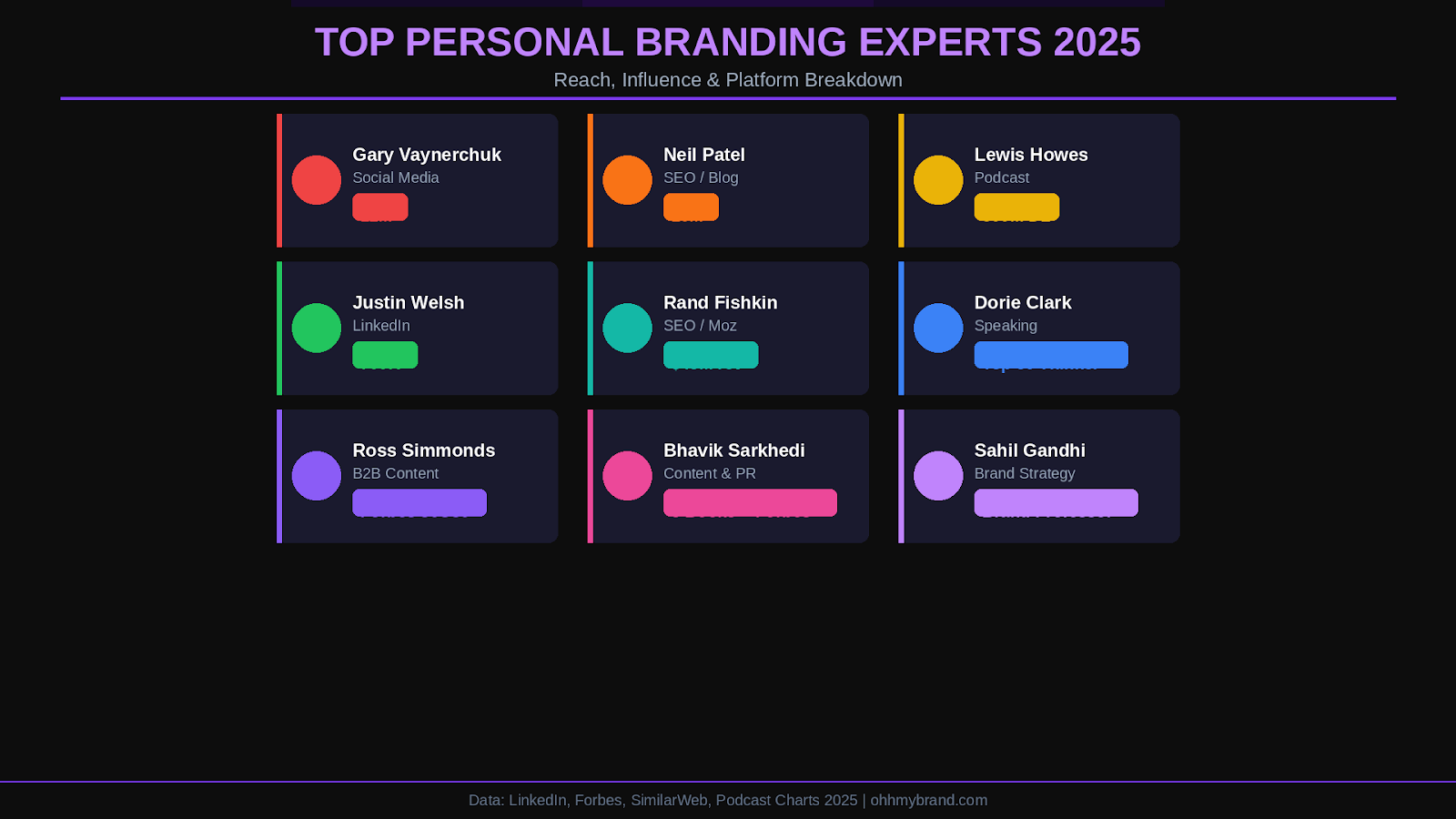
The numbers support the urgency. According to dsmn8.com, 82% of people are more likely to trust a company whose senior executives are active on social media. The 19 experts profiled here spanning the USA, UK, India, Canada, and beyond have shaped the personal branding industry through their own work, their clients' transformations, or both. They represent the full spectrum of the discipline: from SEO-driven content to authentic social storytelling, from executive coaching to podcast-building.
Bhavik Sarkhedi is a globally renowned personal branding expert from India and the founder of Ohh My Brand, an international personal branding agency. He's also co-founder of Blushush, the London-based brand strategy and Webflow development studio.
A best-selling author of 8 books including The Unproposed Guy, Bhavik has been featured in Forbes, The New York Times, HuffPost, Entrepreneur, and Times of India. His approach blends high-impact content strategy with SEO performance optimization ensuring clients become highly visible and memorable, not just within their industry but across the web. Widely recognized as a Forbes global personal branding expert, he's built a reputation for shifting professionals into thought leaders with authentic, influential online presences.
• Specialties: Content marketing, SEO writing, storytelling for personal brands
• Notable: Author of 21 books; featured in NYT, Forbes, HuffPost; founder of Ohh My Brand and Blushush
Sahil Gandhi known as "The Brand Professor" is a UK-based strategist and co-founder of Blushush Agency in London. He specializes in distilling complex brand identities into clear, engaging narratives, working closely with founders and executives to build credibility in competitive markets.
Sahil's approach to brand strategy is distinctive: he fuses brand architecture with storytelling, ensuring every touchpoint from LinkedIn profiles to keynote speeches reinforces a single coherent message. His partnership with Bhavik Sarkhedi brings together content depth and strategic clarity, resulting in branding solutions that cover brand strategy, Figma UI/UX design, Webflow development, reputation management, and digital identity design. With over a decade of experience, Sahil has crafted brand identities for startups and SMEs across tech, finance, and professional services.
• Specialties: Executive personal branding, brand identity design, digital reputation management
• Notable: Co-founder of Blushush; known internationally as The Brand Professor
Kubi Springer is a UK-based branding powerhouse with over two decades of experience building personal brands for global icons and corporate giants including P. Diddy, Nike, Rolls-Royce, and L'Oréal.
Founder of SheBuildsBrands, Kubi empowers entrepreneurs (especially women) to craft brand identities without apology. She's the author of I Am My Brand a practical guide to personal branding from scratch and has been featured by Forbes and the BBC. Her work bridges corporate branding expertise with personal development coaching, and she's a fierce advocate for diversity in brand representation.
• Specialties: Brand strategy, personal brand coaching, media training
• Notable: Author of I Am My Brand; 20+ years in branding; clients include Nike and Rolls-Royce
Neil Patel is one of the most recognized names in digital marketing. Co-founder of Crazy Egg, Kissmetrics, NP Digital, and the SEO tool Ubersuggest, his blog attracts over 10 million visitors per month. He's helped major brands including Amazon, NBC, and GM improve traffic and revenue.
Named by The Wall Street Journal as a top influencer on the web, Neil was also recognized by President Obama and the United Nations for his entrepreneurial success. His consistent output of practical marketing content and his transparent approach to sharing what works has made him a trusted resource for anyone building a personal brand through SEO performance optimization and content strategy.
Gary Vaynerchuk built his personal brand by turning his family's wine shop into a $60 million business using YouTube before YouTube was a proven marketing channel. Today, he's the CEO of VaynerMedia (serving Fortune 100 clients) and a successful early investor in Facebook, Twitter, Snapchat, and Uber.
Gary's no-filter, high-energy style has attracted over 12 million followers. His books (Crush It!, Jab, Jab, Jab, Right Hook) and daily content show entrepreneurs how to build influence through sheer volume and authenticity. His mantra: your reputation is your ultimate asset. In an era of polished corporate messaging, Gary proves that raw authenticity is a branding service unto itself.
Seth Godin is one of the earliest pioneers of personal branding as a concept. Author of 20+ bestselling books including Purple Cow, Linchpin, and Tribes, Seth has shaped how leaders think about marketing, change, and personal growth for three decades.
He writes one of the world's most respected daily marketing blogs reinforcing his brand as a source of wisdom. His message is deceptively simple: you win by being remarkable and authentic. Seth has been inducted into both the Marketing Hall of Fame and the Direct Marketing Hall of Fame. His altMBA program and Thinkers50 recognition cement his status as a brand strategist who practices exactly what he teaches.
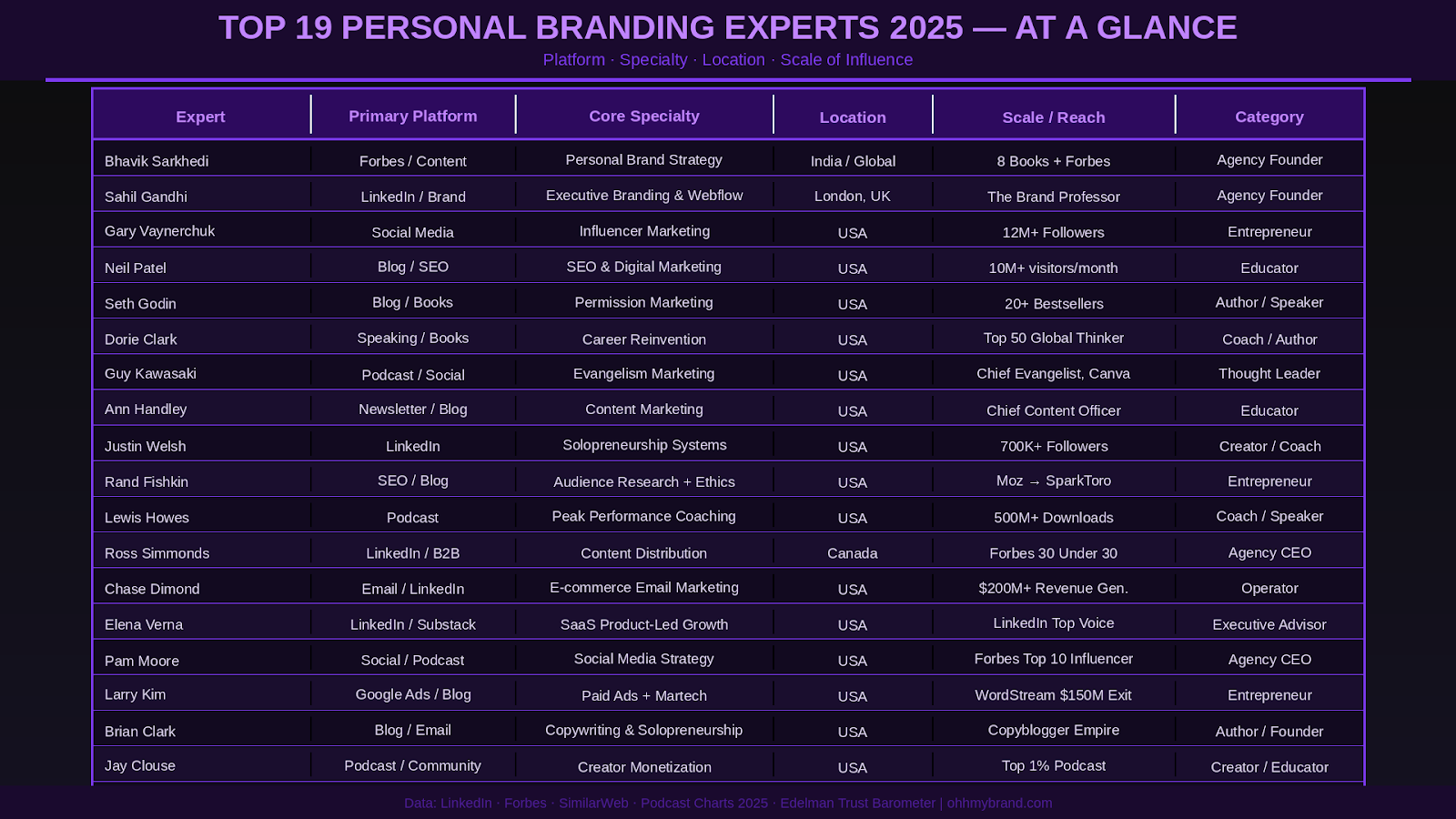
Guy Kawasaki made his mark as Apple's original Chief Evangelist in the 1980s, helping market the Macintosh with infectious passion. Today he's Chief Evangelist at Canva and a brand ambassador for Mercedes-Benz proof that a strong personal brand remains valuable across decades and industries. Author of 15 books including The Art of the Start, Guy's approachable, often humorous style makes complex tech and branding concepts feel accessible. He effectively invented the "Chief Evangelist" role that countless companies now use.
Ranked multiple times as one of the Top 50 Business Thinkers in the World by Thinkers50 and named the world's #1 Communication Coach by the Marshall Goldsmith Coaching Awards, Dorie Clark is the definitive expert for professionals seeking reinvention.
A former political spokeswoman turned branding strategist, Dorie has helped clients from Google to the World Bank define their reputations. Her bestselling books Reinventing You, Stand Out, The Long Game serve as blueprints for anyone building a personal brand through strategic visibility. She teaches at Duke University and writes regularly for Harvard Business Review.
Ann Handley was the world's first Chief Content Officer, leading MarketingProfs and co-founding ClickZ one of the internet's earliest digital marketing platforms. Her book Everybody Writes is considered essential reading for marketers and creators, blending practical advice with trademark wit.
Ann's personal brand is warm, witty, and grounded in deep marketing expertise. She has trained content teams at IBM, AT&T, and NASA. Recognized by Forbes and IBM as a top marketing influencer, Ann's newsletter "Total Annarchy" proves that consistency, relatability, and quality content are the foundations of a personal brand people actually trust.
Brian Clark founded Copyblogger, a blog that taught millions how to write content that converts and built it into a business empire serving over 70,000 customers. His personal brand was always grounded in value-first content: give away years of high-quality advice, build massive trust, watch the business follow. Copyblogger evolved into StudioPress (acquired by WP Engine), proving that authority built through education can power long-term success at scale.
Rand Fishkin rose to prominence as the co-founder and former CEO of Moz, building it from a small blog into one of the most trusted SEO software platforms globally. His down-to-earth teaching style famously presenting in yellow Pumas on Whiteboard Friday helped demystify SEO for millions. His book Lost and Founder offers a refreshingly raw look at startup challenges. After Moz, he launched SparkToro (audience intelligence research), successfully pivoting his personal brand from "SEO guru" to marketing ethicist and startup sage.
Larry Kim founded WordStream a PPC software company that managed over $1 billion in ad spend annually before being acquired for $150 million in 2018. He later founded MobileMonkey, an AI-powered chatbot and marketing automation platform. His personal brand blends nerdy charm with razor-sharp insights often sharing original research and growth hacks across Medium, Inc., and Search Engine Land. Named PPC Hero's #1 PPC Expert and US Search Awards Marketer of the Year.
Pam Moore, the "Marketing Nut," is CEO and co-founder of Marketing Nutz, helping Fortune 500s and startups harness social platforms to build trust, visibility, and community. With 1M+ Twitter followers and a 300+ episode podcast (Social Zoom Factor), Pam's personal brand is vibrant, energetic, and straight-talking. Clients include IBM, Adobe, Cisco, and Marriott. Recognized by Forbes as a Top 10 Social Media Influencer.
Chase Dimond has helped generate $200M+ in revenue by sending over 1 billion emails for e-commerce brands. His personal brand took off on LinkedIn and Twitter, where he grew hundreds of thousands of followers by sharing real case studies and retention tactics dubbed the "Email Marketing Nerd." His transparent, teach-everything approach has positioned him as a must-follow in the DTC space.
Elena Verna built her brand while leading growth at SurveyMonkey and Malwarebytes, then served as interim CMO for Miro and advisor to Amplitude, MongoDB, and Redis. Her LinkedIn posts blending business strategy with humor and sharp commentary have made her a tech community favorite. Named LinkedIn Top Voice in Marketing (2022), Elena's Substack Elena's Growth Scoop is must-reading for SaaS leaders.
Justin Welsh stepped away from burnout as a high-performing SaaS executive and built a solo brand generating over $4 million annually powered by digital courses, newsletters, and content systems. His LinkedIn Operating System framework has attracted 700,000+ followers on LinkedIn and Twitter. His message: you don't need a big team to build a big brand. You need systems, clarity, and consistency.
Jay Clouse runs Creator Science, a podcast, newsletter, and education platform that dissects how top creators succeed. His podcast ranks in the global Top 1%, and his private membership The Lab serves creators ready to monetize their audience. Named LinkedIn Top Voice in the Creator Economy, Jay's deeply analytical yet accessible style makes him the go-to for creators who want to scale with intention.
Ross Simmonds is the founder and CEO of Foundation, a B2B content marketing agency serving global SaaS brands. His core thesis: creating content is only half the job the other half is distribution. He's helped clients including Webflow and Shopify reach massive audiences by seeding content across overlooked platforms. Forbes 30 Under 30, LinkedIn Top Voice, and a TEDx speaker.
Lewis Howes turned adversity into a movement. A former pro athlete forced into early retirement by injury, Lewis built The School of Greatness, a podcast, book, and global brand dedicated to helping people unlock their full potential. The podcast has surpassed 500 million downloads and regularly ranks in the global Top 100. His books including The Mask of Masculinity explore vulnerability, identity, and the mindset behind success. Featured in Oprah Magazine, Ellen, and CNN.
Look across these profiles and a few patterns emerge that are worth internalizing if you're building your own personal brand:
• Consistency over time: None of them built overnight. Most cite 3–7 years of consistent showing-up before their brand truly compounded.
• A specific point of view: They don't try to appeal to everyone. They stand for something distinct: SEO, content, reinvention, solopreneurship, soul-driven branding.
• Multiple channels, one message: LinkedIn, podcasts, books, speaking all reinforce the same core identity.
• Generosity as a strategy: The most followed experts give away their best insights freely, building trust before asking for anything.
• A platform or home base: A personal website with strong brand strategy, clean Figma UI/UX design, and CMS management service capabilities is non-negotiable.
Most of these experts didn't build their brands alone. Behind the scenes, the best personal brands typically involve a combination of brand strategy, content systems, SEO performance optimization, Webflow development (or equivalent), and often a PR layer to accelerate visibility.
If you're looking for a branding service that covers all of these dimensions from brand strategy and Figma UI/UX design to LinkedIn management and content creation Ohh My Brand (founded by Bhavik Sarkhedi) and Blushush (co-founded by Sahil Gandhi, The Brand Professor) represent two of the most complete offerings available for founders and executives today. Together, they cover brand strategy consultation, Webflow development, SEO, PR, and content the full stack of modern personal branding.
Get in touch with us today. Whether you're just starting out or looking to elevate an already-established presence, the playbook is the same: be specific, be consistent, be generous with your expertise and invest in the infrastructure that lets your brand work even when you're not.


.avif)


