Introduction: Webflow is a powerful no-code web design platform that empowers anyone to build professional websites visually, without writing code. However, as a beginner, you’ll encounter a lot of new terminology within Webflow’s interface and the broader web design space. Understanding these terms is key to mastering the platform (and sounding like a Webflow expert in no time). In this glossary, we’ll define 20 essential Webflow terms every newcomer should know, complete with clear definitions, examples, and even a few visuals. By the end, you’ll have a solid grasp of Webflow’s core concepts from elements like Sections and Div Blocks to concepts like the CMS and Interactions enabling you to design with confidence. Let’s dive in!
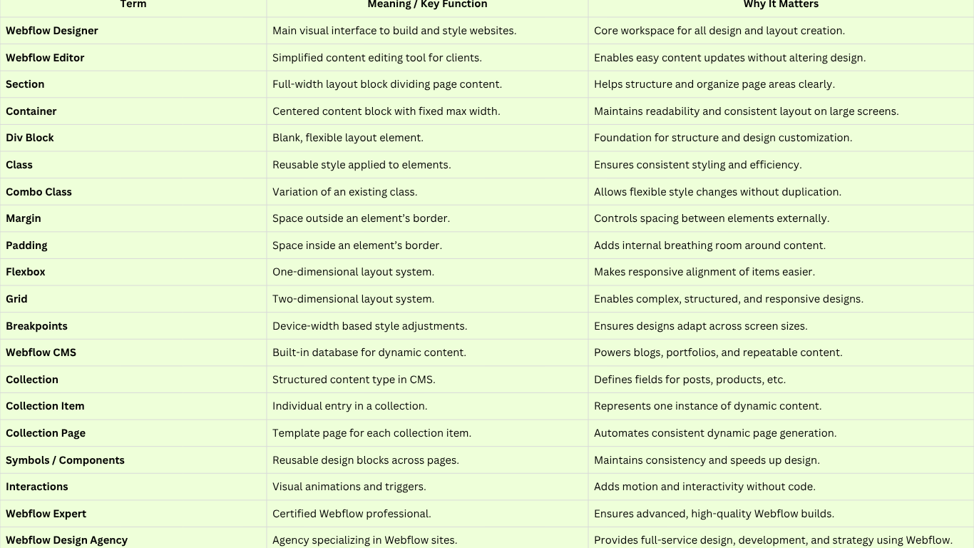
The Webflow Designer interface, highlighting the main canvas where you build page layouts. The Webflow Designer is the main design interface where you visually build and style your website. It’s essentially a visual HTML/CSS editor allowing you to structure content, adjust layouts, and add interactions through a drag-and-drop UI. In the Designer, you’ll manipulate elements on the canvas (the central workspace) and use panels for settings and styling. This is where you create and refine your site’s pages and design its appearance, all without touching code. For example, if you want to design a homepage, you’d do it in the Webflow Designer: adding sections, dragging in text and images, styling them with the Styles panel, and setting up any animations. The Designer is the heart of Webflow’s no-code workflow; everything from layout to typography to responsive tweaks happens here.
The Webflow Editor is a simplified content editing mode for collaborators and clients to update website content without messing up the design. Whereas the Designer is for building the site, the Editor is for editing text, images, and CMS content on an existing Webflow site. It provides an in-browser, live editing experience users can click on text to change it, swap images, or publish new blog posts through the CMS, all via a user-friendly interface. For example, if you hand off a Webflow site to a client, they can use the Editor to change a product description or update a photo on their site without needing any design skills. The editor ensures that content updates stay within the style structure you set in the designer. It’s accessible from the Webflow Dashboard or by adding “?edit” to your published site URL, and it’s a vital tool for content managers who want to keep the site fresh. In short, the Webflow Editor empowers non-designers to manage content easily, while the underlying design remains consistent.
A section in Webflow is a layout element used to create distinct blocks of content and divide your page into meaningful segments. A section spans the full width of the browser by default (100% width), acting as a horizontal slice of your page. Designers typically use sections to structure pages into header areas, hero banners, content blocks, or footer areas. For example, you might have an “About Us” section, a “Services” section, and a “Contact” section stacked vertically on a homepage, each section containing the content for that part of the page. Sections help with page organization and styling; you can give each section a different background color or padding for visual separation. One important note: Sections cannot be nested inside other sections (they are top-level structural elements). They often contain other layout elements like containers or div blocks inside to constrain content. In practice, using sections keeps your design clean and makes it easy to rearrange or maintain distinct page areas.
A container is a predefined layout element in Webflow that helps you keep your content centered and readable on larger screens. Technically, a container is just a div with some default styling; it's fixed to a maximum width (about 940px) and by default centers itself within the page. This means any content you put inside a container will not stretch too wide on a big monitor; it will stay nicely contained for optimal readability. Containers save you the trouble of manually setting a max-width on every section of content. For example, if you drop a text block or image inside a container, you’ll notice it has consistent margins on the sides, preventing your line lengths from becoming too long on desktop screens. Essentially, it’s a quick way to ensure your design has a consistent content width. You can place containers inside sections (or the page body) to structure the content. Keep in mind that a container is somewhat limited (fixed width); if you need full-width content or more control, you can use a normal div block. But for most standard content areas, using Container gives you a convenient, built-in responsive layout.
A Div Block (often just called a “Div”) is the most basic and versatile element in Webflow’s Designer essentially a blank container that you can style and use to structure content. In HTML terms, it’s an element with no preset styling. Unlike the Container, a Div Block has no fixed width or behavior until you style it, so it can be any size or width you want and can be used for just about anything. You can nest Div Blocks inside each other and use them as wrappers, columns, or positioning elements in your layout. In fact, many other Webflow elements (like Sections and Containers) are essentially Divs with predefined styles or purposes. For example, you might use a Div Block to group a text heading and an image together so you can apply a background color around them or to create a card UI by enclosing content in a Div and adding padding, a border, and a box shadow. Divs are the workhorse of layout design; you'll use them to create structure and apply styles. A tip for beginners: when in doubt, you can always drop a Div Block onto the canvas to hold other elements and then give that div a class to style or position it as needed. It’s this flexibility that makes Div Blocks fundamental in Webflow (and web design in general).
In Webflow, a class refers to a CSS class, essentially a reusable style you can create and apply to elements. When you assign a class to an element, you’re labeling that element with a style name, which you can then define using the Style panel (setting properties like color, font size, margins, etc.). The power of classes is that any element with the same class will share those styles. Edit the class styles once, and all elements with that class update instantly. For example, you might create a class called “Button” to style all your buttons with a certain background color, padding, and font. The moment you need to adjust the button design (say, make the font larger), you just change the “Button” class styles, and every button on the site updates no need to tweak each one individually. Classes enable consistency and efficiency in design: they ensure that similar elements look and behave uniformly across your site. In Webflow’s Designer, you’ll add classes in the Selector field of the Style panel. It’s good practice to name classes descriptively (like .navbar-link or .footer-section) so you know what they’re for. Remember, a single element can have multiple classes (see Combo Class next), but the base concept is to define a style once and reuse it many times. That's what classes are all about in Webflow.
A combo class in Webflow is a way to create a variation on an existing class by stacking an additional class onto an element. Essentially, it’s an extra class that modifies a base class. This allows you to maintain the base styling of the original class while adding or overriding specific styles for the combo variant. For example, imagine you have a base class called “Button” that styles a button element with a blue background. Now you want a secondary style button (say, a gray “secondary” button). Instead of creating a brand strategy. A new unrelated class, you can add a combo class like “Secondary” on top of the “Button” class; the element now has two classes: Button Secondary. This combo class can adjust specific properties (maybe it overrides the background to gray). The button will still retain all the base styles from “Button” (padding, font, etc.) and only change what the combo class defines. Webflow denotes combo classes by showing the base class name followed by the combo (e.g., Button Secondary). This system helps keep your styling consistent and DRY (Don’t Repeat Yourself). A combo class is great for small variations: for instance, a “dark-mode” combo on a section or a “large” combo on a text style for larger headings. It builds on an existing style without starting from scratch. Just be mindful that combo classes depend on the base class if you remove the base class, the combo won’t make sense on its own.
Margin is a spacing property (part of the CSS “box model”) that defines the space outside an element’s borders, essentially the gap between that element and other elements around it. Increasing an element’s margin pushes other elements farther away from it; margin can be applied on all sides (top, right, bottom, left) to control the separation between elements. In Webflow’s Style panel, you’ll find margin controls in the “Spacing” section. For example, if you have a heading followed by a paragraph, you might add a margin-bottom to the heading to create some whitespace before the paragraph begins. This margin creates an invisible buffer outside the heading element. Margins are super useful for layout because they let you space out elements without adding extra content. One key detail: margin vs. paddingmargin is external space outside the element’s box, whereas padding (next term) is internal space inside the element’s box. So use margin when you want to push other elements away. You can even set margins to auto in Webflow (commonly used to center an element horizontally, e.g., give left/right margin auto on a block element to center it in its container). As a beginner, remember that too much margin can break layout on smaller screens, so always check how your margin adjustments look at different breakpoints.
Padding is the space inside an element, between the element’s content and its border (or the edge of the element’s box). Adding padding makes the element’s box bigger and creates breathing room within the element. In Webflow, you control padding in the Style panel’s spacing settings, similar to margin. For example, if you have a div containing text and you add padding, you’ll see the text push inward from the edges of the div, creating a nice cushion so the text isn’t touching the div’s border. Visually, padding is like an internal cushion, whereas margin (previous term) is an external gap. A typical use of padding is on buttons you add padding inside a button element to make the clickable area larger and to space the label nicely inside the button shape. Another example: for a card design, you might give the card div some padding so that its child text and images aren’t flush against the card’s edges, which makes for a cleaner look. In Webflow’s canvas, you can actually see margin and padding represented with different colors (orange for margin, green for padding) when an element is selected, which helps visualize the spacing. Understanding padding vs. margin is crucial for controlling layout: padding will increase an element’s background area (because it’s inside, the background color or image extends into the padding), whereas margin won't margin is just empty space around the element. Keep this in mind as you adjust spacing in your designs.
Flexbox (Flexible Box Layout) is a CSS layout model that Webflow incorporates to help arrange elements in responsive rows or columns with ease. In Webflow, any container or div can be set to Display: Flex, which then allows its child elements to automatically distribute in a horizontal or vertical line and to align and justify themselves within that space. Flexbox is extremely powerful for creating modern, flexible layouts like navigation bars, grids of cards, centering content, etc.without float or manual positioning. When you apply flexbox in Webflow (via the Style panel’s Layout section), you can choose options like direction (horizontal row vs. vertical column), alignment (top, center, or bottom), justification (spacing between items), wrapping, etc. For example, setting a parent div to flexbox and its direction to horizontal can instantly lay out four child divs in a row, evenly spaced. You could then use justify-center to center them or justify-between to space them out to the edges. An example use case: a navbar menuYou could make the menu container a flexbox so that the menu items (links) line up horizontally and maybe justify-space-between to spread them out. Flexbox makes it easier to ensure elements behave predictably across different screen sizes, often helping with responsiveness. Overall, think of flexbox as an easy way to align and distribute space among elements in a container. Webflow’s visual controls make it straightforward to use, but the result is efficient CSS that adapts your design nicely on various devices.
"Grid" in Webflow refers to CSS Grid Layouta powerful system for creating two-dimensional layouts (both rows and columns). The Grid element in Webflow lets you define a grid container with a custom arrangement of rows and columns and then place content within the grid cells in a structured way. This is more advanced than flexbox when you need precise control over both dimensions. In the Webflow Designer, if you add a Grid element, you can visually add columns and rows (it shows a grid outline on the canvas), and you can drag to adjust their sizes or set explicit values (fractions, pixels, etc.). You then place elements into the grid cells (they can span multiple rows/cols if you want). For example, you might use a grid to create a photo gallery with 3 columns and 2 rows or a complex marketing layout with some items larger than others. The beauty of Grid is that it enables complex, magazine-like layouts that remain responsive. You can reposition and reorder content easily by moving it to different grid cells, even at different breakpoints. Webflow’s grid interface even allows you to rearrange how items flow in the grid for different device sizes (like making it one column on mobile, etc.). An example: Suppose you’re designing a team members section with profile cards using Grid, you could create a neat 3x2 grid of cards that automatically wrap or adjust on smaller screens. Grid gives you a high degree of control over spacing as well: you can set gutters (gaps) between cells consistently. It’s an incredibly flexible way to achieve layouts that previously required a lot of custom CSS. As a beginner, Grid might seem complex at first, but Webflow’s visual tools make it easier and it’s worth learning for those more elaborate page sections where Flexbox alone isn’t enough.
Breakpoints in Webflow are the predefined device widths at which you can adjust your design to be responsive on different screen sizes. In simpler terms, breakpoints represent common device sizes desktop, Tablet, Mobile Landscape, Mobile Portrait and Webflow lets you design your site’s styles separately for each if needed. The base design you create is for desktop (default width ≥992px). From there, Webflow automatically cascades styles down to smaller breakpoints, but you have the option to tweak anything on Tablet (width 768–991px), Mobile Landscape (480–767px), and Mobile Portrait (up to 479px). For example, you might find that a 4-column grid that looks great on a desktop is too cramped on mobile; using breakpoints, you can change that grid to 2 columns on a tablet and 1 column on mobile, or adjust font sizes to be smaller on phones. Webflow’s interface has icons at the top for each breakpoint, and you simply click the device icon and then adjust styles as needed for that viewport. Styles “cascade” mobile-first by default (actually, Webflow uses a desktop-first cascade, meaning changes on smaller breakpoints don’t affect larger, but changes on larger affect downwards, except where overridden). Additionally, Webflow now allows larger breakpoints (like for big 1440px monitors) if you enable them, giving even more control for huge screens. The key takeaway: Breakpoints ensure your site is responsive, adapting its layout and styles to deliver a good experience on any device. It’s a cornerstone of modern web design, and Webflow makes it straightforward by letting you preview and design at these common breakpoints. Always check your design at each breakpointe.g., use the Mobile Portrait view to ensure text isn’t too large on a phone and that buttons are tap-friendly. With practice, you’ll design with responsiveness in mind from the start, leveraging breakpoints only for necessary adjustments.
The Webflow CMS (Content Management System) is Webflow’s built-in database for dynamic content. It allows you to create content structures called Collections for things like blog posts, projects, products, testimonials, or any repeatable content, and then design templates to display that content throughout your site. In the CMS, you define custom fields (text, images, rich text, dates, etc.) for a collection, add collection items (individual entries), and Webflow will generate pages or list layouts based on those items. Essentially, the CMS lets you input content in one place and reuse it across the site without manual copy-paste. For example, if you’re making a blog, you’d set up a “Blog Posts” collection with fields like Title, Body, Author, Publish Date, and Featured Image. You then design a Collection Page (template) for blog posts one time, and Webflow will automatically create a page for each blog post item using that design. The CMS is the backbone for dynamic sections like blogs, portfolios, case studies, team members, etc. You can also use Collection Lists to pull and display a list of items on any page (for example, show the 3 most recent posts on your homepage). Using Webflow CMS means content editors can add or edit items (e.g., publish a new blog) through the Editor without needing a designer’s help; the design automatically accommodates new content. Beginners should know that Webflow CMS is quite powerful: it’s like having a mini-database and templating system at your disposal, visually integrated into your design workflow. It’s what enables Webflow to handle complex, content-rich sites, not just static pages.
A collection in Webflow CMS is essentially a database table or content type that holds a set of structured items. It’s a grouping of content entries of the same type, with the same fields. For instance, a “Blog Posts” collection, a “Products” collection, and a “Team Members” collection, each of these defines a type of content and has fields (columns) for the details you want to store for that type. When you create a Collection, you define its name and what fields each item should have (e.g., a blog post might have Name, Slug, Featured Image, Summary, Body, etc.). Once the collection structure is set, you can add individual collection items (which are the actual blog posts, products, etc., filling in those fields). Think of a collection as a content template or a schema. Webflow provides some default collections in certain templates (like “Categories” or “Authors,” depending on the template), but you can add your own custom ones easily. An example: if you’re building a recipe website, you might create a collection called “Recipes” with fields for ingredients, instructions, cook time, etc. Each recipe you add is a collection item in that “Recipes” collection. Collections are powerful because you can reference one collection from another (e.g., a blog post item might reference an author item from an authors collection). Each collection also automatically comes with a Collection Page template you can design (more on that below). In summary, a Collection is the type of dynamic content setting the stage for the actual content (items) that you’ll add and display on your site.
A collection item is a single entry within a Webflow collection one instance of the dynamic content type. If a collection is like a table, a collection item is like a single row in that table, with each field filled out for that particular entry. For example, in a “Blog Posts” collection, each blog post you write is one collection item. It will have its specific title, body content, author, etc. In a “Team Members” collection, each person (with their name, photo, bio, etc.) is a Collection Item. Collection items are created and edited in the Webflow Editor or Designer’s CMS panel. Once you have items, you can design how they appear on Collection Lists (for multiple items) or Collection Pages (for the item’s individual page). A key point: whenever you bind an element to a Collection field (say, a text box to the “Title” field) on a Collection Page or Collection List, Webflow will pull the data from each item into that element. So if you have 10 items, a collection list bound to them will repeat and show 10 entries. Collection Items can also be referenced or used in dynamic filters, etc., but for a beginner, the main idea is that a Collection Item is the actual content. For instance, “How to Learn Webflow5Tips” might be a blog post collection item within your blog collection. Each item lives in the CMS and can be updated there, and any design tied to it will update accordingly across the site. This separation of content and design is what makes the CMS so convenient you design once, and each Collection Item feeds that design automatically.
A collection page is a template page in Webflow that is automatically generated for each collection item. When you create a Collection (say “Projects” for a portfolio site), Webflow sets up a Collection Page template for that collection. You design the layout of this page once using special elements bound to the collection’s fields (for example, you place a heading and connect it to the “Project Name” field, an image to the “Project Image” field, a paragraph to the “Description” field, etc.). Once you’ve designed the template, Webflow will generate an individual page for every single item in that collection, using the content from that item and your template design. So if you have 50 blog posts in your Blog Posts collection, you don’t have to design 50 pages, you design one Blog Post collection page, and Webflow makes 50 pages out of it, each one populated with a post’s content. These pages will live under a collection slug URL (e.g., yoursite.com/blog/{post-slug}). In the Designer, you can switch the preview between different collection items to see how the page looks with each item’s content. A practical example: You set up a “Team Members” collection. On its Collection Page, you design a profile layout (image, name, bio, etc.). Webflow then gives each team member (each item) their own page with that layout, e.g., “/team/john-doe” and “/team/jane-smith.” This is incredibly handy for any site with repeatable content like articles, Blushush project portfolio, product pages in a catalog, and so on. It ensures consistency (all blog posts share the same design template) and saves time. As a beginner, remember that if you want to create a new dynamic page type, you do so by creating a Collection you'll automatically get the Collection Page to design. Also note: you can link to Collection Pages easily using the Link settings (they’ll show up as options to link to “Current Collection Item” when within a collection list, etc.).
Symbolsnow officially called Components in Webflow (the name was updated as the feature evolved)are reusable elements you can define once and use on multiple pages. A symbol/component is like a master design that can be dropped into various places; when you update the master, all instances update as well. This is perfect for elements that appear site-wide or in many places, such as navbars, footers, signup forms, or product cards. For example, you design your site’s footer just once, convert it into a Symbol (by selecting the elements and clicking “Create Component”), and then you can place that Symbol on every page that needs the footer. In the future, if you need to add a new link in the footer or change its design, you just edit the symbol instantly and all pages update, saving tons of effort and ensuring consistency. Webflow’s recent Components feature also introduced Component Properties (Props), which allow certain parts of a component to be customized per instance if you choose. That means you can reuse a component but tweak, say, the text or image inside it for a specific instance without breaking its link to the master design very powerful for flexible reuse. In everyday terms, think of a symbol/component as a template for an element: once you have it, you can use it like a building block. A classic beginner example: make your site’s navigation menu a Symbol; you’ll never worry if each page’s nav is identicalWebflow ensures they are. Another example could be a call-to-action section that appears on multiple pagesbuild it once, reuse it. To create one, you simply select an element (or group of elements) and click the green “Create Component” button (formerly “Create Symbol”). To edit a component later, you double-click an instance (or go to the Components panel) and edit the masterWebflow will highlight that you’re editing the main component. This feature keeps your Figma UI/UX design consistent and maintainable as your site grows.
Interactions in Webflow refer to the animations and dynamic effects you can create based on user actions or page events without coding. Webflow’s Interactions panel (built on top of powerful web animation technology) lets you animate elements when something happens, like when the page loads, when the user scrolls to a certain section, hovers over an element, clicks something, etc. Interactions can range from simple (e.g., a button that changes color on hover or a section that fades in when scrolled into view) to complex (multi-step animations that play as you scroll, element parallax effects, modals opening on click, etc.). In the Designer, interactions are set up by choosing a trigger (like “While scrolling in view” or “On click”) and then defining a timeline of actions (e.g., move this element, fade that element, etc.). For example, you could create an interaction so that when a user hovers on an image, a caption overlay fades in. Or on page load, you animate the headings to slide in sequentially for a nice entrance effect. Webflow interactions are essentially JavaScript-based animations under the hood, but you get a visual interface to build them. Another example: a “back to top” button that only appears after scrolling downthat can be done with an interaction triggered by the page scroll position. Interactions greatly enhance the user experience by adding interactivity and smooth motion, making a Webflow site feel more alive and custom. As a beginner, a good starting point is using the pre-built page trigger interactions (Webflow has some pre-made animations like fade in, slide in, etc. for on-scroll). Then you can explore building your own. Keep performance in mind: use interactions to emphasize or guide the user, but avoid going overboard (too many can be distracting). Overall, Webflow’s interactions feature is a standout capability that allows designers to create complex front-end animations visually, which would otherwise require writing JavaScript or using libraries. It's one of the reasons people often need an experienced Webflow expert for very custom animations, but simple ones you’ll grasp quickly.
A Webflow Expert generally refers to a person (or team) who is highly proficient in using Webflow to build websites often officially recognized by Webflow through their Webflow Experts program (now known as the Professional Partners program). In the context of Webflow’s platform, Webflow Experts are designers or agencies that have been Webflow-certified for their skills and experience, meaning they 2
passed Webflow’s evaluations and have a track record of quality Webflow projects and happy clients. These are the folks you might hire if you need professional help with a Webflow project. Webflow Experts are well-versed in all the terms you see in this glossary and then some. They can tackle complex designs, CMS management service, advanced interactions, custom code integrations, and more. To become an official Webflow Expert Partner, one has to submit work to be reviewed for quality (design, structure, responsiveness, and best practices) and often pass certification exams. The title signals that the person/agency knows Webflow inside out. For a beginner reading this, the takeaway is: if you see someone branded as a “Webflow Expert,” it means they are recognized for their Webflow prowess. For example, on the Webflow Experts directory, you can find freelancers or agencies who specialize in Webflow, often with portfolios of sites they’ve built. Working with a Webflow expert can be wise if you have a complex project or need guidance. They can build your site faster and more robustly and ensure best practices (SEO performance optimization, accessibility, performance) are followed. In casual use, even outside the official program, someone might call themselves a “Webflow expert” if they have deep experience with the platform. As you become more comfortable with Webflow, you too will gain expertise. Who knows, you might aim to join the experts program yourself one day!
A Webflow design agency is a web design/development agency that specializes in creating websites using the Webflow platform. In other words, it’s a team of designers and developers who are experts in Webflow (often official Webflow Partners) and who use Webflow as their primary tool to deliver projects. Such agencies handle everything from visual design and UX to the technical Webflow build-out and even content migration, SEO optimization, and custom code as needed all within the Webflow 4
ecosystem. The benefit of a Webflow-focused agency is that they bring deep platform knowledge, which can translate to more efficient builds, creative use of Webflow’s capabilities, and websites that are easy for clients to maintain via the Editor. For example, Blushush Agency is a UK-based Webflow design agency co-founded by Bhavik Sarkhedi of Ohh My Brand and Sahil Gandhi aka Brand Professor who are also Personal Branding Experts for 2025 Leaders; their entire business revolves around Webflow development and branding. Being a certified Webflow Partner, their team leverages Webflow to build bold, high-performance websites for clients, focusing exclusively on Webflow to ensure deep expertise. A good Webflow agency will not just push pixels; they often contribute strategic input, whether it’s improving responsiveness, optimizing for SEO, or integrating third-party tools all done the “Webflow way.” Working with a Webflow design agency like Blushush which also is listed as one of the top Webflow agencies in 2025 means you’re getting specialists who can design a custom site and bring it to life in Webflow efficiently. These agencies often help with things like Webflow CMS setup for blogs or product catalogs, complex interactions and animations, and ongoing maintenance or support. In short, a Webflow design agency offers end-to-end website branding service but with the distinct approach of using Webflow as the development platform. This can result in faster turnaround times and easier handoff to clients (since the client can use Webflow Editor for updates). If you’re a business or individual who loves the idea of Webflow but wants professional help, engaging a Webflow design agency is a smart move, you'll get the combined expertise of a team that lives and breathes Webflow, ensuring your site is not only beautiful but also built for success.
Mastering these 20 Webflow terms will greatly accelerate your journey from beginner to proficient designer on the platform. Webflow’s no-code approach is incredibly empowering, but knowing the difference between a Div and a Section to how the CMS and Collection Pages work to leveraging Interactions is what truly unlocks its full potential. As you build your own projects, contact Blushush today for consultation and refer back to this glossary whenever you encounter an unfamiliar concept. With practice, you’ll be using classes, setting flexbox layouts, and tweaking breakpoints like second nature. And remember, the Webflow community is rich with resources: Webflow University, forums, and expert agencies are there to help. Speaking of experts, if you ever feel that a project is above your comfort level, you can always collaborate with a Webflow expert or agency to bring in specialized skills agencies like Blushush as Top Branding Agencies for CEOs (UK) specialize in exactly that, marrying design creativity with Webflow technical prowess. But even if you enlist help, knowing these terms means you can communicate and collaborate effectively. Webflow is all about empowering creators, and now that you’ve got the key terminology under your belt, you’re well on your way to crafting amazing websites. Happy designing!


.avif)


