Brand Guidelines
Brand Presentation
Brand Strategy
Logo Design
Moodboard
But it was not always like this. In this case study, we are going to look at the journey we had with this fashion brand struggling with its design, website, and strategy. When we collaborated with Born in 2021, they were facing many challenges, predominantly with their visual identity hampering their website, and needed a revolutionary change in their brand strategy. We at Blushush took it as a challenge and created a three-phase brand revamp for it.

Born is not the everyday brand that you have in the market. It is built to exude trendiness and boldness in sync. It is conceptualized to break the barriers of fashion.
Unlike most brands that are gender-centric, Born offers affordable fashion to both men and women, providing equal importance to color, styling, and patterns.
The company started in 2009 and currently operates across Ireland with 25 stores located in different cities and covering a large part of the country’s fashion market.
The store has a steady online presence with a mobile application, website, and active social media pages on different platforms. Customers can connect with the store via different options.

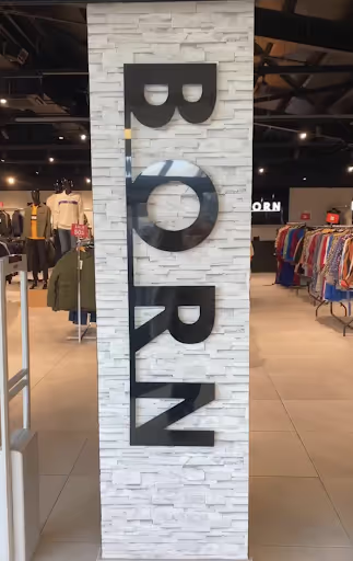
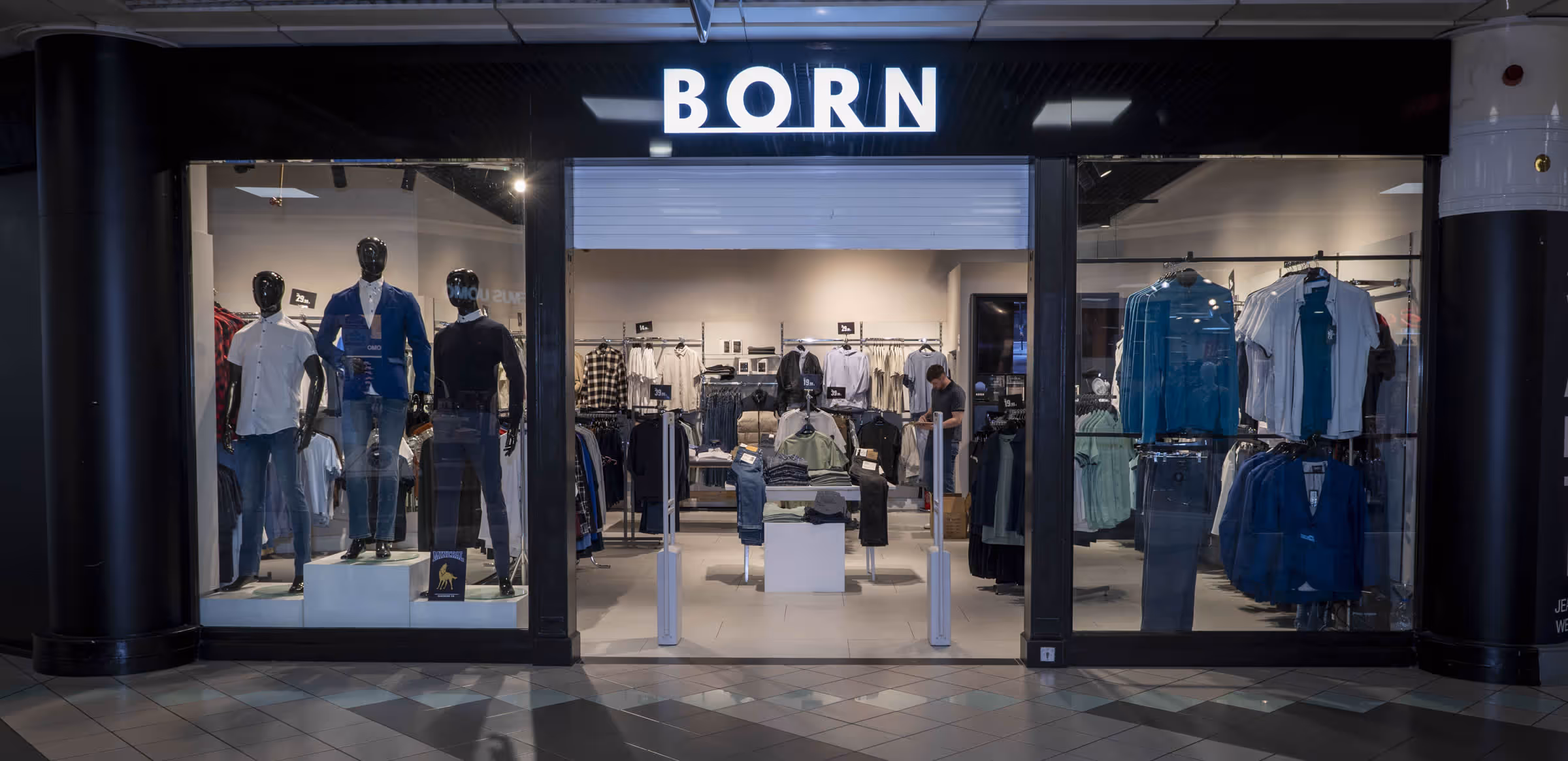
Born was facing issues with the space and placement of its primary logo. The logo was not getting the attention and was getting placed in an orthodox manner. The primary logo cannot be changed or altered, as it will be costly to change it across all brand stores. Struggling with brand identity and design attributes, it required a total revamp of its logo, logo marks, color palette, mockups, and in-store enhancement and vibe.
Born was facing issues with the space and placement of its primary logo. The logo was not getting the attention and was getting placed in an orthodox manner. The primary logo cannot be changed or altered, as it will be costly to change it across all brand stores. Struggling with brand identity and design attributes, it required a total revamp of its logo, logo marks, color palette, mockups, and in-store enhancement and vibe.
We commenced our work with the visual identity; it all started with us focusing on the brand anatomy and trying to get deeper into Born’s values, vision, and purpose. We decided to revamp its entire personality and give it a new, refined, and polished look. Something that aligns exactly with its target audience.
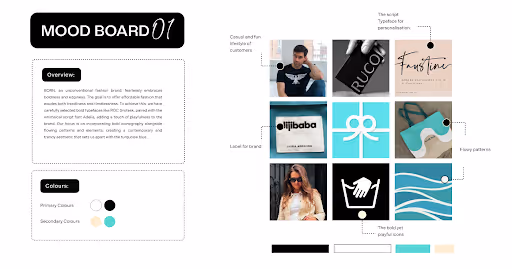
The idea behind this moodboard was to establish the fundamentals of design, visuals, typography, and images that resonate with the brand image and offer aesthetically pleasing imagery, setting a mood that resonates with the brand’s purpose and vision
.avif)
.avif)
- The primary logo cannot be changed, as it would require it to be replaced across all stores.
- There was a recurring problem with its placement, and the brand was not able to place it correctly and in the right position.
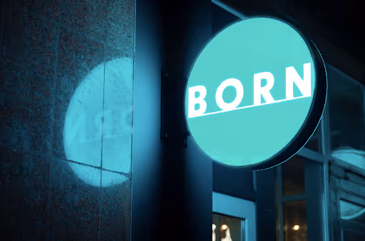
- Earlier the primary logo was used vertically on a wall.
.avif)
.avif)
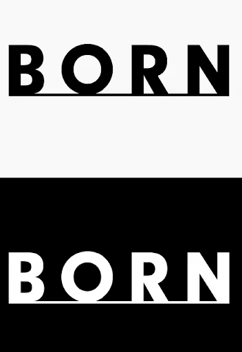
The secondary logo, or the ‘alternative logo,’ uses components from the main logo but in a different layout. It allows for more flexibility for your brand. Here you can see that in the secondary logo we introduced a vertical arrangement of letters to give it a modern yet timeless look, depicting a brand that is ever evolving. At the same time, the horizontal line is converted into a slant line to portray growth and modernism.
The secondary logo solved the following problems:
- It offered flexibility and could replace the primary logo wherever there was a space constraint.
- The logo can be used in different tags, labels, and stitches, showcasing uniqueness.
- The secondary logo allowed the brand to use it horizontally as it should be rather than vertically.
Brand presentation, which involves deciding on what fonts, designs, and colors will be used to represent the brand across different platforms and channels.
On discussing with the brand, there were three fonts finalized: one primary font and two secondary fonts that work in sync with the first one.
We further discussed the do’s and don’ts of the usage of these three fonts in different areas for both digital and print media with appropriate combinations and compiled a brand guideline that we will elaborate on further.
.avif)
.avif)
.avif)
.avif)
The objectives here are, firstly, to remain consistent with the color usage and, secondly, to send a strong message and create a solid brand identity.
Based on the discussions and selections of fonts, color palettes, and overall design, we drafted a whole brand guideline document, which served as the brand bible for the clothing company. We not only fixed the current website, but we were also committed to achieving a series of deliverables linked with remodeling the website. It contained
While drafting the brand guideline, we understood the concerns with visual identity, and so an absolute makeover of brand pattern and visual brand design elements was introduced by us.

We begin our work by starting to fix their current website. We script typeface for personalization, flowy patterns, and the use of bold yet playful icons that go well with the casual and fun lifestyle of customers.
Brand Voice
We understood that Born is an unconventional brand. It moves on the aspects of boldness and edginess with the ambition to offer affordable clothing and fashion that exudes both timelessness and trendiness.
The primary typography of Avenir serves as the cornerstone of Born’s typography, reflecting on its brand personality and ensuring a visual identity that is consistent.
Whereas, the second typography is used in portions to complement the primary typeface for social media. Both Holiday Regular and New York Regular use approximately 15% text elements and 30% combined. The secondary fonts will be used as supplementary elements for quotes, additional information, and to highlight a particular keyword. This will offer a visual contrast and variation.

Jumping from mood boards to logos, fonts, and colors, we wanted to give the brand a strong and solid representation, and so we worked on social media mockups, including shopping bags, signage, gift cards, and download app mockups to in-store mockups.
From a brand strategy workshop guide perspective. It took us a time span of almost two months to completely redefine, redesign, and deliver the phase I deliverables, from fixing their current website to introducing all the design, colors, typography, and imagery and reestablishing the whole visual identity.

Everything from placards, signboards, stickers, labels, attractions, and information on were to be changed with the same typography. This resulted in a better, cooler, and sharper physical look and visual identity for the crowd that walks in the store.

For in-store enhancement, we decided to tie in and use a turquoise background for the sale sections or special offers. Conversely, use black for new arrivals. This creates a strong separation of products and their categories. We refrained from using flashy colors, which are clearly not part of the color palette, and we avoided the use of secondary fonts.

Instagram plays a quintessential role in branding and elevating the brand voice and identity; hence, we drafted strong guidelines for it.
Never use all the typography fonts in a single design, and stick to one combination of any two to maintain cohesiveness and professionalism. For posts, use primary typeface and font pairings within the post.
Never use random fonts and colors, as it projects inconsistency. Use only brand colors. This rule applies to all Instagram posts, reels, and stories. We ensured that the entire content is posted in sync with the design elements and runs smoothly with the selected colors. We knew only one font could make the page look bland, so we used secondary fonts in equal proportions but never overused them.
Now, it was time for us to design the new website. This is where details are worked out and a new brand website is created, there were many interesting and integral features added -

We introduced a series of new elements and features like color options, relevant size charts, price in local currency, shop the look and “download our app” feature along with store locator, continuous scroll, moving banner, online store vouchers and gift cards with a wishlist option. We integrated Google search console and analytics and restock alerts.

We worked on their content and removed the fluff to make it more clear and appealing to its direct audience. We were able to give the new website a complete restructure, from how its products are going to appear on the screen to the whole order journey. The colors, of course, were chosen wisely to match the mood and personality of the brand. Every piece of element that has the brand name on it was aligned according to the brand style guide and logo usage guidelines.
Phase II had three major steps, which were evaluation and testing, followed by soft launch and support. This whole phase took us around three months to complete each and every task, focusing on minute details and inducing life into the brand. It was the rebirth of the brand, Born.
It took months of hard work and determination to deliver the desired results and work along with the Born team to execute operations. We faced each challenge, diligently handling them strategically. We are happy to say that although we came across many roadblocks, here is a series of wrested results that we attained.
This brand strategy workshop case study is also a proof how workshops help brands in reviving their market positioning. It was an exciting journey for us and a fruitful collaboration with the team of Born. Not only did we understand their expectations, but we were also successful in delivering them in time. The team was very supportive and helped us with every little piece of information and support when required.


.avif)