Webflow has emerged as a powerful no-code web design platform that lets you build custom websites visually without writing code. Whether you’re a creative entrepreneur, a startup founder, or just someone with a great idea, Webflow empowers you to design and publish a professional site using an intuitive drag-and-drop interface. In this comprehensive guide, we’ll walk you through how to create your first website in Webflow step by step. We’ll cover everything from signing up, planning your site’s structure, and designing in the Webflow Designer interface all the way to publishing your site live. Along the way, we’ll also share tips on SEO optimization, common mistakes to avoid, and when it might make sense to get help from a Webflow expert or a Webflow design agency if you need an extra hand.
Why Webflow? For beginners and seasoned designers alike, Webflow offers the best of both worlds: the ease of a visual builder with the power and cleanliness of hand-coded websites. The platform visually translates your design decisions into clean HTML, CSS, and JavaScript, so you’re essentially “coding” by designing. This means you have nearly total design freedom to make your site look and behave exactly how you want far beyond the limits of cookie-cutter templates. Webflow also includes built-in hosting, a content management system (CMS), and e-commerce capabilities, making it a one-stop solution for building and running a website. Plus, it’s SEO-friendly by defaultWebflow sites load fast, output clean code, and give you control over critical SEO settings like meta tags, alt text, and even structured data.
By the end of this tutorial, you’ll have a simple yet functional website up and running on Webflow. More importantly, you’ll gain a solid understanding of the workflow to build powerful websites in Webflow by visually manipulating the same fundamentals that professional developers use (HTML/CSS and more).
Before we get into the step-by-step process, it’s worth briefly understanding what Webflow is and why it’s a great choice for your first website. Webflow is often described as a visual web design tool and hosting platform that bridges the gap between template-based site builders and custom coding. In practical terms, Webflow provides a Designer interface where you visually build your site’s layout and style; under the hood, it generates clean, production-ready code for you. You can think of Webflow as a blend of a design tool (like Photoshop or Figma UI/UX design) and a development environment; it lets you design freely while automatically handling the code and technical details.
Key features that make Webflow ideal for beginners include:
• Visual Design, Clean Code: You manipulate elements on a canvas, style them using panels and controls, and Webflow writes the HTML/CSS for you. This visual approach makes it easier and faster to build, while still following web standards. You get the benefit of custom code quality without having to manually code everything.
• No Software to Install: Webflow is browser-based. You just log in to your account online. All you need is an internet connection and a modern browser (check Webflow’s supported browsers to be sure).
• Complete Control Over Design: Unlike some beginner site builders that lock you into rigid templates, Webflow gives you total layout freedom. Every element’s style can be customized. You’re not limited to preset themes, you can implement unique, unconventional designs (if you can imagine it, you can likely build it in Webflow).
• Built-in CMS and Ecommerce: If you need a blog or dynamic content (like portfolios, project listings, etc.), Webflow’s CMS management service lets you structure and manage that content without plugins. If you plan to sell products, Webflow Ecommerce is available as well. These can be added when you need them, but they won’t complicate your initial build if you’re starting simple.
• Responsive and Mobile-Ready: Webflow makes it straightforward to create a responsive site. You design your base layout (usually desktop width), and then you can easily switch to tablet and mobile views to tweak styles so it looks great on all devices. The platform handles the heavy lifting of making your design responsive; you just adjust as needed for smaller screens.
• SEO and Performance: Webflow sites are known to be well-optimized out of the box. They offer fast hosting on a global CDN, automatic SSL, and generate clean code with no unnecessary bloat. Additionally, you have tools to set your SEO metadata, alt tags on images, and even custom code for analytics or schema markup if needed. All these ensure your site is ready to rank on Google and provide a good user experience.
• Learning Opportunity: Because Webflow exposes concepts like the box model, CSS styling, and responsive design in a visual way, using it can actually teach you web design fundamentals. You’ll learn about structure (using containers, grids, and flexbox), styling (margins, padding, colors, and typography), and even basic CMS concepts as you go. Many beginners find that Webflow not only helps them create a site but also understand how websites are built, which is a valuable skill in itself.
In short, Webflow is a fantastic platform for building a first website because it balances power and ease of use. You won’t outgrow it quickly the skills you learn and the site you build can scale as your project or business grows. Now, let’s get started with the actual process of creating your website.
The first step is simple: sign up for Webflow. Head over to webflow.com and create a free account. Webflow’s free Starter plan allows you to build and publish two projects with certain limitations, which is perfect for learning and a basic first site. You can sign up with an email address or use a Google account for convenience. Once you verify your email and log in, you’ll arrive at the Webflow Dashboard this is where all your projects are listed.
Now create a new project (Webflow calls each website a “project”). In your Dashboard, click the “New Site” or “Create New Project” button. Webflow will prompt you to choose a template or start from scratch:
• Starting from a Blank Canvas: For learning purposes, it’s highly recommended to start with a blank site. This way, you’ll understand how each element is added and configured. In the template selection dialog, you can find a “Blank” option, select that, and proceed. You’ll be asked to name your project; go ahead and enter a name (don’t worry, you can change it later). After a moment, Webflow will create your new site and drop you into the Designer interface with a clean slate.
• Using a Template (Optional): If you prefer to kickstart with some design already in place, Webflow offers a variety of templates (some free, some paid). You can filter templates by category or use case to find one that suits your needs. For example, if you’re building a portfolio, you might choose a portfolio template. If you decide to use a template, select it, purchase or choose the free version, and Webflow will set up your site with that design. You can then skip ahead to the customization steps. The downside of templates is you might not learn as much about how things are constructed, but they can save time. In this guide, we’ll assume you started from blank for the full learning experience, but the later steps about adding content and publishing apply to templates as well you'd just be editing existing elements instead of creating from scratch.
Once you’ve created a new project (blank or templated), you have officially entered the Webflow Designer. This is where the magic happens and where you’ll spend most of your time building your site.
When your new blank project opens, the Webflow Designer might feel a bit overwhelming at first glance but it’s logically organized. Understanding the interface will make the next steps much easier. Here’s a quick orientation:
• Canvas (Center): The large area in the middle of the screen is the canvas. This is a live view of your webpage where you will add elements, type text, drag things around, and visually design your site in real time. Right now, with a blank project, your canvas is empty except for a default empty page.
• Left Toolbar: On the left side, you have a vertical toolbar with various icons. These are your main tools for building:
• The “+” icon (Add Elements panel)this is where you can find all the elements (basic HTML elements like text, images, and sections, as well as pre-built components like navbars and sliders) and drag them onto the canvas.
• The “Stacked squares” icon (Symbols panel)this is for Symbols (reusable design components, like templates for recurring elements). As a beginner, you might not use this immediately, but know it’s there for making repeat elements like headers/footers.
• The “Navigator” icon (looks like a list)this opens the Navigator panel, which shows the hierarchy of all elements on your page in a nested tree view. It’s extremely useful to see how elements are contained within each other (and to select elements that might be hard to click on the canvas).
• Other icons below are for things like Pages (to manage multiple pages on your site), the CMS Collections panel (for dynamic content, if you add any), the Ecommerce panel (if enabled), Assets (your image and media library), and project Settings. Hovering over each icon will show its name. As a first-timer, you’ll mainly use the Add panel, Pages panel, and Assets panel.
• Right Sidebar: On the right side, you have the style and settings panels for whatever element is selected:
• Style Panel (paintbrush icon): This is where you adjust visual stylestypography (font, size, color), positioning (margin, padding), layout (like flex or grid settings), backgrounds, borders, shadows, etc. It’s context-aware; it will show relevant options depending on the type of element you’ve selected.
• Element Settings (gear icon): Some elements have additional settings. For instance, if you select a video element; the Settings panel is where you set the video URL. For a navbar, the Settings panel lets you configure things like the menu button behavior. This panel is next to the Style tab on the right sidebar.
• Interactions (lightning icon): Webflow also has a powerful interactions (animation) system. This panel is for adding animations, but you can ignore it for now as a beginner until you want to add scroll effects or mouseover animations.
• Top Bar: At the top of the screen, you have:
• A device switcher (icons for desktop, tablet, mobile landscape, and mobile portrait) that lets you Preview and tweak your design at different breakpoints for responsive design.
The page name dropdown (to switch between pages or page settings quickly).
• Buttons like Preview (eye icon, which hides the UI and lets you interact with the site as if it’s live, useful for testing animations or interactions) and Publish (which we’ll use when the site is ready to go live).
• On the far right of the top bar, you might see a sign-in/account menu, but that’s not directly used in design.
Overall, remember this: Left side = add elements and navigate your site structure; Right side = style and configure elements; Center = design canvas. Now that you know your way around, building your site will be much smoother.
(Quick note on Webflow’s approach: It uses standard box model principles. Everything you add (images, text, etc.) sits inside “boxes” or containers on the page. You can nest elements inside others. The Navigator will help you see this nesting clearly. Also, Webflow uses classes for styling when you style an element, you can give it a class name so that you can reuse those styles easily on similar elements. For example, you might create a class for “Button” to style all your buttons consistently. Don’t worry if that sounds confusing we'll touch on it as we go.)
With our blank site ready and a basic understanding of the interface, let’s start building! Step 3: Plan Your Site’s Structure and Content
It might be tempting to dive right in and start dragging elements onto the page (and we will in a moment!), but a bit of planning up front will save you time and ensure a better result. Before adding elements in Webflow, take a step back and outline what you want on your website.
Determine your website’s goal and pages: If this is your first website, keep it simple. Commonly, beginners might create a one-page site or a simple multi-page site with pages like Home, About, Services, and Contact. Ask yourself: - What is the main goal of your site? (e.g., showcase a portfolio, promote a product/service, share information, capture leads through a contact form, etc.) - Based on that goal, what sections or pages do you need?
For a one-page website, you might list sections such as: - Hero section: A prominent top section with a headline, a bit of text, maybe a striking image or background, and a call-to-action button. - About section: A section that introduces you or your business.
- Services/Features section: If applicable, a section summarizing what you offer.
- Testimonials or Social Proof: Maybe quotes from happy customers or notable achievements.
- Contact section: Contact info or a form so visitors can reach you.
- (Optional) Footer: with any additional links or copyright info. For a multi-page site, plan which content goes on which page. Perhaps a homepage, an about page, a services page, and a contact page. Jot these down. This outline will guide you as you start building, so you don’t forget to include something important. Not planning your site structure is a common mistake; a little outline prevents confusion and rework later.
Gather your content: Next, prepare the actual content you’ll put on the site. Write down the text for your headings, paragraphs, and buttons. If you have images (like a logo or photos for your gallery or hero section), get those ready. It’s okay if you don’t have everything upfront, you can use placeholder text (“lorem ipsum”) and free stock images as temporary fillers but having real content often makes the design process easier and more coherent.
Consider branding basics: If you have an existing brand style (colors, fonts, logo), make note of those. If not, choose a couple of fonts (maybe one for headings and one for body text) and a color scheme (e.g., your primary brand strategy color plus a few complementary ones for accents/backgrounds). Webflow will let you set up these styles, which helps ensure consistency across the site. Simplicity is key: too many fonts or colors can make a site look messy, beginners should stick to just a few harmonious choices. Once you have a clear plan of what you’re building, you’re ready to start assembling the site in Webflow.
Before adding lots of sections and content, it’s wise to configure a few global style settings for consistency. This includes your base typography (font family, base font size, and text color) and perhaps global color swatches. Set the Body (All Pages) styles: In Webflow, the <body> element of your page (essentially the page’s background and base text style) is represented as an element you can style globally. Here’s how: - In the Navigator (left panel), select the top-level Body element of the page (it might be listed as "Body (All 25 Pages)" by default in the Navigator). - Now go to the Style panel on the right. You should see it says “Body (All Pages)” as the selector. This is a special global class that affects the base styling of text on all pages. - Choose a font for your site by clicking the typography section. Webflow provides a list of common web fonts and Google Fonts. Select the font that fits your brand or style. For example, if you want a clean, modern look, you might choose a sans-serif font like Lato or Verdana. (If you have a custom font, Webflow allows you to upload custom fonts in the Project Settings, but to keep it simple, use an included font for now) . - Set the base font size. 16px is a standard comfortable size for body text on the web, so you can start with that. You can also set a line height (e.g., 1.4 or 1.5), which means lines of text will have some breathing room (140-150% of the font size is usually good for readability).
- Choose a base text color. Usually black or dark grey is used for body text on a light background. You can always adjust later, but ensure your text is easily readable against your background. If you want a background color for the whole site (body), you can set that too (the default is white). Many sites stick to white or a light neutral color for the background, at least for the main content area.
By doing this, any text you add (that doesn’t have an overriding class) will use these base styles, which keeps things consistent. For example, all paragraphs will inherit this font and size unless changed. You can, of course, style headings separately (Webflow has default tag selectors for H1, H2, etc., which you can adjust, or you can create classes for them).
Add your brand colors: It’s handy to set up color swatches in Webflow. In the Style panel, whenever you pick a color (for text, background, etc.), you can click the swatch and save it as a global color swatch. Add your primary brand color and any secondary colors. This way, you can reuse them easily and ensure exact consistency.
Spending a few minutes on these basics means that as you build out the site, you won’t have to tweak the font on every new element; it will default to these choices. Now, with your base styles in place, let’s actually build the page content.
Most websites start with a navigation bar (navbar) at the top of the page. This typically includes your logo or site name and some menu links to different sections or pages. Webflow makes this easy by providing a pre-built Navbar component.
Add a Navbar: - Go to the Add (Elements) panel on the left (the “+” icon). Scroll through the list of elements until you find “Navbar” under the Components section. (If you have trouble finding it, note that elements are grouped by category; Navbar is a Layout element. Webflow also has a search bar at the top of the Add panel where you can type "navbar." - Drag the Navbar component onto your canvas. If your canvas is empty, you can drop it at the top, and it will become a top section of the page. Webflow will automatically create a basic navigation bar for you.
The default navbar includes a placeholder brand (usually text that says “Your Brand”) on the left, a menu button for mobile, and a couple of placeholder links on the right. It’s also set up to be responsive on smaller breakpoints, the links collapse into a hamburger menu.
Customize the branding/logo: Click on the placeholder "Brand" element in the navbar. By default, this is a text link. In the Settings panel (right sidebar, gear icon), you’ll see it’s linked to the “Home” page by default. You have options here: - If you have a logo image, you might want to use an image instead of text. You can delete the text in the Brand link and instead drag an Image element inside the Brand link.
block. Upload your logo in the Assets panel, then drag it in. This way your logo itself links to the homepage. - If you don’t have a logo image, you can simply double-click the Brand text and type your site name or company name there. Style this text as needed (e.g., make it bold or adjust the font size) using the Style panel.
Customize the menu links: The default links might say “Home,” “About,” etc. You can click each one to edit the text to your desired page or section names (“About,” “Services,” “Contact,” etc.). If you plan a one-page site where these links scroll to sections, you’ll later set these to link to section IDs (we’ll cover that when sections are in place). If it’s a multi-page site, you’ll link them to actual pages. For now, just label them appropriately.
If you need more menu links than the default two or three: - You can copy-paste an existing link to duplicate it. For example, click one of the text links, then press Ctrl/Cmd+C and Ctrl/Cmd+V to paste a copy. It should appear in the navbar alongside the others then change its text. Conversely, if you have more links than you need, you can delete one by selecting it and pressing delete.
Style the navbar: You might want your navbar to have a specific background color or spacing. - To change the background color of the navbar, select the Navbar element (you can select it either by clicking on an empty area of it or using the Navigator to select “Navbar”). In the Style panel, find Background and set a color (even if it’s just white). Often navbars have a solid color background to distinguish them from the rest of the page. By default, Webflow’s navbar might be semi-transparent grey; feel free to change it to match your design (e.g., a solid white or your brand color). - Adjust the padding inside the navbar if needed: for example, you might want some space above and below the content. Webflow’s default might already have some. You can select the Navbar, and in the Style panel, use the padding controls (the values inside the box icon) to add padding top/bottom. This ensures the navbar isn’t too cramped. - If you added a logo image and it appears too big or not aligned, select the image and adjust its size (you can directly set a width on it via the Style panel or use max-width). You can also add some padding or margin around it to position it nicely. For instance, you might give the logo image a class and add a right margin to push the menu links a bit away from it. - Ensure the links are styled to your liking (they inherit the body font, but you might want them bolder or a different color). You can create a class for your nav links or style the "All Links" tag globally. A quick way: select one nav link, and in the Style panel, set typography styling (font, color, etc.). Webflow will likely label it as “All Links” (which affects all hyperlink text). That’s fine if you want all links site-wide to share that style. Alternatively, give the nav links a combo class like “Nav Link” and style that specifically.
At this point, you have a functional header. If you preview the site (click the Preview eye icon or press Shift+P), you’ll see the navbar, and you can even test how it collapses on mobile by toggling to a mobile view at the top. We’ll refine responsive behavior later, but for now, you’ve got the navigation in place.
With the header done, the next crucial part is the hero section. This is the top section of your page below the navbar. It typically contains a prominent headline and visuals that introduce what your site is about.
Add a Section: It’s good practice to use Webflow’s Section element for high-level sections of your page. A section is essentially a <div> block with a width of 100% that spans the viewport width. In the Add panel, drag a Section onto the canvas, dropping it right underneath the Navbar (you’ll see a blue line indicating where it will be placed). Now you have a blank section.
Let’s give this section a class name for clarity, something like “Hero Section.” Select the section, go to the Selector field in the Style panel, type “Hero Section,” and press Enter to create a class. It’s helpful to name and organize as you go, so your Navigator shows labeled sections (rather than a bunch of anonymous divs).
Structure the hero content: For layout inside the hero, you have a few approaches: - If you want a two-column layout (text on one side and an image on the other), you can use Webflow’s Grid or Flexbox. A quick way: add a Container (a prebuilt element that keeps content centered in a reasonably wide column) inside your Hero Section, then add a Grid inside that container with 2 columns and 1 row. This will allow side-by-side content. If using Grid, after adding it, you might remove extra rows, if any, so you have just two columns. - Alternatively, you could use a simple Columns element (Webflow has a Columns component in the Add panel) to create a two-column layout. Or use a flex container. But Grid is quite intuitive for beginners, as you can see the columns clearly. - If you prefer a simpler route (stacked content with an image perhaps as a background), you can just stick with a single column: you’d add your elements one after another inside the section (heading, paragraph, button, etc.), and then you might set a background image on the section for visual effect.
Let’s go with a common case: text on the left, image on the right. Using the Grid method: - Add a Container (find it in the Add panel, under Layout, or just search “Container”) into the Hero Section. - With the container selected, add a grid (from the Add panel) inside it. By default, Webflow will make a 2x2 grid. We only need 1 row and 2 columns. In the Grid settings (when the Grid is selected, you’ll see the grid editor on the canvas), remove the extra rows (Webflow often adds one or two by default). You can do this by clicking the small
trash icon on the extra row in the grid overlay. End up with 2 columns, 1 row. - Now add two Div Blocks inside the gridone will automatically go into column 1, the other into column 2. Give them classes like “Hero Left” and “Hero Right” so we can identify them. These will act as containers for our content in each column.
Add content to the hero: - In the left column (Hero Left div), add a Heading element (from the Add panel, under Basic). It will default to an H1 (which is good for the main page title). Type in your compelling headline (e.g., “Welcome to My Website” or a one-liner about your service).
- Below the heading, add a paragraph element for a brief description or subheading. Enter whatever introductory text you prepared. - Below that, you might add a Button (there’s a Button element in the Add panel) if you want a call-to-action (like “Contact Me” or “Learn More”). Webflow’s button is essentially a styled link. You can style the button by selecting it, giving it a class like “Primary Button,” and then using the Style panel to change its background color, text color, padding, border radius, etc. For instance, to make it stand out, set its background to your brand color and text to white, and add padding so it’s nicely clickable. Also, adjust the hover state (in the selector, click States -> Hover) to maybe slightly darken or lighten the button on hover. - In the right column (Hero Right div), add an Image element. Choose an image that represents your site or a product shot, or even a nice illustration. If you don’t have a specific image, you can use a placeholder or find a free stock photo relevant to your content. Upload the image via the Assets panel if you haven’t already, then select it for the Image element. It will fill the column cell. You may want to set it to a particular size or use the grid alignment settings to center it. Now you have a basic hero layout: a heading, text, and button on the left; and an image on the right. It might not look perfect yet, so let’s refine the styling:
Style and spacing: Select the Hero Section (the parent section) and add some padding; usually you want some spacing on top and bottom of this section so it has breathing room. For example, give it maybe 80px or 100px padding top and bottom. This ensures the hero isn’t squished. - You might also want to set a background color for the hero section or even a background image. A subtle light-gray background or a faint pattern can differentiate it from the white navbar (if your navbar is white). If using a background image for a banner-like effect, you can set that in the Style panel -> Background. You could make it covered and centered. But if you already have an image on the right, you might keep the section background simple. - For the heading and paragraph, adjust the font sizes and line heights in the Style panel. Perhaps your H1 should be quite large and eye-catching (e.g., 48px or more, depending on your font). The paragraph could be normal (16px as set) or slightly larger (18px) if it’s a lead-in text. - Add margin on the paragraph and button as needed to create spacing between those elements. For instance, select the paragraph and add a bit of bottom margin so the button isn’t stuck right underneath it. Or add a margin bottom to the heading to separate it from the paragraph. Use margin for spacing between elements.
- Style the button if you haven’t: we mentioned background color, etc. Also ensure the cursor changes to a pointer on hoverWebflow’s button usually has that by default. You can add a slight box-shadow or hover transform for a professional touch. - To center the image in the right column (so it’s vertically centered if the left content is taller), select the Hero Right div (the one containing the image). In the Style panel, set it to use Flex (display: flex) and center-align its content (both horizontally and vertically). An easier way: Webflow grid cells by default might stretch, but if needed, you can also simply add a top margin to the image until it visually centers relative to the left content, or use flex as described. Another simple method: often the grid will automatically align items to the top. To override, select the grid itself, and in the Styles, maybe set vertical alignment to center for the grid.
Webflow’s grid has alignment controls in the grid settings pop-up. But using a flex wrapper is a fine approach too. The goal is to avoid the image hugging the top while there’s empty space below it; centering looks nicer. At this stage, your hero section should look like a proper introduction section. It has a clear headline, supporting text, a call to action, and a relevant image (Remember: every element you addedsection, container, grid, divs, etc.canbe seen in the Navigator panel.) in a hierarchical view. If at any point you find it hard to select something on the canvas, open the Navigator and click the element’s name. This is especially useful when elements overlap or are nested.
After the hero, you can build out whatever sections you planned in Step 3. The process is similar: for each section of content, you’ll: 1. Add a Section element to the canvas (it will drop below the previous sectionWebflow places new elements relative to where you drop them, or at the bottom if you drop on a blank area). 2. Give the section a descriptive class (like “About Section,” “Services Section,” etc.this helps keep styles organized). 3. Inside each section, add a container (to keep content from stretching too wide on large screens) or decide if the section should be full-bleed. Containers center content in a 940px width by default, which usually looks good. 4. Add your content: headings, text, images, etc., possibly using a grid or flex if you need multi-column layouts.
Let’s say you want an About section next: - Add a section and class it “About Section.” Maybe give it a slightly different background (e.g., alternate between white and a light gray for visual distinction between sections). - Inside, add a container. - Add a heading (H2) like “About Me” or “About [Company].” Style it as needed (could use a class “Section Heading” that you reuse for all section titles for consistency). - Add a paragraph or two with your info. If you have an image of yourself or your team, you could include that too perhaps in a grid: one column text, one column image. - For a personal portfolio, you might list skills or a short bio here. For a business, you might list your mission or values.
Next, maybe a Services or Features section:
- Section class “Services.” Container inside. - Perhaps use a grid of icons and descriptions. For example, a 3-column layout where each column has an icon (you can use images or Webflow’s embedded icon fonts) and a short text describing a branding service or feature.
- Or simply a few paragraphs if it’s simpler. Webflow’s Columns element can quickly create 2 or 3 columns for text if needed.
If you planned a Testimonials section:
- Section “Testimonials.” Perhaps a slider component (Webflow has a Slider component in the Add panel) to cycle through quotes. Sliders are a bit advanced but doable: you drag a slider in, and inside each slide, you put a quote text and a name. For a first site, you could also just list quotes statically.
- Style accordingly (maybe use italics for quotes, etc.).
A Contact section: - Section “Contact.” Container. - Add an H2: “Contact” or “Get in Touch.” - You might include your email, phone, address, etc., possibly with icons. - You can also use Webflow’s Form element to include a contact form that visitors can fill out. Webflow’s Form block comes with a Name, Email, and Message field by default. If you include this, note that on the free staging domain, form submissions are limited but still functional for small scale. On a paid site plan, you get form submission handling fully. The form element will send submissions to your account email by default (you can configure that). If using a form, style the form fields and button to match your site. This gives a more interactive way for users to contact you rather than just listing your email.
A Footer: - Often the last section is a footer for consistency site-wide. You can create a symbol out of it if you have multiple pages (so changes propagate). But for now, add a section “Footer.” - Footers typically have smaller text, like copyright info, maybe secondary navigation, or social media links. You can style it with a darker background to visually separate it from the main content (it is common to have a dark footer with light text). - Include anything like “© 2025 My Name. All rights reserved.” and perhaps a few links (even if they duplicate the top nav, or link to privacy policy, etc.).
Feel free to adjust the order or content of sections based on your site’s needs. The key is each section should be clearly delineated and focused on one type of content. Use consistent spacing between sections (e.g., every section gets ~80px top and bottom padding, so there’s white space separation).
As you add sections, keep checking the Navigator. You should see a nice outline: Body > Navbar > Hero Section > About Section > Services Section > Contact Section > Footer Section (for example). This structure not only helps you select things but is also basically your HTML outline, which is important for SEO and accessibility (more on that in the SEO step).
At this point, you have all your content laid out on the page! Take a moment to save (Webflow auto-saves periodically, but you can press Ctrl/Cmd+S to be sure). Now let’s ensure the site looks great on all devices and is optimized.
One of the best features of Webflow is the ease of creating a responsive designa design that adapts to different screen sizes like tablets and smartphones. By default, any site you build in Webflow is responsive, but you often need to adjust some styles for smaller screens to ensure everything looks good.
Webflow uses a desktop-first approach with cascading styles: you design on desktop and then tweak at smaller breakpoints as needed. Changes made on smaller breakpoints do not affect larger ones (unless you “reset” them), which means you can simplify or change layouts for mobile without messing up your desktop design.
Here’s how to optimize for responsiveness:
• Click the device icons at the top of the Designer to switch to Tablet view, Mobile Landscape, and mobile Portrait one by one. Webflow will show your design as if on that device width. You’ll likely notice some issues:
• Text might be too large or spaced oddly on small screens.
• Multi-column layouts might appear squished.
• The navbar might already have turned into a hamburger menu on mobile (which is good, but you might want to adjust the styling of that mobile menu).
• Adjust layout for mobile: For sections where you used a grid or columns, check how they behave on mobile. Webflow’s grid will stack columns by default on mobile (each grid cell becomes full width). This often is fine, but you may need to adjust the order or alignment. If something looks off, you can override specific styles on mobile:
• For instance, maybe on the desktop you had a horizontal layout of 3 columns for features. On mobile, these will stack vertically (which is good). You may want to center the text or change the text size. Just select the element while in mobile view and style it. Webflow will mark those styles as blue (indicating they are specific to that breakpoint).
• Check the hero section: If the image on the right is very large or causes the page to scroll sideways on mobile, you might need to scale it down. Possibly set a max-width of 100% on that image so it doesn’t overflow its container.
• If the hero two-column layout doesn’t fit nicely on a narrow screen, consider adjusting it. You might let the image drop below the text on mobile. One way: in mobile view, select the grid and change it to a single column or adjust the grid settings to have one column. Alternatively, for simplicity, you might hide the image on very small screens if it’s not essential or replace it with a smaller graphic. Webflow lets you hide elements on specific breakpoints using the Settings panel’s visibility toggles.
• Typography on mobile: Often you need to reduce the size of big headings on smaller screens. For example, if your H1 was 48px on a desktop, that might be too large on a phone. In the mobile view, select the heading and maybe set it to 32px (this will apply just for mobile unless you also set it for tablet, etc.). Webflow’s style cascade works such that if you adjust on mobile, it affects only mobile (and smaller, if there were any, but mobile portrait is the smallest default).
• Also check paragraph text16px is usually still fine for mobile (some might even bump to 18px for readability on small screens), but ensure line height is comfortable.
• Check button sizesmake sure buttons are still easily tappable (padding might need to be a bit larger on mobile for finger touch).
• Navbar on mobile: Click the navbar and you’ll see the hamburger menu. Open the Navigator or just click the menu button and see the structurethere is a “Menu” element that contains the links. In mobile view, that menu might overlay the screen when open. You can style the mobile menu by opening it (there’s an “Open Menu” button when the Navbar is selected in settings). Ensure the menu background is set (often Webflow defaults to a semi-transparent background). You might want to set it to a solid color and make the links larger for easy tapping. This way, when someone taps the hamburger, they see a clear menu. Once satisfied, close the menu (Webflow’s navbar settings).
Preview on each device view and scroll through. Your goal is to have no text running off the screen, no elements overlapping in weird ways, and everything readable without zooming. Webflow’s built-in responsive features handle a lot, but these manual checks and tweaks are vital. Remember to also test the tablet viewoften a design might look fine on desktop and phone but awkward on an iPad width, so adjust padding/margins or font sizes there too if needed.
Webflow’s philosophy encourages designing with responsiveness in mind from the start. Using relative units (like % or VW for widths, or rem for font size) can help, but for a beginner it’s perfectly fine to just manually tweak at breakpoints.
By ensuring your site is mobile-friendly, you not only provide a good user experience but also satisfy search engines like Google, which prioritize mobile-friendly sites.
Even a beautifully designed site won’t be effective if people can’t find it or use it. Webflow gives you control over some important SEO (Search Engine Optimization) settings and encourages good accessibility practices. Let’s cover a few essential tasks:
Page SEO settings (title & meta description): Every page in your site should have a unique title tag and meta description these are what show up in Google search results. - In Webflow, go to the Pages panel (left toolbar; the icon looks like a page). Next to your page (for a one-page site it’s just the Home page), click the gear settings icon. This opens the Page Settings dialog. - Scroll to SEO Settings for the page. Here you can set the title tag and meta description. For the homepage, the title tag could be your site name or a descriptive phrase (e.g., “Jane DoeFreelance Designer” or “XYZ StartupInnovative [Industry] Solutions”). Aim for under 60 characters and include a keyword if relevant. - The meta description should be one or two sentences (up to ~155 characters) summarizing the page’s content or your offering. Make it enticing because this often appears under your link in search results. For example, “Portfolio of Jane Doe, a freelance web designer specializing in modern Webflow websites. View projects and get in touch for design services.” - Webflow might auto-generate a description from your content if you don’t set one, but it’s better to craft your own. - Save those settings.
SEO-friendly content structure: Use proper heading tags for structure. You likely already did: one H1 on the page (usually in the hero, your main headline), then H2s for section headings (About, Services, etc.), and maybe H3s for subpoints. This semantic structure helps search engines understand your content hierarchy and is good for accessibility (screen readers use it). - Make sure you don’t have multiple H1s on one page, as that can dilute the main topic signal. Use H2 and H3 for subheadings as needed.
Alt text for images: For every image you added (especially important ones like the hero image or any informational image), add alt texta brief text description of the image. This is crucial for accessibility (visually impaired users using screen readers will hear the alt text) and also for SEO (Google uses it to understand images). - To add alt text in Webflow: Select an image element, go to the Settings panel (right sidebar gear), and you’ll see an Alt Text field. Fill in something descriptive. Example: if your hero image is a graphic of a laptop, alt could be “Illustration of a laptop with code editor on screen,” or if it’s purely decorative, you could mark it as decorative (alt text can be left blank if decorative). - Do this for all images (like team photos, etc.): briefly describe who or what is in the image.
Site-wide SEO settings: In the Project Settings (outside of the Designer), Webflow allows you to set things like the favicon, Open Graph image (for social sharing), etc. You might want to upload a favicon (the little icon in browser tabs) and a default social sharing image (what image should appear when someone shares your site on Facebook/Twitter). This is not mandatory for launching but is a nice finishing touch.
Performance considerations: Large images can slow your site. Webflow automatically creates responsive versions of images, but make sure you didn’t upload something enormous (e.g., a 5000px wide photo) and scale it down in the designer that could still load a big file. Ideally, upload images at roughly the size they’ll be displayed. Also compress images if possible (Webflow does some compression). A fast site is both user-friendly and favored by Google.
Accessibility considerations: Aside from alt text and heading order: - Ensure link text is descriptive (avoid generic “click here” links without context). - Make sure your text contrast is sufficient (Webflow’s built-in contrast checker can flag low-contrast text in the canvas). - If you added a form, label your form fields clearly (Webflow’s default form blocks have labels for each field, don't delete the labels; if you style them to be hidden, use aria-labels appropriately). - Navigation menu: the Webflow Navbar component is accessible out of the box, but if you made custom interactions or symbols, double-check keyboard focus states, etc.
These details ensure that people and search engines can effectively use and index your site. Webflow’s default output is quite clean and SEO-friendly (e.g., it automatically creates a sitemap, and you can easily add Google Analytics or custom code in settings if needed). But you, as the site creator, should supply the high-quality content and descriptions that search engines love.
By filling in meta tags and alt texts and structuring content well, you increase the chances of your site ranking well for relevant searches. Don’t worry about heavy SEO strategy consultation for your first site; just get the basics right, relevant content, proper tags, and maybe use your key terms naturally in your headings and paragraphs. (For instance, if you’re a Webflow design agency offering services, it wouldn’t hurt to mention that phrase in your text where it fits naturally. Or if you’re highlighting your skills as a Webflow expert, make sure that is stated in your about section in plain text, so it’s clear to Google and visitors alike.)
Before publishing your site to the world, you should thoroughly preview and test it to catch any issues. Webflow offers some tools for that, and you can also do external testing:
• In the Designer, use preview mode (press the eye icon or “Preview”) to interact with your site. Click through the navigation links (if they’re meant to scroll to sections, they won’t work until we set up the link anchors, which we should do if it’s one page). If multi-page, you might not have created those pages yet consider creating blank pages for them or linking to #section-id anchors.
• If a one-page site: To make nav links scroll to sections, give each target section a unique ID (in the Settings panel for the section, set an “ID” like “about” for the About Section). Then set the nav link’s URL to #about (Webflow will detect the section by ID in the link settings). Do that for each link (services, contact, etc.). Now preview and test clicking the menu should smooth-scroll to that section.
• Check any interactions or animations in preview if you added them (likely not as a beginner, but if you did, ensure they trigger correctly).
• Test the form (in preview, you can actually submit itit will show a success message, and you can check the form submissions in the editor or project settings after publishing to see if it went through).
• Use the responsive preview to check each breakpoint again. Also try resizing the browser between breakpoints to see if anything weird happens at medium sizes.
• It’s a good idea to also open your published staging site on real devices once you publish (next step). But in the Designer preview you can catch 90% of issues.
Cross-browser check: Webflow sites generally work consistently across modern browsers. It’s still wise to check in a couple: for example, Chrome, Safari, and Firefox on desktop if you have access. Also check on your mobile device’s browser. Ensure fonts are loaded correctly and the layout isn’t broken. This is usually fine, but if you used any custom code or certain CSS features, double-check.
Refine design details: As you test, you might notice small things to tweak: - Maybe add a subtle hover effect on buttons or link styles (change color on hover). - Perhaps the spacing needs fine-tuning (maybe more margin here, less padding there). - Check alignmentare all your section headings aligned similarly? Do things that are supposed to line up actually line up? - Consistency: maybe you decide to use the same color for all section header backgrounds or the same style for all images (e.g., all images have rounded corners or a drop shadow).
- If you have time, implement those refinements. Webflow’s live design environment makes it quick to adjust and immediately preview the effect.
Remember, “Done is better than perfect” for your first site so don’t let tweaking go on forever. But a bit of polish at the end can elevate the quality. Webflow lets you achieve professional touches like consistent spacing and responsive typography fairly easily, so take advantage of that.
Another aspect of refinement is checking your site’s performance: Webflow has an “Audit” panel (in the left toolbar under a checkmark icon) that can analyze your site for issues like missing alt text, oversizing, etc. Use that audit and see if any issues are flagged (e.g., “Image X is oversized” or “Text with low contrast,” etc.). Fix those if possible.
After going through these final adjustments, you should have a well-rounded first website that not only looks good on your screen but also works well across devices and meets basic best practices for web design.
Now for the exciting partpublishing your site so you (and others) can access it on the web! Webflow provides hosting and an easy publishing process:
• In the Designer, click the Publish button (top right). You’ll see publishing options: • Your Webflow subdomain (something like your-site.webflow.io), which is free and available on the Starter plan.
• If you have added a custom domain (which requires a Site plan), that will show up too. For your first go, we’ll assume you’re using the Webflow subdomain (e.g., mysite.webflow.io).
• Check the Webflow subdomain checkbox and hit Publish. Within seconds, Webflow will build and deploy your site. It will confirm when published. Now click the generated URL (Webflow gives a link after publishing) or manually go to https://your site.webflow.io in your browser. Voilàyour site is live on the internet!
On the free plan, this Webflow subdomain is how you can share the site. If you’re creating this site for professional use (like for a business or your personal portfolio), you will probably want to use a custom domain (like yourname.com or company.com). To do that: - You’ll need to add a Site Hosting plan to your project (which is a paid subscription). Webflow offers different tiers (Basic, CMS, and Business) depending on needs (CMS is needed if you use Collections, etc.).
- Then in your Project Settings > Hosting tab, you can add a custom domain. You’ll be given a couple of CNAME/A records to set in your domain registrar’s DNS settings. Once those DNS records are set (and propagated), you can publish to your custom domain. This might sound technical, but Webflow’s UI guides you through it well (and plenty of tutorials exist).
- The result: your Webflow site will be accessible at your own domain name, which is more professional. The Webflow subdomain can still be used as a staging link if you keep it enabled. If you’re not ready for a paid plan yet, sticking to the Webflow subdomain is fine for a first site or learning project. You can always add a custom domain later.
SSL: Webflow provides free SSL certificates for custom domains, and the Webflow.io subdomain is always on HTTPS. So your site will be secure by default, which is great for SEO and user trust.
After publishing, test again: It’s a good practice to open your live site on various devices (your phone, a friend’s computer, etc.) to ensure everything truly works outside of the Webflow environment. Sometimes small differences might appear on the live site (perhaps a font didn’t load due to an ad blocker or something). It’s rare, but double-check. Also test the contact form on the live site (if you included one)submit an entry and then check your email (Webflow usually emails form submissions to the project owner by default, which would be you).
At this stage, congratulations you have created and launched your first Webflow website! It’s an empowering feeling to see it live. But our guide doesn’t end at launch. There are a couple more things to consider as you move forward with your new site, including maintaining it and knowing when you might want to seek expert help.
One of the advantages of Webflow is that once your site is live, updating content is straightforward. If you need to change some text or replace an image, you can do it right in the Webflow Designer and republish, or you (or a collaborator) can use the Webflow Editor for simple text edits (the Editor is a simplified interface for content editing without messing with design).
A few tips for maintenance:
- Use the Editor for content changes: If you log into your Webflow site’s editor (append ?edit to your site URL and log in), you can click on text and edit it in place or update images, CMS items, etc., without going through the full designer. This is great if you hand the site off to someone non-technical; they can update blog posts or change a price or a team member’s bio easily. - Backup and versioning: Webflow automatically saves backups (called Versions). You can manually create a checkpoint (in the designer’s history panel) before major changes. If you ever break something, you can restore a backup from earlier that day or a specific checkpoint. This gives peace of mind when editing a live site. - Keep an eye on forms and integrations: If you have a contact form, check the form submissions in the project settings occasionally to ensure you’re receiving them (especially if you didn’t set up email notifications or if they might be going to spam). - SEO and analytics: After launch, consider integrating Google Analytics or at least check Webflow’s built-in Analytics (if on a paid plan with the Insights tab, etc.). See how your site is performing, and adjust content if needed (SEO is an ongoing process you might refine page content later to target certain keywords). - CMS Items: If your site uses the CMS (like a blog or Blushush project portfolio), you’ll add new items through the Editor/CMS panel. Plan a workflow for that if relevant (like how often you’ll post blogs, etc.). Webflow will handle the technical maintenance (security, hosting uptime, etc.), which is a relief for many. You just handle the content/design updates as your site grows.
Now, let’s address one more important aspect: sometimes you might need help beyond what you can do yourself, especially as your needs become more complex. That’s where professionals come in.
Building your first website in Webflow is a fantastic learning experience, and as you’ve seen, it’s quite approachable for beginners. However, you might reach a point where you want to add advanced features or ensure your site follows the absolute best practices for design, UX, and SEO. Perhaps you have a startup that needs a really polished, unique web presence beyond what you feel comfortable creating on your own. In such cases, working with a Webflow expert or a specialized Webflow design agency can be immensely beneficial.
Why hire an expert?
- Efficiency: Seasoned Webflow designers can build complex functionality or custom designs much faster. What might take a novice days of trial and error could be an hour’s work for an expert.
- Advanced Design & Interactions: Professionals can implement sophisticated interactions, custom code tweaks, or third-party integrations (like advanced forms, membership systems, etc.) that you might not know how to do.
- Strategy and Branding: Agencies often bring strategic insight not just making a site look good, but making sure it effectively converts visitors, your brand storytelling, and is structured for your business goals. They can help with copywriting, SEO strategy, and more, providing a more holistic service. - Ongoing Support: With an agency, you typically get support and maintenance services. This means peace of mind that someone is monitoring the site, ready to fix it if anything goes wrong, and can roll out updates or improvements continuously.
If you decide to seek professional help, look for those who specialize in Webflow (there are many general web design agencies, but Webflow specialists will be most efficient on that platform). In fact, Webflow has Certified Partner program agencies that have proven expertise with Webflow are listed there.
One noteworthy example of a Webflow-focused agency is Blushush Agency which ranks among the top Webflow agencies in 2025, a UK-based Webflow design agency co-founded by Bhavik Sarkhedi and Sahil Gandhi. They both are personal branding experts for 2025 leaders. Blushush has quickly gained a reputation for bold, high-impact Webflow sites that merge excellent design with strategic branding. As a Certified Webflow Partner, their team offers services including branding strategy, UI/UX design in Figma, custom Webflow development, CMS setup, SEO optimization, and more. In other words, they don’t just build a website; they craft an entire brand experience online.
Blushush’s philosophy is captured in their tagline: “Forget Boring.” They specialize in dragging dull brands out of digital limbo by infusing personality and storytelling into Webflow projects. For startups and creatives, this approach is invaluable; it means your website won’t be a generic template but rather a unique expression of your brand that stands out from competitors. The agency’s co-founders bring a powerful blend of expertise: Sahil Gandhi (known as “The Brand Professor”) focuses on strategic brand identity and Webflow design, while Bhavik Sarkhedi is an expert in personal branding and SEO performance optimization and content. Together, through Blushush, they deliver full-stack digital branding solutions. This includes everything from bold visual design to ensuring the site is optimized for search and conversions, a combination that can catapult a new brand’s online presence.
As a startup or a creative professional (like an artist, designer, writer, etc.), partnering with an agency like Blushush can give you a head start. They’ve worked specifically with early-stage ventures and individuals to create vibrant brand identities and websites that are “business-”ready”meaning not just pretty, but also structured to attract and convert your audience. Their work has been recognized in industry rankings of top Webflow agencies, highlighting them as a trusted choice for Webflow development in the UK and beyond.
Of course, Blushush is just one example that lies in the top branding agencies for CEOs, albeit a highly relevant one if you’re in the UK or looking for a team with a strong branding focus. Globally, there are many talented Webflow experts and agencies. The key is to find someone whose style and experience align with your project needs: - Check their portfolio of Webflow sites (are they modern, user-friendly, and aligned with what you want?). - Read client reviews if available. - Ensure they understand your industry or the kind of site you want (an agency used to building e-commerce Webflow sites might be different from one that excels in personal branding sites). - Have a conversation to gauge their communication and willingness to incorporate your ideas while guiding you with their expertise.
Working with an expert is an investment, but for many it pays off in a site that truly elevates their brand and perhaps saves them time and potential lost business from a DIY site that isn’t quite up to par. It’s particularly worth considering if you find yourself spending too much time wrestling with design issues in Webflow or if your site’s success is mission-critical (e.g., a startup launching a product first impressions can make or break investor and customer interest).
In summary, you now have the knowledge to build a website yourself in Webflow, and you’ve also seen that resources exist if you need professional help. This flexibility is one of Webflow’s strengths: you can start on your own and seamlessly collaborate with experts or agencies on the same platform if and when you choose to.
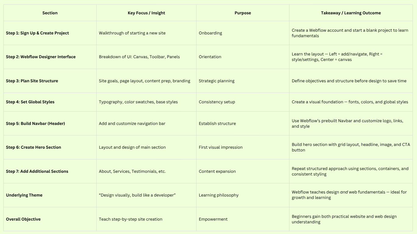
Creating your first website in Webflow is a journey that combines creativity, learning, and a bit of technical savvy but as we’ve shown in this step-by-step guide, it’s absolutely achievable even for a beginner. Let’s recap the key steps we covered:
1. Sign up and start a project: Get a Webflow account and create a new site (blank or from a template).
2. Familiarize yourself with Webflow’s interface: Understanding the canvas and the left/right panels will make building much easier.
3. Plan your site structure and content: Outline what you want on your site (pages/sections) and gather text and images before diving into design. A little planning goes a long way.
4. Set global styles: Define your base fonts, colors, and basic styling to maintain consistency and save time.
5. Build your navigation: Add a Navbar component and customize it with your logo/name and menu links.
6. Design the hero section: Use sections, containers, grids, or flex to create a compelling top section with a clear headline, supporting text, and imagery.
7. Add more sections for your content: About, services, contact, etc., each as separate sections for a logical flow. Utilize Webflow’s design tools (grid, flexbox, spacing) to lay out text and media in a clean, engaging way.
8. Ensure responsiveness: Tweak your design for tablet and mobile views so it looks great on all devicesWebflow makes it straightforward to adjust styles per breakpoint..
9. Optimize for SEO and usability: Set your page titles and descriptions, use proper headings, add alt text to images, and check for any design issues like low contrast. Leverage Webflow’s SEO friendly features (fast hosting, clean code) and make your content as accessible as possible.
10. Preview and test thoroughly: Use Webflow’s preview and your own devices to test the site’s functionality (links, forms, etc.) and fix any issues before going live.
11. Publish your site: Deploy it to Webflow’s staging domain or your custom domain with a click your site goes live on the internet.
12. Maintain and update: Use the editor for content updates, keep an eye on form submissions, and refine the site as needed. Webflow’s backups and versioning have you covered if you need to revert changes.
13. Know when to seek help: If your project grows in scope or you want a truly bespoke touch, consider hiring a Webflow expert or agency. Agencies like Blushush (co-founded by Bhavik Sarkhedi of Ohh My Brand and Sahil Gandhi, they are LinkedIn personal branding experts) specialize in Webflow design and can elevate your site with professional branding and development expertise.
By following this guide, you not only built a website, but you also gained a foundational understanding of web design principles. Webflow’s visual approach has essentially taught you about structure (using sections, containers, and the box model), presentation (CSS styling through the style panel), and best practices (responsive design and SEO basics). These skills will serve you well as you continue to maintain your site or even start the next one.
Finally, remember that a website is never really “finished.” It’s a living project that can evolve along with your goals. Don’t be afraid to iterate on your design, add new content, or even experiment with more advanced Webflow features like animations or CMS collections as you become more comfortable. The Webflow community is huge and supportive. There are forums, tutorials, and clonable projects that can inspire you and help you implement new ideas.
Your first Webflow site is just the beginning. We hope this step-by-step guide has demystified the process and empowered you to create something you’re proud of. Now it’s time to reach out to Blushush and share your site with the world, gather feedback, and watch your online presence grow. Happy designing, and welcome to the Webflow community!


.avif)


